
Recomendados
Mais conteúdo relacionado
Mais procurados
Mais procurados (20)
Semelhante a Lady gaga rollingstone analysis
Semelhante a Lady gaga rollingstone analysis (20)
Mais de SianLynes
Mais de SianLynes (20)
Lady gaga rollingstone analysis
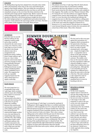
- 1. COLOUR COVERLINES The Rolling Stone logo has been adapted into a hot pink colour which The primary cover line is ‘Lady Gaga Tells All’ which attracts adds to the femininity of the artist on the cover and reinforcing the the audience because they are interested in celebrity appeal to their female audience. This cover defies the conventions of perspective; this lures the audience in as they would want to using the colour of the masthead onto the cover lines as well. By only know secrets about her life which suggests are only available in using black and grey on the cover lines this draws attention to the this magazine. The smaller cover line ‘Obama’s General | Why colourful centre image and the magazine logo. Black is used on the more he’s losing the war’ lures the audience as it suggests that the central selling points of the magazine as it stands out and draws magazine know reasons other people don’t. ’Summer Double attention to them first, with the grey giving an insight into the context. Issue’ is a cover line above the masthead and indicates the The white background gives it a sophisticated and modern look to the magazine has more to offer than usual which is a selling point. magazine. It also enhances the main image and the cover lines. The three Another cover line ‘Wet, hot loud | 4 days at Bonnaroo’ relates colour palette of this magazine is hot pink, black and grey. to the music news which the magazine is famous for as Bonaroo is a U.S. music festival. This also leaves an enigmatic sense because listing the names of artists who were present will attract fans of their music: ‘Elton John | Eminem’. AUDIENCE FONTS From this issue we can tell that the audience for the The font used on this cover goes magazine would be adult against the conventions of a men as they would be magazine which corresponds to attracted by the nude woman the typical rules of having a on the cover. However, since mixture of fonts and sizes. The Lady Gaga is an icon it would font is nor male or female also draw in her female orientated and is all in upper admirers since she is case – despite the height of the recognised for her font – so pragmatics wise is flamboyant artistry. Rolling shouts on the page and grabs Stone’s target audience age is the attention of a glancing from 20+ since it often customer. The smaller cover features controversial artists lines use the same font which and news coverage as well as has been expanded in width and being politically informed reduced in height to create a (see ‘Obama’s General’). bulkier font to address the more Rollingstone focuses on pop persuading lines. Although this culture and liberal politics is not noticeable and may be which is published every 2 mistaken for a different font it weeks. The magazine has allows the same style on the tips built up a reputable of the font. This style conforms magazine brand since the to the original 60’s style of 1960’s which draws in a Rolling Stone, which the regular readership. masthead font is in since its founding in the 60’s.. MAIN IMAGE The main image here is a SPACING & OTHER recognisable music artist COMMENT ‘Lady Gaga’ which correlates On this music magazine, with the music side of Rolling negative space is used such as Stone which it is renowned near the main image’s knee and for. This image is BY SIAN LYNES shoulder and legs. This allows controversial as the artist is the text not to look so intrusive nude and only wearing a bra THE MASTHEAD to the image. It also adds in the form of a gun for exclusivity or rarity to the icon which she is holding. The central image of ‘Lady Gaga’ is covering the masthead of on the cover who remains the However this controversial ‘Rollingstone’ which suggests that there is a certified readership main focus point whilst and innovative image relates and that it is still recognisable even if it is obscured. By having a conforming to the rule of thirds. well to Rolling Stone who bold and spaced out tag line of ‘Summer double issue’ above the Leaders are also used in the have always featured magazine masthead it draws immediate attention since the logo form of dashes between each controversial images on their has been moved as it looks out of place. This is also a unique cover line to move the cover, the most famous for selling point as the audience feel they get more for their money audience’s eye onto the next instant being John Lennon and should be drawn to buy it as it is a special issue in feature swiftly. The balanced and Yoko Ono. This striking comparison to other ‘ordinary’ issues. The masthead logo creates look of the text and colours image aims at both a male the letter ‘R’ as an ascender to give it a striking look. The close overall makes the magazine and female audience who kerning of the masthead letters give it a theatrical look. The appeal more to a customer as it would be interested in the banner is placed directly right underneath the masthead so the is not too ‘busy’ and would not meaning why the artist chose audience can draw quick information about the specific put them off buying it since it is such a niche pose and who publication of this issue such as price, website, and date and issue not cluttered. I should use a are fans of her previous number. similar approach when creating work. my magazine.