
Recomendados
Mais conteúdo relacionado
Mais de Shuyeb_Abdul
Último
Último (20)
Contents & Double Page Spread Analysis
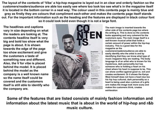
- 1. The layout of the contents of ‘Vibe’ a hip-hop magazine is layed out in an clear and orderly fashion so the customers/readers/audience are able too easily see where too look too see what’s in the magazine itself it is located in the bottom corner in a neat way. The colour used in this contents page is mainly blue and grey as firstly they are colours that compliment each-other and makes the contents page itself stands out. For the important information such as the heading and the features are displayed in black colour font so it could look bold even though it is not a large font. The main image is inserted towards the other side of the contents page too where the writing is. This is done so the contents looks appealing and very coherent for the customers eyes. The main image itself is a well-known musical artist that holds a certain amount of power within the hip-hop industry. This is a good idea for the magazine as the customers/readers/audience are able to easily identify who the artist is and by identifying that they can know what type of music magazine they are reading. The body language is of an artist who is known for his mysterious, dark personality but has someone who is holding a heart on his chest where his heart is suppose to be. This can show conflict against good vs. evil and creates excitement. Or it shows the Kanye West himself does not have a heart due too his hip hop cultured, dark personality so a heart is being used also a picture of a girls arm makes the image look more scary and makes the customers think, creates exhilaration The headlines and captions vary in size depending on what the readers are looking at. The contents headline itself is very big and bold too show what the page is about. It is shown towards the edge of the page too show excitement and give the customers a taste of something new and different. Also, the V for vibe is placed behind the model. It is placed behind the model as the company is a well known name so the name itself could be covered and the customers itself is still able to identify who the company are. Some of the features that are listed consists of mainly fashion information and information about the latest music that is about in the world of hip-hop and r&b music culture.
- 2. This is a contents page of a well known rock ‘n’ roll magazine called Kerrang and looking at the layout of the contents page it consists of a lot of images so it may give you a slight taste of what is going to be on the inside of the magazine itself. In this contents there are all types of colour so there is not really a colour palette this can symbolize rock as it is wild so this reflects on the contents page as placing pictures all over the contents page even some that are tilted too show excitement and they put the contents towards the side. On a normal contents page of a music magazine there is a main image of someone famous however in this contents page there are pictures of many artists on the page itself, this makes it easier too see what this edition of Kerrang magazine is about and who it is based on. Also consists of some writing right at the top may be a review. The body language given is of a rock and roll nature with the mics close too them and wearing dark colours and tattoos etc. The headlines and captions use a specific colour palette in order for it too stand out so the good use of black and yellow gives it an edgy feeling too portray a feeling of rock and roll and also make the readers see clearly what they are reading. Also on the captions a style is used which makes it more innovative and exciting and that is the use of highlighting the caption too let the readers know of the subtopics. Some of the features that this contents page consist of are aspects such as feedback, the news in other words what is going on in the world of rock and the music artist. There are also a lot of reviews such as song, video & album reviews etc.
- 3. The layout in this hip-hop magazine seems very organised as the main image is on one end of the double page spread and MOST of the writing is on the other end however in this case there is some amount of writing on the side of the main image itself. Like a double page spread the main image is very big compared too the little writing that is on the side of the model. The colours used are mainly black and white too show class however there is a contrast of the model as she is in colour so the main model herself stands out and also any key words are highlighted in blue too show importance and create excitement for the customers themselves. The pictures in this double page spread is very unique because as well as being one MAIN picture of the model in colour. It seems like in the background there are pictures of her in different positions but in black and white, this compliments the double page itself as it makes it look approachable and it’s something new for the customers also it shows the models personality as being ‘girly’ by looking at the poses. The headlines are larger than the text itself yet smaller than the model this may be a tad confusing from afar as the headlines may not stand out however in this case it tries too stand out by changing the font type and by making it bold etc. Also for any important word it is highlighted in light blue as this is very vibrant and draws attention to the customers. The features listed within the double page spread is normally about the main image so in this case it’ll be about the female main model that is solange knowles and the text will be about her as you can see her name is highlighted using a light blue colour
- 4. The layout of this double page spread is usually like how typical double page spreads are with the text being on only one side and the main image itself is large and located on the other side of the double page spread. However, we see that ¾ of the double page is filled up by just the heading itself as it is EXTREMELY big and Bold. Except from the main model itself the colour palette used in this magazine is the typical black and white palette and for any important terms are highlighted in red. The model is in full colour and wearing a vibrant shirt too make her stand. The main image like a typical double page there is only one and it is set on one side of the spread itself. The main image is a known artist ‘Lily Allen’ and her pose signifies her personality how she is very bubbly and petit but according too the headline it can create conflict as the headlines is a portrayed negatively so her being an attention seeker. The headline is extremely big and it’s places tilted and unorganised too create a sense of excitement and persuade the readers/audience/ customers too read it, it is black and white and the black boxes are in different sizes too show thrill. The captions are slightly bigger than the text and a different font type. The features that are listed on this double page spread is that of the main model who is Lily Allen in this case, by looking at the picture we are able too tell this article is going too be about the music artist herself and her name is highlighted in red on the subheading