1. New Dove Cream
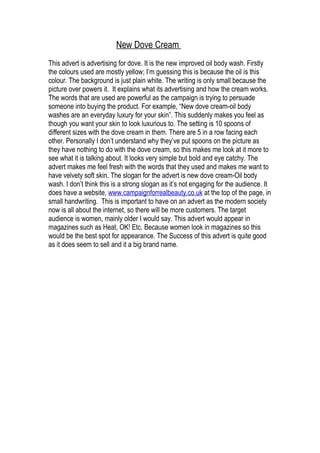
This advert is advertising for dove. It is the new improved oil body wash. Firstly
the colours used are mostly yellow; I’m guessing this is because the oil is this
colour. The background is just plain white. The writing is only small because the
picture over powers it. It explains what its advertising and how the cream works.
The words that are used are powerful as the campaign is trying to persuade
someone into buying the product. For example, “New dove cream-oil body
washes are an everyday luxury for your skin”. This suddenly makes you feel as
though you want your skin to look luxurious to. The setting is 10 spoons of
different sizes with the dove cream in them. There are 5 in a row facing each
other. Personally I don’t understand why they’ve put spoons on the picture as
they have nothing to do with the dove cream, so this makes me look at it more to
see what it is talking about. It looks very simple but bold and eye catchy. The
advert makes me feel fresh with the words that they used and makes me want to
have velvety soft skin. The slogan for the advert is new dove cream-Oil body
wash. I don’t think this is a strong slogan as it’s not engaging for the audience. It
does have a website, www.campaignforrealbeauty.co.uk at the top of the page, in
small handwriting. This is important to have on an advert as the modern society
now is all about the internet, so there will be more customers. The target
audience is women, mainly older I would say. This advert would appear in
magazines such as Heat, OK! Etc. Because women look in magazines so this
would be the best spot for appearance. The Success of this advert is quite good
as it does seem to sell and it a big brand name.