Mais conteúdo relacionado Semelhante a Creating an Uber Clone - Part I - Transcript.pdf (20) 1. Creating an Uber Clone - Part I
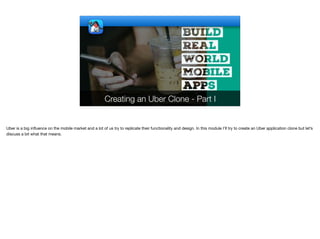
Uber is a big influence on the mobile market and a lot of us try to replicate their functionality and design. In this module I’ll try to create an Uber application clone but let’s
discuss a bit what that means.
2. Clone?
✦I’m not going to build everything they offer as it would
be impossible to go into that level
✦The server portion will be very basic as the focus here
is on mobile
✦I will try to build a similar although not identical UX/UI. I
think that would be a useful tutorial
✦I will build out most but not all of the Map related
features and explain how they are achieved
© Codename One 2017 all rights reserved
Lets start by setting expectations in place. I’m not going to build everything in the app as there are so many nuances and details within the final app that it would be
impossible to go through everything. However, I will build most of the big ticket UI elements and I’ll actually try and focus on the “hard stuff” rather than doing things that
are mostly simple.
I chose to clone the existing app rather than building my own since I want to show a professional grade application and Uber is pretty much that. The goal of this module
is to teach the theory of building a professional app. It’s not here for the purpose of rebuilding Uber.
I’ll use Spring Boot as usual for the server but I’ll try to keep it bare. It’s actually better to do stuff in the server in real world scenarios but in this case I want to focus on
client development.
I’m trying to create a close clone but not identical clone. Doing that last bit between identical and pretty close is a huge amount of effort that doesn’t provide a benefit. In
fact it makes things worse because it forces the code and designs to be more convoluted
I will spend a lot of time in the Map UI and try to explain how to build a decent GIS application. This isn’t a GIS tutorial though as I’m not an expert in that field, I took
some shortcuts in building this app so hopefully they don’t show much
3. Cloning Process
✦We’ll start by breaking down the functionality of the
Uber app
✦Then we’ll use that to build the basic UI mockup
✦Next we’ll build a simple server
✦We’ll connect the server and client
✦Then we’ll fill out the details
✦The final result will be an app that you could use for a
taxi service but you would probably need to flesh out
some details…
© Codename One 2017 all rights reserved
Before we start we need to essentially understand the functionality of Uber. Even if you used the app in the past a lot of the functionality is pretty subtle and you might
have run through it without noticing. We need to grab screenshots of Uber features that we can review and compare to what we are trying to implement
Once we have those images we can use them to create a mockup of the Uber UI.
Once the mockup is in place we can create a server
And then connect the whole thing together
And fill in the details as we move along. This is pretty similar to the process I used to build all the apps in the course. As you will notice I prefer building the UI first and
think it’s always the best approach.
When we finish the app it should be a fully working app but you will probably need some work in order to bring it to production grade. I’ll try to highlight the bits that are
necessary as we move through the UI
4. © Codename One 2017 all rights reserved
Animations
There are some great transition animations in the uber app which you can see here. I’ll go into some details of how we can achieve some of them near the end of the
module. We’ll start by focusing on the basic skeleton UI. Notice that these animations differ between Android and iOS.
Now lets go into the screenshots I captured of the uber application.
5. © Codename One 2017 all rights reserved
The First Screen After The Logo Splash
This shows that even a major native app can have UX blunders. We have the Uber logo splash screen followed by a permission prompt for location.
But lets move on…
6. Login Part 1
© Codename One 2017 all rights reserved
This is the basic login flow to Uber. One of the first things I checked is the look in landscape mode. Turns out that Uber doesn’t support that!
The app is fixed to portrait on mobile phones. It doesn’t seem to have much support for tablets either which makes some sense as you would probably not hail a cab
with a tablet. This allowed them to simplify some of their UX logic and we can probably use a similar approach.
There are two options for login, the first uses social login through google/facebook and that falls to the native login option. The second one uses SMS style activation by
collecting the phone number. We have support for that in our SMS activation cn1lib. The UI’s shown here are all very simple, clean and minimalistic which should make
them very easy to replicate in Codename One.
On the right you can see a simple form that allows us to select a country if the one we detected isn’t correct. It’s a pretty simple list with flags and search.
Notice that when you scroll down in the form the title collapses in the material design style to provide a more compact view.
7. Login Part 2
© Codename One 2017 all rights reserved
The SMS activation process works with 4 digits. It doesn’t seem to automatically offer to grab the SMS which is pretty lame. We can do better than this, I don’t
understand why Uber wouldn’t do something better on Android where its possible. One important thing to notice is the way the digit input looks. These are 4 separate
digits but they have one error message below.
When a number is already active in the server you can use your password and get a password reset form which I didn’t include in the screenshots. I’m not sure I’ll go into
that level of detail with the implementation.
One thing that is missing from the screenshots is the next button progress effect which is pretty cool. When you press the arrow button the screen tints and the arrow is
surrounded by a circular blue progress bar. That should be pretty easy to accomplish in Codename One so it’s something I’ll try to do as well.
8. Main UI
© Codename One 2017 all rights reserved
The UI itself is mostly the map which is great. There are the cars and landmarks highlighted on the map. The “Where to?” text field isn’t really a text field. It’s a button.
When you click on it you see the search form to find directions to order an Uber that you can see in the screenshot next to the map. Notices can be swiped from the
bottom, this is a doable element but is non-trivial so I won’t go into it with this app and ignore that specific element. We can see two floating buttons of recent searches/
trips that you can repeat, that should be pretty easy to replicate as well.
Notice that the side menu icon just “floats” with no title to disturb the UI of the application. One of the small details is the fact that the menu button is black surrounded
by a white outline. That means it will be reasonably visible both on a dark and light map. That’s great attention to detail…
Once we pick a location we get a UI prompt with an order option. It also shows the direction on the map highlighting my location and destination.
If we open the side menu we can see the design is very simple, I’ll skip the Uber for business stuff in the app we make but I’ll try to reproduce this exact UI design. Notice
how the minimalistic design that even skimps on colors is able to broadcast elegance…
9. Payment
© Codename One 2017 all rights reserved
Payment is a relatively simple UX, I won’t go into it at all because we can just integrate braintree for billing and skip on some of these complexities. Credit card billing is
problematic not just due to technical difficulties but due to liability, I wouldn’t go into that unless I had to.
10. Additional Forms
© Codename One 2017 all rights reserved
I won’t go into the details of each of these forms. Notice I blocked out in red some private information about my trips that isn’t really important. One thing you should
notice is how simple these UI’s are… I won’t really get into them but they should be pretty trivial.
11. © Codename One 2017 all rights reserved
iOS Version
The iOS version is remarkably similar to the Android version both in design and transitions. Notice that the login form has some pretty cool background rotation animation
but other than that only the transitions differ in the app. Everything else looks identical even in text input and the floating action button. This will make our lives much
easier