
Recomendados
Mais conteúdo relacionado
Mais procurados
Mais procurados (19)
Destaque
Destaque (17)
Semelhante a COMM 130 Portfolio
Semelhante a COMM 130 Portfolio (20)
Último
Último (20)
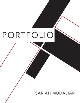
COMM 130 Portfolio
- 2. CONTACT CONTENTS 4 6 8 10 12 16 18 20 22 Magazine Cover Prezi Presentation Photodesign Montage Business Identity Infographic HTML & CSS Webpage Mockup Brochure Sariah Mudaliar phone email website 555 432 7894 sariahmudaliar@hotmail.co.nz www.sariahmudaliar.com
- 3. MAGAZINE COVER 4 DESCRIPTION DATE COURSE INSTRUCTOR PROGRAMS USED OBJECTIVE PROCESS Design a creative magazine cover of your choice that is all about yourself and your interests/hobbies! 27 September 2016 COMM 130 Visual Media - Section 1 Nicole Nugent Adobe InDesign, Adobe Photoshop Use the principles and elements of design to create a well balanced flowing piece with a high quality photo showcasing yourself. 1. I sketched out ideas of what material I wanted on my magazine. I did a brainstorm sketch and layout sketches. I then proceeded to create a shape map in InDesign. 2. I opened up my photograph in Photoshop and edited the brightness. I blurred the background and made it black and white. 3. I added the image to Indesign. I started to add in the magazine title and article titles. 4. I moved the layout around of my text until I was happy when it had the flow I wanted. 5. I now added in the color. I chose to go with a simple triad theme of Blue, Yellow and Red. 6. I added the finishing touches, and made sure that everything was aligned with something else in the magazine cover.
- 4. PREZI PRESENTATION DESCRIPTION DATE COURSE INSTRUCTOR PROGRAMS USED OBJECTIVE PROCESS A Prezi Presentation about the Top 10 Places to Travel in the World, creating your own image as the home slide. 5 October 2016 COMM 130 Visual Media - Section 1 Nicole Nugent Adobe Photoshop, Prezi Create an instructional Prezi Presentation using Prezi software to show and perform its various features and abilities. 1. Chose a topic to present. I love to travel so I chose my Top 10 Places in the World. I sketched out how I wanted the home screen to look like, which was a giant silhouette of a map and then have circles identifying the places on the map. sketches 2. I found a rough image of a world map on Google. I then opened it up in Photoshop and isolated the image and painted it to the color I wanted. I then imported it into a JPEG and added it to my Prezi Presentation. I then started to add circles and slides of the different places I wanted to show. 3. I also inserted images from Google of each place to also show not just give a description of them. 4. I started to play around with the camera spins and angles and paths until I was pleased with the overall flow of the presentation. 6
- 5. PHOTODESIGN DESCRIPTION DATE COURSE INSTRUCTOR PROGRAMS USED OBJECTIVE PROCESS A photo design of a quote I chose. “life is tough, but so very beautiful”. 3 December 2016 COMM 130 Visual Media - Section 1 Nicole Nugent Adobe Photoshop By using photography and design skills to create a piece that uses a consistent color scheme from the photo. 1. I chose a quote or saying that I wanted to base this project on. I chose “life is tough, but so very beautiful”. 2. I took this photograph in New Zealand and put it in Photoshop. I brightened it up a little bit so the colors were more vibrant. 3. I added in solid boxes filled with colors from the photograph, using an analogous color scheme of blue, blue-green and green. 4. I then added in the text and chose to keep it white so that it stands out from the colored boxes. I then added thinner lines bordering the entire photograph and also under the solid boxes. 5. The last thing that I did was to add the color swatches at the bottom. 8
- 6. MONTAGE DESCRIPTION DATE COURSE INSTRUCTOR PROGRAMS USED OBJECTIVE PROCESS A montage of a spiritual quote from Elder Neal A. Maxwell. 18 October 2016 COMM 130 Visual Media - Section 1 Nicole Nugent Adobe Photoshop Design a spiritual poster montage using a mix of images and type. Quote: “Faith in God, includes having faith in his timing”. I wanted to create a montage that looked realistic and not too fake or a montage with a ton of edits. I had an idea that I wanted it to be simple and clean so I went with two images of a plant and clock. 1. I found a quote that I liked and then went and found my images, the clock and flower. 2. In Photoshop I edited the flower image so that it was sharper and the background more blurry than what it originally was. I then added the clock above it and masked it out with a low opacity. 3. I made sure that I used good alignment and that all the smaller details were taken care of. I also played around with the colors to make sure they go together well. 10
- 7. BUSINESS IDENTITY DESCRIPTION DATE COURSE INSTRUCTOR PROGRAMS USED OBJECTIVE PROCESS The business card and letterhead designs of my new company “River Bound Bungee Jumping”. 25 October 2016 COMM 130 Visual Media - Section 1 Nicole Nugent Adobe InDesign, Adobe Illustrator Create a logo, business card and letterhead for a company to establish their identity and business. 1. I researched on the internet to see what kind of company I wanted to design for in the first place and decided on Bungee Jumping. I then went and started doing some sketches of what would work. 2. I then started making the different variations and drawing the symbols I wanted on Illustrator. I then also started playing around with some different color schemes. I wanted to keep it simple so I went with complementary. 3. I found an image of a bungee jumper and used the pen tool to re-create my own version of that picture and selected the color I wanted. I then played around with the different shapes of logos to see which I liked best which was the circle one. 4. I then played around with the font combinations and found one that I liked. I also then played around with the color a little more, and found values that I liked. 5. The last things I did were just the small details on what needed to be fixed and to make sure everything was aligned correctly.12
- 9. INFOGRAPHIC DESCRIPTION DATE COURSE INSTRUCTOR PROGRAMS USED OBJECTIVE PROCESS An infographic that shows all the basic facts of New Zealand. From the history all the way through to the best places to visit. 1 November 2016 COMM 130 Visual Media - Section 1 Nicole Nugent Adobe InDesign, Adobe Illustrator Create an infographic that organizes information in a creative and visually pleasing way. 1. I started brainstorming what topic I wanted to do my infographic on. I decided to go with New Zealand. I did half demographics and half interesting places to see and visit. 2. I did some extra research and made sure I had all of my facts right. 3. I then started to do a brainstorm sketch and two layout sketches to see what kind of graphics I would need to draw. 4. I then started to draw all the graphics that I thought I would need making sure that they were kept simple and not too busy. I also drew the pie chart. 5. I then started to put together my whole layout for the infographic on Illustrator. After having everything where I wanted it, I started to add in color. I originally was going to go with a Split-complementary color scheme, but then changed my mind once actually adding color and decided to go with Tetradic. 6. I then worked on the smaller details and making sure everything was aligned.16
- 10. HTML & CSS DESCRIPTION DATE COURSE INSTRUCTOR PROGRAMS USED OBJECTIVE PROCESS Using HTML and CSS to create a Webpage for my River Bound Bungee Jumping Company. 8 November 2016 COMM 130 Visual Media - Section 1 Nicole Nugent Notepadd++ Create and code a custom webpage using HTML and CSS. 1. I used the logo I created from a previous project. 2. I resized my logo so that it was no longer than 500 px on the long side. 3. I created my HTML file and started adding my content and tags. 4. I added my CSS file and then linked it to my HTML file. 5. I kept with the color scheme of monochromatic with green, white and black. I added a black and white photograph as the background so that the content and logo would stand out. 6. I then changed the colors of my fonts and chose a style that complemented my logo and one that was not too different. 7. I then made sure to validate my HTML and CSS. 18
- 11. WEB PAGE DESCRIPTION DATE COURSE INSTRUCTOR PROGRAMS USED OBJECTIVE PROCESS A webpage mockup for my company River Bound Bungee Jumping. 15 November 2016 COMM 130 Visual Media - Section 1 Nicole Nugent Adobe InDesign, Adobe Photoshop Design a website homepage using a grid for the company we created. 1. I first decided that I would create the homepage for the company that I created in past projects. 2. I then started sketching ideas of how I wanted the overall layout and flow of the webpage to be. I wanted it to be easy to navigate and also engaging for the audience to want to stay and interact with the page. 3. After I drew my three sketches, I went on to Photoshop and started to put together my wireframe, using the 16 line grid. 4. After my wireframe, I copied the PSD file and started to insert my images and text. 5. My final design ended up being a little different than what my original sketch was, but I think that it turned out a lot cleaner and sharper with the alignment. I also kept playing around with the colors until I got the right feeling and atmosphere I wanted to create with this web page. 20
- 12. BROCHURE DESCRIPTION DATE COURSE INSTRUCTOR PROGRAMS USED OBJECTIVE PROCESS A brochure advertising and informing the audience of what River Bound Bungee Jumping is all about. 30 November 2016 COMM 130 Visual Media - Section 1 Nicole Nugent Adobe InDesign, Adobe Photoshop Design a brochure for the company I created, River Bound Bungee Jumping. 1. I first created the logo in Illustrator. 2. I wrote all the body copy and content that I wanted to include in my brochure. 3. I went and found all the images that I wanted for my brochure. I then went into InDesign and started to design the layout of my brochure. 4. When I made a rough draft with the images and layout, I inserted my body copy and formatted it so that I had clean lines and everything was alligned. 5. I exported the brochure as a PDF for printing and as JPEGS. 4. I then exported the brochure document as JPEGS. 22