Sanoma Get tomorrow 2017 Oli Gardner
•
1 gostou•1,117 visualizações

http://gettomorrow.fi/

Recomendados
Recomendados
Mais conteúdo relacionado
Mais procurados
Mais procurados (8)
Destaque
Semelhante a Sanoma Get tomorrow 2017 Oli Gardner
Semelhante a Sanoma Get tomorrow 2017 Oli Gardner (20)
Último
Último (20)
Sanoma Get tomorrow 2017 Oli Gardner
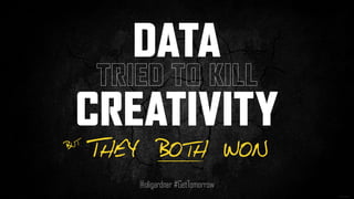
- 1. DATA TRIED TO KILL CREATIVITY @oligardner #GetTomorrow THEY BOTH WONBUT
- 2. 1
- 3. 65%OF M AR KETERS SAID THEY D ON’T HAVE ENO UGH DATA TO DO TH EIR J OB EF F EC TIVELY. 65% * from multiple surveys of 700+ marketers * @oligardner #GetTomorrow
- 4. We did it because it was trendy
- 5. DESIGN DECISIONS NEED TO BE INFORMED BY DATA NOT TRENDS @oligardner #GetTomorrow
- 9. IS DATA KILLING CREATIVITY? @oligardner #GetTomorrow
- 10. Data is backwards thinking. It’s about the past, not the future.” ” - Oliver Freeman Futurist DATA IS KILLING CREATIVITY
- 11. Great ideas are created by people, not data.” ” - Luke Chess Creative Director, Mammal Sydney DATA IS KILLING CREATIVITY
- 15. 3rd Floor 320-328 329-337 33% still WENT THE WRONG WAY
- 19. 3rd Floor 320-328 329-337 EVERYBODY WENT THE RIGHT WAY
- 20. YOU CAN’T CHANGE IT IF YOU DIDN’T SEE IT @oligardner #GetTomorrow
- 22. 2011 2010 PARALLAX SCROLLING A beautiful motion design and photographic technique, parallax scrolling can create an excellent experience. Sadly it was quickly abused. CINEMAGRAPHS Another beautiful concept, that didn’t gain much traction, instead its subtlety was passed over in favour of the surging animated GIF. STICKY NAVIGATION A similar device to the HelloBar, but designed for anchor (in-page) navigation. Something that can really help long landing pages. INLINE FORM FIELD LABELS This one blew up UX and CRO communities. Primarily because the label disappeared when the field was clicked, removing context and hints. BUTTON COLOUR As affordable A/B testing tools hit the market, so cometh a slew of bad case studies that encourage bad experimentation practices. HELLO BAR The first sticky bar emerges from Digital Telepathy, allowing you to place persistent offers at the top of the page. 2012 EXPLAINER VIDEOS Everyone needs an explainer video, right? Explain that to me. FULLSCREEN HERO IMAGES Wide adoption of fullscreen background images was the beginning of many trends that would harm readability of the all-important above-the-fold value prop area of web pages everywhere. 1991 WWW The World Wide Web is made available to the general public. 1994 THE FOLD Jakob Nielsen proclaims that people don’t scroll, and most debated topic in digital marketing begins, and never stops. 1997 CAPTCHAS The first evil interruptive device is added to web forms. Creating a usability nightmare. 1998 POPUPS Things get even uglier as web designers and developers begin hacking browser behaviour. The hard to escape Javascript popup empowers the black hats to start misbehaving. 2004 PINOT NOIR Not a design trend, but an example of the power trends can wield when left unchecked. 2007 CAROUSELS Oft looked upon as a way to pacify stakeholder politics, carousel sliders hit every homepage adding massive amounts of content destined never to be seen. RE-CAPTCHA The evil captcha is turned into a device that does good – by crowdsourcing digitizing of hard- to-read books. Gets acquired by Google in 2009. RESPONSIVE WEB DESIGN One of the biggest web bandwagons ever. RWD seemed like a great idea at the time, but the lack of control over the mobile experience can cause issues. MOBILE-FIRST DESIGN Closely tied to RWD, mobile-first sought to future-proof web experiences by placing emphasis on mobile – because all of your traffic is mobile, right? EYE TRACKING An expensive and fancy way to detect what people are looking at on a web page. It quickly gained notoriety when the “baby gaze” experiment did the rounds on marketing blogs. 2013 INLINE FORM FIELD LABELS II A community-led success story. Designers created a way to keep the label inline without disappearing. HAMBURGER MENU Massive debates raged about this one, but influence from OS designers has forced this into mass adoption. FLAT DESIGN Affordance is thrown out the window en masse with a trend that can destroy app usability. 2014 BACKGROUND VIDEOS The fullscreen hero image extends to video, further impacting readability and increasing instances of “false bottoms”. CONGRATULATIONS! A Facebook hack more than a design trend. But quite hilarious. Congratulations!!! GHOST BUTTONS Rectangles with opaque fills create quite awesome secondary state buttons, but poor affordance and readability can render them unclickable-looking. GOOD COP / BAD COP The psychological term for the two- button popup, whereby you have to click something you don’t agree with to exit the experience. SCROLLJACKING 20 years of interaction design thrown down the toilet. Designers once more try to re-invent the quite perfect browser scrolling mechanism. 2015 SCROLL-TRIGGERED ANIMATIONS As you scroll down the page, images and text start to fly in, drawing your attention to them. Great the first time you see them. Thereafter annoying as hell. CSS ANIMATED CTAs These have the ability to get really out of hand. Although there are some really nice subtle effects. WELCOME MAT An entrance-overlay method from SumoMe whereby the entire screen is covered. An interruptive experience that has seen some positive updates. 2016 OVERLAYS Unbounce signals the end to the popup, ushering in a new era of responsible marketing practices. SKELETON SCREENS A technique where a wireframe-like layout appears before the content to accelerate load times and provide a signal that loading is happening. CONVERSATIONAL FORMS One of the most interesting new interaction models to emerge, conversational forms turn a regular web form into a chat-like experience. CONFIRM SHAMING A new name for good cop / bad cop emerges. Manipulinks is another. Regardless of the name, I hope one sticks as it makes it easier to track the trend. STICKY TOP AND BOTTOM Top-anchored sticky bars are awesome, bottom ones feel slightly more interruptive, but when both are used at the same time it destroys the viewport. 2017 SMART NAVIGATION This will be an interesting one, where navigational devices will be presented to visitors where and when they hold the most contextual importance and utility. ASYMMETRIC DESIGN Could this simple yet elegant and dynamic trend be the saviour of the false bottom? Quite possibly. 2017? 2017 will be an interesting year for trends, hopefully we’ll see an increase in experimentation and validation. DESIGN TRENDLINE @OliGardner @Unbounce #GetTomorrow
- 24. - Pinot Noir
- 25. - Pinot Noir - Another wine varietal
- 26. - Pinot Noir - Another wine varietal
- 34. “It only takes one tree to make a thousand matches.
- 35. “It only takes one tree to make a thousand matches. Only takes one match to burn a thousand trees.” — Stereophonics
- 36. I DRINK A LOT OF WINE
- 37. But I haven’t bought a bottle of Merlot in 13 years #TRENDpower
- 38. 2011 2010 PARALLAX SCROLLING A beautiful motion design and photographic technique, parallax scrolling can create an excellent experience. Sadly it was quickly abused. CINEMAGRAPHS Another beautiful concept, that didn’t gain much traction, instead its subtlety was passed over in favour of the surging animated GIF. STICKY NAVIGATION A similar device to the HelloBar, but designed for anchor (in-page) navigation. Something that can really help long landing pages. INLINE FORM FIELD LABELS This one blew up UX and CRO communities. Primarily because the label disappeared when the field was clicked, removing context and hints. BUTTON COLOUR As affordable A/B testing tools hit the market, so cometh a slew of bad case studies that encourage bad experimentation practices. HELLO BAR The first sticky bar emerges from Digital Telepathy, allowing you to place persistent offers at the top of the page. 2012 EXPLAINER VIDEOS Everyone needs an explainer video, right? Explain that to me. FULLSCREEN HERO IMAGES Wide adoption of fullscreen background images was the beginning of many trends that would harm readability of the all-important above-the-fold value prop area of web pages everywhere. 1991 WWW The World Wide Web is made available to the general public. 1994 THE FOLD Jakob Nielsen proclaims that people don’t scroll, and most debated topic in digital marketing begins, and never stops. 1997 CAPTCHAS The first evil interruptive device is added to web forms. Creating a usability nightmare. 1998 POPUPS Things get even uglier as web designers and developers begin hacking browser behaviour. The hard to escape Javascript popup empowers the black hats to start misbehaving. 2004 PINOT NOIR Not a design trend, but an example of the power trends can wield when left unchecked. RE-CAPTCHA The evil captcha is turned into a device that does good – by crowdsourcing digitizing of hard- to-read books. Gets acquired by Google in 2009. RESPONSIVE WEB DESIGN One of the biggest web bandwagons ever. RWD seemed like a great idea at the time, but the lack of control over the mobile experience can cause issues. MOBILE-FIRST DESIGN Closely tied to RWD, mobile-first sought to future-proof web experiences by placing emphasis on mobile – because all of your traffic is mobile, right? EYE TRACKING An expensive and fancy way to detect what people are looking at on a web page. It quickly gained notoriety when the “baby gaze” experiment did the rounds on marketing blogs. 2013 INLINE FORM FIELD LABELS II A community-led success story. Designers created a way to keep the label inline without disappearing. HAMBURGER MENU Massive debates raged about this one, but influence from OS designers has forced this into mass adoption. FLAT DESIGN Affordance is thrown out the window en masse with a trend that can destroy app usability. 2014 BACKGROUND VIDEOS The fullscreen hero image extends to video, further impacting readability and increasing instances of “false bottoms”. CONGRATULATIONS! A Facebook hack more than a design trend. But quite hilarious. Congratulations!!! GHOST BUTTONS Rectangles with opaque fills create quite awesome secondary state buttons, but poor affordance and readability can render them unclickable-looking. GOOD COP / BAD COP The psychological term for the two- button popup, whereby you have to click something you don’t agree with to exit the experience. SCROLLJACKING 20 years of interaction design thrown down the toilet. Designers once more try to re-invent the quite perfect browser scrolling mechanism. 2015 SCROLL-TRIGGERED ANIMATIONS As you scroll down the page, images and text start to fly in, drawing your attention to them. Great the first time you see them. Thereafter annoying as hell. CSS ANIMATED CTAs These have the ability to get really out of hand. Although there are some really nice subtle effects. WELCOME MAT An entrance-overlay method from SumoMe whereby the entire screen is covered. An interruptive experience that has seen some positive updates. 2016 OVERLAYS Unbounce signals the end to the popup, ushering in a new era of responsible marketing practices. SKELETON SCREENS A technique where a wireframe-like layout appears before the content to accelerate load times and provide a signal that loading is happening. CONVERSATIONAL FORMS One of the most interesting new interaction models to emerge, conversational forms turn a regular web form into a chat-like experience. CONFIRM SHAMING A new name for good cop / bad cop emerges. Manipulinks is another. Regardless of the name, I hope one sticks as it makes it easier to track the trend. STICKY TOP AND BOTTOM Top-anchored sticky bars are awesome, bottom ones feel slightly more interruptive, but when both are used at the same time it destroys the viewport. 2017 SMART NAVIGATION This will be an interesting one, where navigational devices will be presented to visitors where and when they hold the most contextual importance and utility. ASYMMETRIC DESIGN Could this simple yet elegant and dynamic trend be the saviour of the false bottom? Quite possibly. 2017? 2017 will be an interesting year for trends, hopefully we’ll see an increase in experimentation and validation. 2007 CAROUSELS Oft looked upon as a way to pacify stakeholder politics, carousel sliders hit every homepage adding massive amounts of content destined never to be seen.
- 39. TRENDSKILL CREATIVITY NOT DATA @oligardner #GetTomorrow
- 40. The Importance of Original & Creative Storytelling
- 42. Which marketing channel will in invest most for 2018?
- 43. DOING DIGITAL RIGHT @oligardner #GetTomorrow
- 45. Horror Vacui
- 48. ATTENTION RATIO 82:1 Photo: Issei Kato/Reuters./ Published: 01/20/2014 12:06:38
- 49. 1:1 13.80% 2:1 11.74% 3:1 10.32% 4:1 8.63% 5:1 9.17% 6:1 8.70% 7:1 7.62% 8:1 9.58% 9:1 6.86% 10:1 5.86% Conversion Rate vs Attention Ratio CONVERSION RATE Data pulled from Unbounce landing page database - Pages with forms on them - excluding links for terms & conditions and privacy policy ATTENTION RATIO
- 50. 1:1 13.80% 2:1 11.74% 3:1 10.32% 4:1 8.63% 5:1 9.17% 6:1 8.70% 7:1 7.62% 8:1 9.58% 9:1 6.86% 10:1 5.86% Conversion Rate vs Attention Ratio CONVERSION RATE Data pulled from Unbounce landing page database - Pages with forms on them - excluding links for terms & conditions and privacy policy ATTENTION RATIO
- 52. MY RESEARCH DATA MARKETING TEAM DYSFUNCTION @oligardner #GetTomorrow
- 55. DESIGNER COPYWRITER Writers want me to start designing before they give me content. MARKETER
- 56. 81%OF DESIGNERS HAVE TO START THEIR D ESIGN WORK BEFORE THEY RECEIVE THE COPY 81% “Design gets frustrating when you don't have everything you need from the beginning” * * % of designers polled in a survey regarding working in marketing “It’s like painting by numbers.”
- 57. DESIGNER COPYWRITER Writers don't get that search engines see things differently to humans. MARKETER
- 58. DESIGNER COPYWRITER Marketers have no understanding of customer behaviour. MARKETER
- 59. DESIGNER COPYWRITER they're too myopic and enjoy naval gazing. MARKETER
- 60. na·vel-gaz·ing /‘ nāvel gāziNG/ noun self-indulgent or excessive contemplation of oneself…
- 61. DESIGNER COPYWRITER …they don't respect design and think they know how it should be done. MARKETERMARKETER
- 62. 98%OF MARKETERS SAID THEY ARE RESPONSIBLE FOR GIVING DES IGN FEEDBACK TO DESIGNE RS 98%* * % of marketers polled in a survey regarding working with designers and copywriters in marketing
- 63. 87%OF MARKETERS WHO GIVE D ESIGN FEEDBACK B ELI EVE THEY ARE QUALIFIED TO DO S O. 87%* * % of marketers polled in a survey regarding working with designers and copywriters in marketing
- 64. 87%OF MARKETERS WHO GIVE D ESIGN FEEDBACK B ELI EVE THEY ARE QUALIFIED TO DO S O. 87%* * % of marketers polled in a survey regarding working with designers and copywriters in marketing
- 66. DESIGNER COPYWRITERMARKETER Designers are too sensitive.
- 68. design != copying shit
- 69. DESIGN MATTERS AND CREATIVITY @oligardner #GetTomorrow v
- 74. data-informed design accelerates delight @oligardner #GetTomorrow
- 77. Are you a designer?
- 78. Art
- 79. Art > Design
- 80. Art > Design > Optimization
- 81. MacGyver.
- 85. MacGyvered
- 87. What is the biggest marketing challenge your teams face?
- 88. What is the biggest marketing challenge your teams face?
- 89. What is the biggest marketing challenge your teams face?
- 90. CROSS-CHANNEL EXPERIENCES CONNECTING OFFLINE TO ONLINE @oligardner #GetTomorrow
- 91. Delightful
- 92. TV TO DIGITAL @oligardner #GetTomorrow
- 93. CROSS-CHANNEL TV AUDIENCE ATTRITION Other channels PVR/DVR Recordings allow ad skipping Netflix, Amazon etc… URL too long to remember Desktop search leaks to competitors Converted Sales Product Found Friction & Distractions Bad Mobile Experience
- 94. SleepCountry.ca
- 95. 1
- 96. WHAT I WAS PROMISED
- 97. WHAT I GOT
- 100. Context
- 121. Scott Stratten @unmarketing QR Codes Kill Kittens
- 122. WTF?
- 123. WTF?
- 124. THE FIRST RULE OF CTAS HAVE A F#CKING CTA! @oligardner #GetTomorrow
- 125. What happens if you don’t have a Call to Action?
- 128. IT’S NOT ABOUT OUR ATTENTION SPAN. @oligardner #GetTomorrow THE LENGTH OFv
- 129. IT’S NOT ABOUT OUR ATTENTION SPAN. @oligardner #GetTomorrow IT’S ABOUT HOW OUR LACK OF ATTENTION CHANGES HOW WE USE TECHNOLOGY. THE LENGTH OFv
- 131. CLARITY @oligardner #GetTomorrow IS THE MOST IMPORTANT PART OF THE CONVERSION EQUATION
- 133. What product do you think this company sells?
- 134. What product do you think this company sells? WHAT PRODUCT DO YOU THINK THIS COMPANY SELLS?
- 135. What product do you think this company sells? WHAT PRODUCT DO YOU THINK THIS COMPANY SELLS? ONLY 6% ANSWERED BUSINESS LOANS
- 136. What product do you think this company sells?
- 137. MEETING A GUY? DOCTOR CONSULTATION A TALK SHOW NOT SURE NOT SURE NOT SURE NOT SURE VIAGRA SOMETHING ABOUT OLD MEN
- 138. What product do you think this company sells?
- 139. What product do you think this company sells? WHAT PRODUCT DO YOU THINK THIS COMPANY SELLS? 36% ANSWERED BUSINESS LOANS
- 140. What product do you think this company sells? WHAT PRODUCT DO YOU THINK THIS COMPANY SELLS? 36% ANSWERED BUSINESS LOANS +500%
- 141. SORRY LARRY
- 143. 2011 2010 2012 1991 1994 1997 1998 2004 2007 2013 2014 2015 2016 2017 PARALLAX SCROLLING A beautiful motion design and photographic technique, parallax scrolling can create an excellent experience. Sadly it was quickly abused. CINEMAGRAPHS Another beautiful concept, that didn’t gain much traction, instead its subtlety was passed over in favour of the surging animated GIF. STICKY NAVIGATION A similar device to the HelloBar, but designed for anchor (in-page) navigation. Something that can really help long landing pages. INLINE FORM FIELD LABELS This one blew up UX and CRO communities. Primarily because the label disappeared when the field was clicked, removing context and hints. BUTTON COLOUR As affordable A/B testing tools hit the market, so cometh a slew of bad case studies that encourage bad experimentation practices. HELLO BAR The first sticky bar emerges from Digital Telepathy, allowing you to place persistent offers at the top of the page. EXPLAINER VIDEOS Everyone needs an explainer video, right? Explain that to me. FULLSCREEN HERO IMAGES Wide adoption of fullscreen background images was the beginning of many trends that would harm readability of the all-important above-the-fold value prop area of web pages everywhere. WWW The World Wide Web is made available to the general public. THE FOLD Jakob Nielsen proclaims that people don’t scroll, and most debated topic in digital marketing begins, and never stops. CAPTCHAS The first evil interruptive device is added to web forms. Creating a usability nightmare. POPUPS Things get even uglier as web designers and developers begin hacking browser behaviour. The hard to escape Javascript popup empowers the black hats to start misbehaving. PINOT NOIR Not a design trend, but an example of the power trends can wield when left unchecked. CAROUSELS Oft looked upon as a way to pacify stakeholder politics, carousel sliders hit every homepage adding massive amounts of content destined never to be seen. RE-CAPTCHA The evil captcha is turned into a device that does good – by crowdsourcing digitizing of hard- to-read books. Gets acquired by Google in 2009. RESPONSIVE WEB DESIGN One of the biggest web bandwagons ever. RWD seemed like a great idea at the time, but the lack of control over the mobile experience can cause issues. MOBILE-FIRST DESIGN Closely tied to RWD, mobile-first sought to future-proof web experiences by placing emphasis on mobile – because all of your traffic is mobile, right? EYE TRACKING An expensive and fancy way to detect what people are looking at on a web page. It quickly gained notoriety when the “baby gaze” experiment did the rounds on marketing blogs. INLINE FORM FIELD LABELS II A community-led success story. Designers created a way to keep the label inline without disappearing. HAMBURGER MENU Massive debates raged about this one, but influence from OS designers has forced this into mass adoption. FLAT DESIGN Microsoft’s 2010 efforts were amplified by Apple and affordance is thrown out the “window” en masse. BACKGROUND VIDEOS The fullscreen hero image extends to video, further impacting readability and increasing instances of “false bottoms”. CONGRATULATIONS! A Facebook hack more than a design trend. But quite hilarious. Congratulations!!! GHOST BUTTONS Rectangles with opaque fills create quite awesome secondary state buttons, but poor affordance and readability can render them unclickable-looking. GOOD COP / BAD COP The psychological term for the two- button popup, whereby you have to click something you don’t agree with to exit the experience. SCROLLJACKING 20 years of interaction design thrown down the toilet. Designers once more try to re-invent the quite perfect browser scrolling mechanism. SCROLL-TRIGGERED ANIMATIONS As you scroll down the page, images and text start to fly in, drawing your attention to them. Great the first time you see them. Thereafter annoying as hell. CSS ANIMATED CTAs These have the ability to get really out of hand. Although there are some really nice subtle effects. WELCOME MAT An entrance-overlay method from SumoMe whereby the entire screen is covered. An interruptive experience that has seen some positive updates. OVERLAYS Unbounce signals the end to the popup, ushering in a new era of responsible marketing practices. SKELETON SCREENS A technique where a wireframe-like layout appears before the content to accelerate load times and provide a signal that loading is happening. CONVERSATIONAL FORMS One of the most interesting new interaction models to emerge, conversational forms turn a regular web form into a chat-like experience. CONFIRM SHAMING A new name for good cop / bad cop emerges. Manipulinks is another. Regardless of the name, I hope one sticks as it makes it easier to track the trend. STICKY TOP AND BOTTOM Top-anchored sticky bars are awesome, bottom ones feel slightly more interruptive, but when both are used at the same time it destroys the viewport. SMART NAVIGATION This will be an interesting one, where navigational devices will be presented to visitors where and when they hold the most contextual importance and utility. ASYMMETRIC DESIGN Could this simple yet elegant and dynamic trend be the saviour of the false bottom? Quite possibly. 2017? 2017 will be an interesting year for trends, hopefully we’ll see an increase in experimentation and validation. Data visualization has become big business, one whose needs will only grow as data expands like a new universe. After an initial peak, the quality declined as the market got swamped. INFOGRAPHICS 2016 CONVERSATIONAL FORMS One of the most interesting new interaction models to emerge, conversational forms turn a regular web form into a chat-like experience. 2016
- 144. NEW TREND THE CONVERSATIONAL FORM FROM DANISH AGENCY SPACE10
- 145. DATA-DRIVEN DESIGN @oligardner #GetTomorrow AN OPTIMIZATION FRAMEWORK FOR MARKETING TEAMS
- 147. @oligardner #GetTomorrow 3D " ! N H E I THE DATA-DRIVEN DESIGN (3D) PROCESS
- 148. CONSULT 3D PLAYBOOK The 3D Playbook is a simple lookup tool for taking the overwhelming amount of data that exists, and narrowing it down to the types, sources, and formats that are most relevant to what you’re working on. 1 " ! N H E I
- 149. 1 " ! N H E I Isolate the data sources you NEED BOUNCE RATE SESSION REC. SESSION REC. POLL MOBILE QA QA ON MOBILE USABILITY TEST USABILITY TEST CONV FORM CONV FORM PAGE LENGTH NPS SURVEY SCROLL MAP CLICK MAP FORM ABANDON LEAD DATA NEW VS RETURN SCROLL MAP CLICK MAP LEAD DATA Choose object of interest SESSION REC. QA ON MOBILE USABILITY TEST SCROLL MAP CLICK MAP LEAD DATA
- 151. MAKE OBSERVATIONS Viewing the data together (recordings, heat maps, survey results) develops empathy, and ultimately better digital experiences. Have the whole team take notes as you look through it. CONSULT 3D PLAYBOOK The 3D Playbook is a simple lookup tool for taking the overwhelming amount of data that exists, and narrowing it down to the types, sources, and formats that are most relevant to what you’re working on. 3 " ! N H E I COLLECT DATA Doing this as a collaborative process will empower your team, and create working relationships that remove the frustrations marketers, designers, and copywriters often feel. A simple status document helps.
- 152. 3 " ! N H E I Session Rec. Mobile QA Usability Test Scroll Map Click Map Lead Data
- 153. Apologies for the poor experience with that form!
- 154. Hi Oli, Wow! I have been a consultant for 25+ years and can say without hesitation that this is the best example of taking responsibility for an error that resulted in a bad customer experience. Equally important was the timeliness of this follow up – thank you! Thanks for the link. Please note that I was able to view the content via the link but was unable to complete the opt in form to download the content. I look forward to viewing the content and will be much more likely to continue to engage with the unbounce brand as a result of this email. Regards,
- 155. Hi Oli, Wow! I have been a consultant for 25+ years and can say without hesitation that this is the best example of taking responsibility for an error that resulted in a bad customer experience. Equally important was the timeliness of this follow up – thank you! Thanks for the link. Please note that I was able to view the content via the link but was unable to complete the opt in form to download the content. I look forward to viewing the content and will be much more likely to continue to engage with the Unbounce brand as a result of this email. Regards,
- 156. Empathy Through Observation, Amplified by Mass Market
- 157. 3 " ! N H E I Mobile QA Usability Test Scroll Map Click Map Lead DataSession Rec.
- 158. Mobile QA Usability Test Scroll Map Click Map Lead Data 3 " ! N H E I Session Rec. +150% increase in the number of fake or spam emails.
- 159. Data provides fuel for new ideas based on insights.” ” DATA IS NOT KILLING CREATIVITY - Melanie Johnston President, DDB Canada
- 160. 4 " ! N H E I ASSIGN MICRO METRICS Every observed pain point needs a corresponding solution. If you can measure it, you can optimize and improve it. Assigning micro metrics ensures you can measure the impact of every design decision you make. MAKE OBSERVATIONS CONSULT 3D PLAYBOOK The 3D Playbook is a simple lookup tool for taking the overwhelming amount of data that exists, and narrowing it down to the types, sources, and formats that are most relevant to what you’re working on. COLLECT DATA Doing this as a collaborative process will empower your team, and create working relationships that remove the frustrations marketers, designers, and copywriters often feel. A simple status document helps. Viewing the data together (recordings, heat maps, survey results) develops empathy, and ultimately better digital experiences. Have the whole team take notes as you look through it.
- 161. “DESIGN CARD” MOCKUPS This is the MacGyver phase. Take your observations, hypotheses, and your new understanding of the user experience, and sketch before/after ways to solve each problem, as a team. Remember, we are all designers. ASSIGN MICRO METRICS MAKE OBSERVATIONS CONSULT 3D PLAYBOOK The 3D Playbook is a simple lookup tool for taking the overwhelming amount of data that exists, and narrowing it down to the types, sources, and formats that are most relevant to what you’re working on. COLLECT DATA Doing this as a collaborative process will empower your team, and create working relationships that remove the frustrations marketers, designers, and copywriters often feel. A simple status document helps. 5 " ! N H E I Viewing the data together (recordings, heat maps, survey results) develops empathy, and ultimately better digital experiences. Have the whole team take notes as you look through it. Every observed pain point needs a corresponding solution. If you can measure it, you can optimize and improve it. Assigning micro metrics ensures you can measure the impact of every design decision you make.
- 162. FINAL 3D DESIGN TREATMENT5 " ! N H E I
- 163. “DESIGN CARD” MOCKUPS This is the MacGyver phase. Take your observations, hypotheses, and your new understanding of the user experience, and sketch before/after ways to solve each problem, as a team. Remember, we are all designers. ASSIGN MICRO METRICS MAKE OBSERVATIONS CONSULT 3D PLAYBOOK The 3D Playbook is a simple lookup tool for taking the overwhelming amount of data that exists, and narrowing it down to the types, sources, and formats that are most relevant to what you’re working on. COLLECT DATA Doing this as a collaborative process will empower your team, and create working relationships that remove the frustrations marketers, designers, and copywriters often feel. A simple status document helps. 6 " ! N H E I TEST & MEASURE MICRO METRICS Micro metrics focus on the holistic elements of the whole. Each observation you are trying to improve creates its own micro metric that can be measured as part of the reporting process. Viewing the data together (recordings, heat maps, survey results) develops empathy, and ultimately better digital experiences. Have the whole team take notes as you look through it. Every observed pain point needs a corresponding solution. If you can measure it, you can optimize and improve it. Assigning micro metrics ensures you can measure the impact of every design decision you make.
- 164. TEST & MEASURE MICRO METRICS RESULTS MICRO METRIC DATA TYPE TOOL/SOURCE SEVERITY CONTROL 3D TREATMENT CHANGE 6 " ! N H E I # of fake emails entered Lead Data Unbounce 5 63 40 -37%
- 167. PASSWORDS MUST CONTAIN AT LEAST SIX CHARACTERS
- 169. Mobile QA Usability Test Scroll Map Click Map Lead Data 3 " ! N H E I Session Rec. Decrease in professional email addresses
- 171. Email Address START THE COURSE NOW 41% 65% +59% +15%Your Best Email Address START THE COURSE NOW Work Email Address START THE COURSE NOW Business Email Address START THE COURSE NOW 47% 50% +22%
- 172. USING DESIGN TO CHANGE BEHAVIOUR @oligardner #GetTomorrow
- 173. Data doesn’t kill creativity, it kills the creative ego.” ” - Jenny Williams CEO, HCF DATA IS NOT KILLING CREATIVITY
- 174. ALL YOU NEED IS… @oligardner #GetTomorrow
- 175. “They take a concept and do magic…” marketers talking about designers “They come from a planet with super powers.” “They're enthusiastic and motivated. Full of ideas, even if most of the ideas are bad.” “They're enthusiastic and motivated. Full of ideas, even if most of the ideas are bad.” “They're enthusiastic and motivated. Full of ideas, even if most of the ideas are bad.” designers talking about marketersdesigners talking about copywriters “They're intelligent, and can turn the bullshit of a marketer into something a customer can understand.” “They’re our symbiotic organism. We die without them.” “They’re our symbiotic organism. We die without them.” “They're intelligent, and can turn the bullshit of a marketer into something a customer can understand.” Music: “The Diary” by Relejar