BDSM⚡Call Girls in Sector 144 Noida Escorts >༒8448380779 Escort Service
Magazine front cover
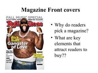
1. Magazine Front covers
• Why do readers
pick a magazine?
• What are key
elements that
attract readers to
buy??
2. Key Elements on a cover
• Masthead, behind main
image.
• Extras
Price, small
Main Image and
Subject matter.
Side story
3. Masthead
• Masthead
This is the “brand of the magazine and
uses the same font and design each
time so readers look for that
particular “brand”
It is large so that the readers can quickly
see it at a glance when skimming
the mags. STANDS OUT
The readers can instantly recognise the
magazine label…
Often in PINK - a “girlie” colour that
would appeal to younger teens
The name sounds like
a girl’s name and this
fits with the idea of it
being a “friend “ to
you.
The name was tested
on focus groups of
target readers who
liked this name
4. Cover Lines
• Cover lines are the
lines of print on a
page, they can
“tempt” the reader in
by giving you clues
to the content
• Cover lines
Multiple stories to
appeal to massive
target audience.
Use a variety of
FONTS and Sizes
of type. This gives
it a relaxed, well
put-together feel
Use of yellow ,
red and white
Main Cover line is
largest font,
features a singer
that would appeal
to the age group
6. Main Image
Main Image
Use of image that
would appeal to
teens. Large
picture surrounded
by cover lines
placed over the
image.
Note how he is
looking directly at
you! INTO
YOURS SOUL!
7. The cover is the key to
getting an audience
Masthead, contrast
Cover lines, mass appeal
stories to increase target
range. 7/10 have cover
lines on edges.
Price, small for no
reason. 9/10 have
small price.
Main Image,
Medium Long
shot, appeal to
teen audience.
8/10 other Music
magazines feature
this same shot
type.
Cover lines