SlideShare uma empresa Scribd logo
1 de 5
Baixar para ler offline
Pie chart
Simple share
of total
Stacked 100%
area chart
Only relative
differences matter
Stacked area chart
Relative and absolute
differences matter
Stacked 100%
bar chart
Only relative
differences matter
Stacked
bar chart
Relative and absolute
differences matter
Few periods Many periods
Changing
over time
Static
Variable width
chart
Two variables
per item
Table or tables with
embedded charts
Many
categories
Bar chart horizontal Circular area chart
Cyclical data
Line chart
Many categories
Many periodsFew categories Few periods
Over timeOne variable per item
Among items
Line chart
Non-cyclical data
Source: ©A. Abela, 2010. www.ExtremePresentation.com
Two
variables
Three
variables
Scatter plot
bubble size
Two
variables
Single
variable
Few data
points
Bar histogram
Many data
points
Line histogram
Visualizations
Comparison
Composition
Relationship Distribution
What would you
like to show?
Scatter plot
Scatter plot
Bar chart vertical Bar chart vertical
Single or few categories
Waterfall chart
Accumulation or
subtraction to total
Stacked 100% bar chart
w/subcomponents
Components of
components
Tree map
Accumulation to
total & absolute
difference matters
Comparison Visualizations
Comparison charts are used to compare the magnitude of values to each other and can be used to easily
find the lowest and highest values in the data. It can also be used to compare current values versus old
to see if the values are increasing or decreasing. Common questions are “what products sells best”
and “how are our sales compared to last year”.
Variable width
chart
Two variables
per item
Table or tables with
embedded charts
Many
categories
Bar chart horizontal Circular area chart
Cyclical data
Line chart
Many categories
Many periodsFew categories Few periods
Over timeOne variable per item
Among items
Line chart
Non-cyclical data
Comparison
Bar chart vertical Bar chart vertical
Single or few categories
Composition Visualizations
Composition charts are used to see how a part compares to the whole and how a total value can be
divided into shares. A composition charts shows the relative value, but some charts can also be used
to show the absolute difference. The difference is between looking at percentage of total and value
of total. Commons questions are “how big part of the market to we have in a region” or
“what areas is our budget divided into”.
Composition
Pie chart
Simple share
of total
Stacked 100%
area chart
Only relative
differences matter
Stacked area chart
Relative and absolute
differences matter
Stacked 100%
bar chart
Only relative
differences matter
Stacked
bar chart
Relative and absolute
differences matter
Few periods Many periods
Changing
over time
Static
Waterfall chart
Accumulation or
subtraction to total
Stacked 100% bar chart
w/subcomponents
Components of
components
Tree map
Accumulation to
total & absolute
difference matters
Distribution Visualizations
Distribution charts are used to see how quantitative values are distributed along an axis from lowest to
highest. Looking at the shape of the data a user can identify characteristics such as the range of
values, central tendency, shape and outliers. It can be used to answer questions such as
“number of customers per age group” or “how many days late are our payments”.
Distribution
Bar histogram Line histogram Scatter plot
Two
variables
Few data
points
Many data
points
Single
variable
Relationship Visualizations
Relationship charts are used to see the relationship between the data and can be used to find
correlations, outliers and clusters of data. Common questions are “is there a correlation between
advertising spend and sales for our products” or “how does expenses and income vary
per region and what’s the deviation”.
Relationship
Two
variables
Three
variables
Scatter plot
bubble size
Scatter plot

Mais conteúdo relacionado

Mais procurados

Introduction to Data Management
Introduction to Data ManagementIntroduction to Data Management
Introduction to Data ManagementAmanda Whitmire
 
Intro to Data Management Plans
Intro to Data Management PlansIntro to Data Management Plans
Intro to Data Management PlansSarah Jones
 
Data Architecture Best Practices for Advanced Analytics
Data Architecture Best Practices for Advanced AnalyticsData Architecture Best Practices for Advanced Analytics
Data Architecture Best Practices for Advanced AnalyticsDATAVERSITY
 
Databricks on AWS.pptx
Databricks on AWS.pptxDatabricks on AWS.pptx
Databricks on AWS.pptxWasm1953
 
Migrate and Modernize Hadoop-Based Security Policies for Databricks
Migrate and Modernize Hadoop-Based Security Policies for DatabricksMigrate and Modernize Hadoop-Based Security Policies for Databricks
Migrate and Modernize Hadoop-Based Security Policies for DatabricksDatabricks
 
The data quality challenge
The data quality challengeThe data quality challenge
The data quality challengeLenia Miltiadous
 
Exploratory data analysis
Exploratory data analysis Exploratory data analysis
Exploratory data analysis Peter Reimann
 
Best Practices in Metadata Management
Best Practices in Metadata ManagementBest Practices in Metadata Management
Best Practices in Metadata ManagementDATAVERSITY
 
Enterprise Data Architecture Deliverables
Enterprise Data Architecture DeliverablesEnterprise Data Architecture Deliverables
Enterprise Data Architecture DeliverablesLars E Martinsson
 
You Need a Data Catalog. Do You Know Why?
You Need a Data Catalog. Do You Know Why?You Need a Data Catalog. Do You Know Why?
You Need a Data Catalog. Do You Know Why?Precisely
 
Data Visualization
Data VisualizationData Visualization
Data Visualizationgzargary
 
Knowledge Graphs for Supply Chain Operations.pdf
Knowledge Graphs for Supply Chain Operations.pdfKnowledge Graphs for Supply Chain Operations.pdf
Knowledge Graphs for Supply Chain Operations.pdfVaticle
 
GraphTalk Copenhagen - Fraud Detection with Graphs
GraphTalk Copenhagen - Fraud Detection with GraphsGraphTalk Copenhagen - Fraud Detection with Graphs
GraphTalk Copenhagen - Fraud Detection with GraphsNeo4j
 
Principles of data visualisation 2021
Principles of data visualisation 2021Principles of data visualisation 2021
Principles of data visualisation 2021Marié Roux
 
Make Data Work for You
Make Data Work for YouMake Data Work for You
Make Data Work for YouDATAVERSITY
 
Lake Database Database Template Map Data in Azure Synapse Analytics
Lake Database  Database Template  Map Data in Azure Synapse AnalyticsLake Database  Database Template  Map Data in Azure Synapse Analytics
Lake Database Database Template Map Data in Azure Synapse AnalyticsErwin de Kreuk
 
Data management principles
Data management principlesData management principles
Data management principlesFiddy Prasetiya
 
AstraZeneca - Re-imagining the Data Landscape in Compound Synthesis & Management
AstraZeneca - Re-imagining the Data Landscape in Compound Synthesis & ManagementAstraZeneca - Re-imagining the Data Landscape in Compound Synthesis & Management
AstraZeneca - Re-imagining the Data Landscape in Compound Synthesis & ManagementNeo4j
 

Mais procurados (20)

Big data case study collection
Big data   case study collectionBig data   case study collection
Big data case study collection
 
Introduction to Data Management
Introduction to Data ManagementIntroduction to Data Management
Introduction to Data Management
 
Intro to Data Management Plans
Intro to Data Management PlansIntro to Data Management Plans
Intro to Data Management Plans
 
Data Architecture Best Practices for Advanced Analytics
Data Architecture Best Practices for Advanced AnalyticsData Architecture Best Practices for Advanced Analytics
Data Architecture Best Practices for Advanced Analytics
 
Databricks on AWS.pptx
Databricks on AWS.pptxDatabricks on AWS.pptx
Databricks on AWS.pptx
 
Migrate and Modernize Hadoop-Based Security Policies for Databricks
Migrate and Modernize Hadoop-Based Security Policies for DatabricksMigrate and Modernize Hadoop-Based Security Policies for Databricks
Migrate and Modernize Hadoop-Based Security Policies for Databricks
 
The data quality challenge
The data quality challengeThe data quality challenge
The data quality challenge
 
Exploratory data analysis
Exploratory data analysis Exploratory data analysis
Exploratory data analysis
 
Best Practices in Metadata Management
Best Practices in Metadata ManagementBest Practices in Metadata Management
Best Practices in Metadata Management
 
Enterprise Data Architecture Deliverables
Enterprise Data Architecture DeliverablesEnterprise Data Architecture Deliverables
Enterprise Data Architecture Deliverables
 
You Need a Data Catalog. Do You Know Why?
You Need a Data Catalog. Do You Know Why?You Need a Data Catalog. Do You Know Why?
You Need a Data Catalog. Do You Know Why?
 
Data Visualization
Data VisualizationData Visualization
Data Visualization
 
Knowledge Graphs for Supply Chain Operations.pdf
Knowledge Graphs for Supply Chain Operations.pdfKnowledge Graphs for Supply Chain Operations.pdf
Knowledge Graphs for Supply Chain Operations.pdf
 
GraphTalk Copenhagen - Fraud Detection with Graphs
GraphTalk Copenhagen - Fraud Detection with GraphsGraphTalk Copenhagen - Fraud Detection with Graphs
GraphTalk Copenhagen - Fraud Detection with Graphs
 
Principles of data visualisation 2021
Principles of data visualisation 2021Principles of data visualisation 2021
Principles of data visualisation 2021
 
Storytelling with Data
Storytelling with Data Storytelling with Data
Storytelling with Data
 
Make Data Work for You
Make Data Work for YouMake Data Work for You
Make Data Work for You
 
Lake Database Database Template Map Data in Azure Synapse Analytics
Lake Database  Database Template  Map Data in Azure Synapse AnalyticsLake Database  Database Template  Map Data in Azure Synapse Analytics
Lake Database Database Template Map Data in Azure Synapse Analytics
 
Data management principles
Data management principlesData management principles
Data management principles
 
AstraZeneca - Re-imagining the Data Landscape in Compound Synthesis & Management
AstraZeneca - Re-imagining the Data Landscape in Compound Synthesis & ManagementAstraZeneca - Re-imagining the Data Landscape in Compound Synthesis & Management
AstraZeneca - Re-imagining the Data Landscape in Compound Synthesis & Management
 

Destaque

5 Ways to Improve Sales Performance with Analytics
5 Ways to Improve Sales Performance with Analytics5 Ways to Improve Sales Performance with Analytics
5 Ways to Improve Sales Performance with AnalyticsQlik
 
AFS Technologies - Five Shared Attributes of Retail Execution Innovators
AFS Technologies - Five Shared Attributes of Retail Execution InnovatorsAFS Technologies - Five Shared Attributes of Retail Execution Innovators
AFS Technologies - Five Shared Attributes of Retail Execution InnovatorsGlobal Creative Group, Inc
 
[Case Study] Enabling Content Bingeing with LookBookHQ
[Case Study] Enabling Content Bingeing with LookBookHQ[Case Study] Enabling Content Bingeing with LookBookHQ
[Case Study] Enabling Content Bingeing with LookBookHQLookBookHQ
 
Using_LookBook_with_Eloqua
Using_LookBook_with_EloquaUsing_LookBook_with_Eloqua
Using_LookBook_with_EloquaTarek Naim
 
Tech Jobs Reach New Heights in the Mile High City
Tech Jobs Reach New Heights in the Mile High CityTech Jobs Reach New Heights in the Mile High City
Tech Jobs Reach New Heights in the Mile High CityExperts Exchange
 

Destaque (6)

5 Ways to Improve Sales Performance with Analytics
5 Ways to Improve Sales Performance with Analytics5 Ways to Improve Sales Performance with Analytics
5 Ways to Improve Sales Performance with Analytics
 
AFS Technologies - Five Shared Attributes of Retail Execution Innovators
AFS Technologies - Five Shared Attributes of Retail Execution InnovatorsAFS Technologies - Five Shared Attributes of Retail Execution Innovators
AFS Technologies - Five Shared Attributes of Retail Execution Innovators
 
[Case Study] Enabling Content Bingeing with LookBookHQ
[Case Study] Enabling Content Bingeing with LookBookHQ[Case Study] Enabling Content Bingeing with LookBookHQ
[Case Study] Enabling Content Bingeing with LookBookHQ
 
Using_LookBook_with_Eloqua
Using_LookBook_with_EloquaUsing_LookBook_with_Eloqua
Using_LookBook_with_Eloqua
 
AFS Retail Execution Survey
AFS Retail Execution SurveyAFS Retail Execution Survey
AFS Retail Execution Survey
 
Tech Jobs Reach New Heights in the Mile High City
Tech Jobs Reach New Heights in the Mile High CityTech Jobs Reach New Heights in the Mile High City
Tech Jobs Reach New Heights in the Mile High City
 

Semelhante a Dissecting How to Choose the Right Chart

4 Ways to Create an Interactive Data Visualization Story
4 Ways to Create an Interactive Data Visualization Story4 Ways to Create an Interactive Data Visualization Story
4 Ways to Create an Interactive Data Visualization StoryHitech BPO
 
Simple graph types
Simple graph typesSimple graph types
Simple graph typesMahi Syama
 
Types of charts in Excel and How to use them
Types of charts in Excel and How to use themTypes of charts in Excel and How to use them
Types of charts in Excel and How to use themVijay Perepa
 
Các loại biểu đồ trình bày dữ liệu kinh doanh
Các loại biểu đồ trình bày dữ liệu kinh doanhCác loại biểu đồ trình bày dữ liệu kinh doanh
Các loại biểu đồ trình bày dữ liệu kinh doanhChng83
 
Descriptive statistics
Descriptive statisticsDescriptive statistics
Descriptive statisticsSr Edith Bogue
 
Use-of-ICT-in-presentation.pdf
Use-of-ICT-in-presentation.pdfUse-of-ICT-in-presentation.pdf
Use-of-ICT-in-presentation.pdfPratibha Sagar
 
Lecture 2-PPT.pdf
Lecture 2-PPT.pdfLecture 2-PPT.pdf
Lecture 2-PPT.pdfRAJKAMAL282
 
Lecture 2-PPT statistics.pdf
Lecture 2-PPT statistics.pdfLecture 2-PPT statistics.pdf
Lecture 2-PPT statistics.pdfDrSJayashree
 
Introduction to Business analytics unit3
Introduction to Business analytics unit3Introduction to Business analytics unit3
Introduction to Business analytics unit3jayarellirs
 
Assignment 3 charts in excel
Assignment 3 charts in excelAssignment 3 charts in excel
Assignment 3 charts in excelktqwerty
 
Different types of charts
Different types of chartsDifferent types of charts
Different types of chartsZakaria Salim
 
Data Analysis Section
Data Analysis SectionData Analysis Section
Data Analysis Sectionmsrichards
 
How to visualize web analytics data and choose a graph?
How to visualize web analytics data and choose a graph?How to visualize web analytics data and choose a graph?
How to visualize web analytics data and choose a graph?Janvi Arora
 
Common Uses of Textbook Graphics
Common Uses of Textbook GraphicsCommon Uses of Textbook Graphics
Common Uses of Textbook GraphicsProfessor Bauer
 

Semelhante a Dissecting How to Choose the Right Chart (20)

4 Ways to Create an Interactive Data Visualization Story
4 Ways to Create an Interactive Data Visualization Story4 Ways to Create an Interactive Data Visualization Story
4 Ways to Create an Interactive Data Visualization Story
 
Simple graph types
Simple graph typesSimple graph types
Simple graph types
 
Types of charts in Excel and How to use them
Types of charts in Excel and How to use themTypes of charts in Excel and How to use them
Types of charts in Excel and How to use them
 
Graphing
GraphingGraphing
Graphing
 
Charts in excel
Charts in excelCharts in excel
Charts in excel
 
Data mining
Data miningData mining
Data mining
 
Các loại biểu đồ trình bày dữ liệu kinh doanh
Các loại biểu đồ trình bày dữ liệu kinh doanhCác loại biểu đồ trình bày dữ liệu kinh doanh
Các loại biểu đồ trình bày dữ liệu kinh doanh
 
Descriptive statistics
Descriptive statisticsDescriptive statistics
Descriptive statistics
 
Use-of-ICT-in-presentation.pdf
Use-of-ICT-in-presentation.pdfUse-of-ICT-in-presentation.pdf
Use-of-ICT-in-presentation.pdf
 
Computer midterms
Computer midtermsComputer midterms
Computer midterms
 
Graphical Displays of Data
Graphical Displays of DataGraphical Displays of Data
Graphical Displays of Data
 
Lecture 2-PPT.pdf
Lecture 2-PPT.pdfLecture 2-PPT.pdf
Lecture 2-PPT.pdf
 
Lecture 2-PPT statistics.pdf
Lecture 2-PPT statistics.pdfLecture 2-PPT statistics.pdf
Lecture 2-PPT statistics.pdf
 
Introduction to Business analytics unit3
Introduction to Business analytics unit3Introduction to Business analytics unit3
Introduction to Business analytics unit3
 
Assignment 3 charts in excel
Assignment 3 charts in excelAssignment 3 charts in excel
Assignment 3 charts in excel
 
Different types of charts
Different types of chartsDifferent types of charts
Different types of charts
 
Data Analysis Section
Data Analysis SectionData Analysis Section
Data Analysis Section
 
How to visualize web analytics data and choose a graph?
How to visualize web analytics data and choose a graph?How to visualize web analytics data and choose a graph?
How to visualize web analytics data and choose a graph?
 
Common Uses of Textbook Graphics
Common Uses of Textbook GraphicsCommon Uses of Textbook Graphics
Common Uses of Textbook Graphics
 
Bar chart
Bar chartBar chart
Bar chart
 

Último

Generative AI for Social Good at Open Data Science East 2024
Generative AI for Social Good at Open Data Science East 2024Generative AI for Social Good at Open Data Science East 2024
Generative AI for Social Good at Open Data Science East 2024Colleen Farrelly
 
Semantic Shed - Squashing and Squeezing.pptx
Semantic Shed - Squashing and Squeezing.pptxSemantic Shed - Squashing and Squeezing.pptx
Semantic Shed - Squashing and Squeezing.pptxMike Bennett
 
20240419 - Measurecamp Amsterdam - SAM.pdf
20240419 - Measurecamp Amsterdam - SAM.pdf20240419 - Measurecamp Amsterdam - SAM.pdf
20240419 - Measurecamp Amsterdam - SAM.pdfHuman37
 
Heart Disease Classification Report: A Data Analysis Project
Heart Disease Classification Report: A Data Analysis ProjectHeart Disease Classification Report: A Data Analysis Project
Heart Disease Classification Report: A Data Analysis ProjectBoston Institute of Analytics
 
Defining Constituents, Data Vizzes and Telling a Data Story
Defining Constituents, Data Vizzes and Telling a Data StoryDefining Constituents, Data Vizzes and Telling a Data Story
Defining Constituents, Data Vizzes and Telling a Data StoryJeremy Anderson
 
Student profile product demonstration on grades, ability, well-being and mind...
Student profile product demonstration on grades, ability, well-being and mind...Student profile product demonstration on grades, ability, well-being and mind...
Student profile product demonstration on grades, ability, well-being and mind...Seán Kennedy
 
Learn How Data Science Changes Our World
Learn How Data Science Changes Our WorldLearn How Data Science Changes Our World
Learn How Data Science Changes Our WorldEduminds Learning
 
Statistics, Data Analysis, and Decision Modeling, 5th edition by James R. Eva...
Statistics, Data Analysis, and Decision Modeling, 5th edition by James R. Eva...Statistics, Data Analysis, and Decision Modeling, 5th edition by James R. Eva...
Statistics, Data Analysis, and Decision Modeling, 5th edition by James R. Eva...ssuserf63bd7
 
Machine learning classification ppt.ppt
Machine learning classification  ppt.pptMachine learning classification  ppt.ppt
Machine learning classification ppt.pptamreenkhanum0307
 
RadioAdProWritingCinderellabyButleri.pdf
RadioAdProWritingCinderellabyButleri.pdfRadioAdProWritingCinderellabyButleri.pdf
RadioAdProWritingCinderellabyButleri.pdfgstagge
 
Identifying Appropriate Test Statistics Involving Population Mean
Identifying Appropriate Test Statistics Involving Population MeanIdentifying Appropriate Test Statistics Involving Population Mean
Identifying Appropriate Test Statistics Involving Population MeanMYRABACSAFRA2
 
Multiple time frame trading analysis -brianshannon.pdf
Multiple time frame trading analysis -brianshannon.pdfMultiple time frame trading analysis -brianshannon.pdf
Multiple time frame trading analysis -brianshannon.pdfchwongval
 
INTERNSHIP ON PURBASHA COMPOSITE TEX LTD
INTERNSHIP ON PURBASHA COMPOSITE TEX LTDINTERNSHIP ON PURBASHA COMPOSITE TEX LTD
INTERNSHIP ON PURBASHA COMPOSITE TEX LTDRafezzaman
 
9711147426✨Call In girls Gurgaon Sector 31. SCO 25 escort service
9711147426✨Call In girls Gurgaon Sector 31. SCO 25 escort service9711147426✨Call In girls Gurgaon Sector 31. SCO 25 escort service
9711147426✨Call In girls Gurgaon Sector 31. SCO 25 escort servicejennyeacort
 
Student Profile Sample report on improving academic performance by uniting gr...
Student Profile Sample report on improving academic performance by uniting gr...Student Profile Sample report on improving academic performance by uniting gr...
Student Profile Sample report on improving academic performance by uniting gr...Seán Kennedy
 
PKS-TGC-1084-630 - Stage 1 Proposal.pptx
PKS-TGC-1084-630 - Stage 1 Proposal.pptxPKS-TGC-1084-630 - Stage 1 Proposal.pptx
PKS-TGC-1084-630 - Stage 1 Proposal.pptxPramod Kumar Srivastava
 
GA4 Without Cookies [Measure Camp AMS]
GA4 Without Cookies [Measure Camp AMS]GA4 Without Cookies [Measure Camp AMS]
GA4 Without Cookies [Measure Camp AMS]📊 Markus Baersch
 
NLP Data Science Project Presentation:Predicting Heart Disease with NLP Data ...
NLP Data Science Project Presentation:Predicting Heart Disease with NLP Data ...NLP Data Science Project Presentation:Predicting Heart Disease with NLP Data ...
NLP Data Science Project Presentation:Predicting Heart Disease with NLP Data ...Boston Institute of Analytics
 
专业一比一美国俄亥俄大学毕业证成绩单pdf电子版制作修改
专业一比一美国俄亥俄大学毕业证成绩单pdf电子版制作修改专业一比一美国俄亥俄大学毕业证成绩单pdf电子版制作修改
专业一比一美国俄亥俄大学毕业证成绩单pdf电子版制作修改yuu sss
 
DBA Basics: Getting Started with Performance Tuning.pdf
DBA Basics: Getting Started with Performance Tuning.pdfDBA Basics: Getting Started with Performance Tuning.pdf
DBA Basics: Getting Started with Performance Tuning.pdfJohn Sterrett
 

Último (20)

Generative AI for Social Good at Open Data Science East 2024
Generative AI for Social Good at Open Data Science East 2024Generative AI for Social Good at Open Data Science East 2024
Generative AI for Social Good at Open Data Science East 2024
 
Semantic Shed - Squashing and Squeezing.pptx
Semantic Shed - Squashing and Squeezing.pptxSemantic Shed - Squashing and Squeezing.pptx
Semantic Shed - Squashing and Squeezing.pptx
 
20240419 - Measurecamp Amsterdam - SAM.pdf
20240419 - Measurecamp Amsterdam - SAM.pdf20240419 - Measurecamp Amsterdam - SAM.pdf
20240419 - Measurecamp Amsterdam - SAM.pdf
 
Heart Disease Classification Report: A Data Analysis Project
Heart Disease Classification Report: A Data Analysis ProjectHeart Disease Classification Report: A Data Analysis Project
Heart Disease Classification Report: A Data Analysis Project
 
Defining Constituents, Data Vizzes and Telling a Data Story
Defining Constituents, Data Vizzes and Telling a Data StoryDefining Constituents, Data Vizzes and Telling a Data Story
Defining Constituents, Data Vizzes and Telling a Data Story
 
Student profile product demonstration on grades, ability, well-being and mind...
Student profile product demonstration on grades, ability, well-being and mind...Student profile product demonstration on grades, ability, well-being and mind...
Student profile product demonstration on grades, ability, well-being and mind...
 
Learn How Data Science Changes Our World
Learn How Data Science Changes Our WorldLearn How Data Science Changes Our World
Learn How Data Science Changes Our World
 
Statistics, Data Analysis, and Decision Modeling, 5th edition by James R. Eva...
Statistics, Data Analysis, and Decision Modeling, 5th edition by James R. Eva...Statistics, Data Analysis, and Decision Modeling, 5th edition by James R. Eva...
Statistics, Data Analysis, and Decision Modeling, 5th edition by James R. Eva...
 
Machine learning classification ppt.ppt
Machine learning classification  ppt.pptMachine learning classification  ppt.ppt
Machine learning classification ppt.ppt
 
RadioAdProWritingCinderellabyButleri.pdf
RadioAdProWritingCinderellabyButleri.pdfRadioAdProWritingCinderellabyButleri.pdf
RadioAdProWritingCinderellabyButleri.pdf
 
Identifying Appropriate Test Statistics Involving Population Mean
Identifying Appropriate Test Statistics Involving Population MeanIdentifying Appropriate Test Statistics Involving Population Mean
Identifying Appropriate Test Statistics Involving Population Mean
 
Multiple time frame trading analysis -brianshannon.pdf
Multiple time frame trading analysis -brianshannon.pdfMultiple time frame trading analysis -brianshannon.pdf
Multiple time frame trading analysis -brianshannon.pdf
 
INTERNSHIP ON PURBASHA COMPOSITE TEX LTD
INTERNSHIP ON PURBASHA COMPOSITE TEX LTDINTERNSHIP ON PURBASHA COMPOSITE TEX LTD
INTERNSHIP ON PURBASHA COMPOSITE TEX LTD
 
9711147426✨Call In girls Gurgaon Sector 31. SCO 25 escort service
9711147426✨Call In girls Gurgaon Sector 31. SCO 25 escort service9711147426✨Call In girls Gurgaon Sector 31. SCO 25 escort service
9711147426✨Call In girls Gurgaon Sector 31. SCO 25 escort service
 
Student Profile Sample report on improving academic performance by uniting gr...
Student Profile Sample report on improving academic performance by uniting gr...Student Profile Sample report on improving academic performance by uniting gr...
Student Profile Sample report on improving academic performance by uniting gr...
 
PKS-TGC-1084-630 - Stage 1 Proposal.pptx
PKS-TGC-1084-630 - Stage 1 Proposal.pptxPKS-TGC-1084-630 - Stage 1 Proposal.pptx
PKS-TGC-1084-630 - Stage 1 Proposal.pptx
 
GA4 Without Cookies [Measure Camp AMS]
GA4 Without Cookies [Measure Camp AMS]GA4 Without Cookies [Measure Camp AMS]
GA4 Without Cookies [Measure Camp AMS]
 
NLP Data Science Project Presentation:Predicting Heart Disease with NLP Data ...
NLP Data Science Project Presentation:Predicting Heart Disease with NLP Data ...NLP Data Science Project Presentation:Predicting Heart Disease with NLP Data ...
NLP Data Science Project Presentation:Predicting Heart Disease with NLP Data ...
 
专业一比一美国俄亥俄大学毕业证成绩单pdf电子版制作修改
专业一比一美国俄亥俄大学毕业证成绩单pdf电子版制作修改专业一比一美国俄亥俄大学毕业证成绩单pdf电子版制作修改
专业一比一美国俄亥俄大学毕业证成绩单pdf电子版制作修改
 
DBA Basics: Getting Started with Performance Tuning.pdf
DBA Basics: Getting Started with Performance Tuning.pdfDBA Basics: Getting Started with Performance Tuning.pdf
DBA Basics: Getting Started with Performance Tuning.pdf
 

Dissecting How to Choose the Right Chart

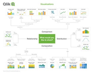
  • 1. Pie chart Simple share of total Stacked 100% area chart Only relative differences matter Stacked area chart Relative and absolute differences matter Stacked 100% bar chart Only relative differences matter Stacked bar chart Relative and absolute differences matter Few periods Many periods Changing over time Static Variable width chart Two variables per item Table or tables with embedded charts Many categories Bar chart horizontal Circular area chart Cyclical data Line chart Many categories Many periodsFew categories Few periods Over timeOne variable per item Among items Line chart Non-cyclical data Source: ©A. Abela, 2010. www.ExtremePresentation.com Two variables Three variables Scatter plot bubble size Two variables Single variable Few data points Bar histogram Many data points Line histogram Visualizations Comparison Composition Relationship Distribution What would you like to show? Scatter plot Scatter plot Bar chart vertical Bar chart vertical Single or few categories Waterfall chart Accumulation or subtraction to total Stacked 100% bar chart w/subcomponents Components of components Tree map Accumulation to total & absolute difference matters
  • 2. Comparison Visualizations Comparison charts are used to compare the magnitude of values to each other and can be used to easily find the lowest and highest values in the data. It can also be used to compare current values versus old to see if the values are increasing or decreasing. Common questions are “what products sells best” and “how are our sales compared to last year”. Variable width chart Two variables per item Table or tables with embedded charts Many categories Bar chart horizontal Circular area chart Cyclical data Line chart Many categories Many periodsFew categories Few periods Over timeOne variable per item Among items Line chart Non-cyclical data Comparison Bar chart vertical Bar chart vertical Single or few categories
  • 3. Composition Visualizations Composition charts are used to see how a part compares to the whole and how a total value can be divided into shares. A composition charts shows the relative value, but some charts can also be used to show the absolute difference. The difference is between looking at percentage of total and value of total. Commons questions are “how big part of the market to we have in a region” or “what areas is our budget divided into”. Composition Pie chart Simple share of total Stacked 100% area chart Only relative differences matter Stacked area chart Relative and absolute differences matter Stacked 100% bar chart Only relative differences matter Stacked bar chart Relative and absolute differences matter Few periods Many periods Changing over time Static Waterfall chart Accumulation or subtraction to total Stacked 100% bar chart w/subcomponents Components of components Tree map Accumulation to total & absolute difference matters
  • 4. Distribution Visualizations Distribution charts are used to see how quantitative values are distributed along an axis from lowest to highest. Looking at the shape of the data a user can identify characteristics such as the range of values, central tendency, shape and outliers. It can be used to answer questions such as “number of customers per age group” or “how many days late are our payments”. Distribution Bar histogram Line histogram Scatter plot Two variables Few data points Many data points Single variable
  • 5. Relationship Visualizations Relationship charts are used to see the relationship between the data and can be used to find correlations, outliers and clusters of data. Common questions are “is there a correlation between advertising spend and sales for our products” or “how does expenses and income vary per region and what’s the deviation”. Relationship Two variables Three variables Scatter plot bubble size Scatter plot