This document summarizes key design elements from a TV listings magazine that the author plans to emulate in their own listings magazine. These include:
1) Placing the magazine logo and date in coordinated colors at the top of each page to establish house style and help readers know what programs air on different days.
2) Including a banner down the side of each page with the day of the week in the corresponding color to further reinforce the house style.
3) Featuring a larger "Today's Choice" column to draw attention to highlighted programs, potentially using a different background color.
4) Organizing the double page spread layout logically and aesthetically with alignment of dates, days, and featured
Call Girls Sultanpur Just Call 📞 8617370543 Top Class Call Girl Service Avail...
TV listings magazine analysis 1 (redone)
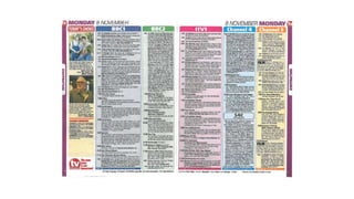
1.
2. At the top of the page there is the date and the logo of the magazine’s
company. This is necessary for the reader so they know what programmes are
on certain days. The days are colour co-ordinated, with a different colour each
day. The logo gives a sense of house style and brand identity. In my listings
magazine, I will create a logo to put on the corner of each page. I will also put
the date on each page of the double page spread, mirroring them to the
middle of the spread like this magazine has done.
Date on the top of the page
3. • At the side of the page there is a banner running down the edge with
the day of the week and the co-ordinating colour for that day, in this
case a dark purple for Monday, the same colour that is at the top of
the page. This gives each day of the week a house style. I am going to
emulate this in my listings magazine.
Date along the side of the page
4. • On the left of the double page spread there is a ‘Today’s choice’
coloumn, which is smaller here than I plan to have on my listings
magazine. It helps to draw focus to the featured programmes, as it is
a different colour to the rest of the double page spread. In my
magazine I will have a larger features part to advertise my
documentary, but I may use this magazine’s method of changing the
background colour of the features coloumn.
Daily feature
5. • The layout of the double page spread is logically placed; everything is lined
up and aesthetically pleasing to the eye. The day is lined up with the daily
feature but also the date, which is something I plan to do in my listings
magazine.
Organisation
6. Main article
This magazine has very colourful
coloumns for each channel,
differentiating each channel from the
others. However, this distracts readers
from the daily feature, which is not my
aim for my magazine, therefore I will not
make the rest of my magazine as
colourful as this one.
7. Page numbers
Page numbers are a common convention of magazines. This TV
listings magazine follows this conventions with small white numbers
at the bottom of the page. I plan to include page numbers on my own
magazine.