Elegant Simplicity: Bridging the gap between the writer and the reader
•Transferir como PPTX, PDF•
1 gostou•1,334 visualizações

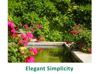
Good writing is simple and elegant - like a well-designed garden. It invites readers to enter, to follow the story, to explore the ideas.

Recomendados
Mais conteúdo relacionado
Semelhante a Elegant Simplicity: Bridging the gap between the writer and the reader
Semelhante a Elegant Simplicity: Bridging the gap between the writer and the reader (20)
Mais de Penny McKinlay
Mais de Penny McKinlay (8)
Último
Último (20)
Elegant Simplicity: Bridging the gap between the writer and the reader
- 2. bridging the gap between the writer and the reader
- 3. Penny McKinlay Communication, Research, Analysis Saskatoon, SK, Canada penny@axonsoft.com http://www.pennymckinlay.axonsoft.com www.wanderlustandwords.blogspot.com
- 4. You wrote it . . . . . . but is anyone reading it?
- 5. Text doesn’t exist in isolation. It is part of a page or a computer screen. The way the words are organized on the page affects the way they are perceived.
- 6. Effective writing is simple and elegant – like a well-designed garden.
- 7. It invites readers to enter, to follow the story, to explore the ideas.
- 8. Here are three key tools for increasing readability:
- 9. #1 Start a conversation with the reader. Invite them to start reading.
- 10. #2 Eliminate the clutter. Make it easy for readers to follow the flow of your story.
- 11. #3 Highlight the most important information. Encourage readers to pause and consider.
- 12. #1 Start a conversation with the reader
- 14. Subject lines
- 18. That’s what I’m looking for
- 22. Questions
- 23. Quotes
- 24. Images of people’s faces – especially their eyes
- 25. What’s on YOUR travel life list?
- 27. “faces grab attention, are recognized quickly, and bypass the usual brain interpreting channels”
- 28. Here are two versions of a slide. The second one does a better job of connecting with its audience.
- 31. #2 Eliminate the clutter
- 32. There is way too much “stuff” in this tiny patio garden.
- 33. Time to clear away some of the clutter.
- 35. PowerPoint presentations are visual - like movies or comics.
- 36. Boring!
- 37. Politically incorrect – maybe. But very effective.
- 39. “We'll be working with the UK. The UK are already rolling out the biometrics. What we'll be endeavouring to do is to supplement and value add to that framework that's already in place, those technologies, so that we're not replicating or duplicating them.”Robert McClelland, Australian federal Attorney General (weaselwords.com.au)
- 40. “A solitary crow on a bare branch – autumn evening” Basho
- 41. Eliminate unnecessary visual effects.
- 42. So much information – charts, numbers, images, colours. But what is important?
- 43. Reducing ideas to their essential elements highlights the key information.
- 44. Uncluttered charts are easier to read.
- 45. Too many bright colours makes it hard to read the data and nothing stands out.
- 46. “Empty space can be dynamic and active through careful placement of positive elements.”
- 48. #3 Highlight the most important information
- 50. Side bars
- 51. Call-out boxes
- 60. Mexico City Unmasked: 20 Insider Tips
- 66. Credits Slide 14 – Spacing magazine, national issue, Spring 2011 Slide 15 – The Idiot and the Odyssey, Joel Stratte-McLure (Kindle version) Slide 16 – Content Rules, Ann Handley (Kindle version) Slide 17 – Fast Company email newsletter Slides 18, 53 – The Oprah Magazine, May 2011 Slides 20, 21, 50 – Travel + Leisure magazine, 2010 Slide 22 - Susan Weinschenk, 100 Things You Should Know About People: #92, http://www.whatmakesthemclick.net/2011/03/27/100-things-you-should-know-about-people-92-there-is-a-brain-area-dedicated-to-perceiving-faces/ Slides 22, 46, 54 – Budget Travel magazine, April 2010 Slides 24, 25, 31, 32, 37, 38, 42, 59 –http://www.slideshare.net/garr/sample-slides-by-garr-reynolds Slide 30 – iStockphoto
- 67. Credits, cont. Slides 39, 40 – Graph Design IQ Test, Stephen Few, www.perceptualedge.com Slide 41 – Garr Reynolds, Presentation Zen Design Slide 45 – Casa Batlló Visual Guide, DosdeArteEdiciones Slide 47 – Wanderlust magazine, November 2010 Slide 49 – Afar magazine, May/June 2011 Slides 52, 57, 58 – online software documentation, Axon Development Corporation Slide 56 –http://www.andyrutledge.com/gestalt-principles-3.php Unless otherwise noted, all photographs were taken by Penny McKinlay in Spain.
Notas do Editor
- Simplicity – reduce ideas to their bare essential elementsSignalvs Noise Ratio – avoid cluttering up your presentation with irrelevant information or graphicsContrast – use contrast to emphasize the most important elements
- Which graph is easier to look at?Correct Answer – Graph BBright colors are great for making important things stand out, but when they’re overused nothing stands out and it becomes more difficult to focus on the data.
- Which of these two tables is easier to read?Correct Answer – Bottom TableThe grid, fill colors, unnecessary precision, and redundant use of the dollar signs in the top table all distract from the data and make it unnecessarily difficult to read and compare values.
- Here’s another slide illustrating the same principles.In addition to Simplicity, Signal vs Noise, Contrast