
Recomendados
Mais conteúdo relacionado
Mais procurados
Mais procurados (19)
Semelhante a Q7 eval
Semelhante a Q7 eval (20)
Último
Último (20)
Q7 eval
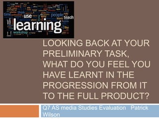
- 1. LOOKING BACK AT YOUR PRELIMINARY TASK, WHAT DO YOU FEEL YOU HAVE LEARNT IN THE PROGRESSION FROM IT TO THE FULL PRODUCT? Q7 AS media Studies Evaluation Patrick Wilson
- 2. During the Beginning When we first started, I had no idea what Photoshop even was. I had never heard of it and was not educated on how to edit an image. So when we were given the task of creating a college magazine for our college. I started with the camera shots, even though I had no idea what to do. I had not learnt about the camera quality tricks so the images I snapped weren’t the greatest. The pages I produced were of a low standard to be honest, I had block colours for the eyes on my model, which made the eyes look very bad. They were over- edited badly and the text wasn’t set to a specific house style. The contents page was no better as the colours I used were not persistent through out (e.g. Yellow boxes). What I learnt from this though was that I had to be more selective with my editing as to not ruin the image. I also learnt that I had to try and use images to make sure that the contents has a feeling of synergy between it and the front cover
- 3. Selection of my genre Some Conventions: Masthead – ¼ of page Colors – black/blue/white/red Limited online resources Puff are rare Banners are rare Single model images Genre reps are traditional Studio, inside, buildings, workshops, bars are some locations Formal Clothing Both sexes to be represented After the preliminary task, we were given the selection of the genre for our main project. After we made this choice, we would have to develop our skills during the project. I decided to select Jazz as I was already aware of a few jazz artists and I had covered the Jazz industry in the past during another subject. I had to decide on which conventions were priority and which of them weren’t. In the end I decided to keep to the conventions to a certain extent. I also had to compare the conventions with those from the age group I have specified to work on, which is 16-25.
- 4. Two categories I had to work on were: To fully complete my magazine to the best of my ability, I had to: - Make sure that I do not over-edit my images. - Learn how to correctly use layers. - Analyse existing magazine covers for inspiration and ideas which have already been successful. - Use different cropping abilities and such to give the ability of different backgrounds to the images. To insure I took the best photos, I had to: - Be able to use lighting effects to improve the light distribution on my models - Use camera angles to give certain effects on the image. - Use different locations to add variety to the images. - Different costumes to portray different characters in the images. Photoshop skills: Camera ability:
- 5. Researching the T.A. When I first started, I had no idea which ways I could learn about my T.A. So I first tried to learn about my T.A. by giving them a list of potential mastheads and fonts for the masthead. After so long, I found that I could use questionnaires to list examples of features on my magazines to gain more feedback. The feedback I got was very useful and helped me decide on a house style, colour scheme, which photos should be used and other ways as well. After researching my T.A. I decided to try and expand my T.A. by having my content suitable for people aged 16-25 while not specifying on a certain group of individuals in this age group. I tried to make my content as varied as possible allowing the biggest possible T.A. for my magazine.
- 6. Research and How it Helped To make sure that my magazine was the best it could possibly be, I looked at existing magazines in my genre to see what content I had to match. Although I am only brand new to magazine making. I am still capable of allowing myself to do the best I possibly can. I studied 4 front covers, 3 contents pages and 3 double page spreads. This gave me plenty of content to analyse to do the best of my ability. Out of these pages in which I analysed, I found out that there are some content which doesn’t work and there are some which does. It all depended on how it was displayed. I also noticed that majority of the content was targeted at an older audience. This allowed me to decide that although I had to stick some conventions, I had to ‘break the mould’. This is because my content would be for a younger audience, so whereas most of the magazines used relaxed colours like dark blue or green, I had to try and use light blue for example to inject some energy into my magazine.
- 7. Digital technology learning List of technology used; - Photoshop - Prezi - Slidely - Flikr - YouTube - Blogger - Screen Recording -More as well! For every type of technology I have learnt to use, I have opened up new possibilities. I found Photoshop to be quite tough to use at first, but after a while, I got used to it am now fairly capable on Photoshop. Prezi is so useful as it is basically a buffed up version of PowerPoint which is available online. This software is good because it offers different takes on a Presentation, while still being able to stick to basic features like having malable text and images being able to be placed. Flikr was also very useful as I was able to upload images in which I had taken and people could tell me which ones are the best ones for me to use for my magazine and which ones I shouldn’t.
- 8. Drafts and how I implemented them I decided to go and construct some drafts for my pages. I decided to do this because it is easier to keep to a plan when you are designing something. It also helps you see how the project has developed over time. In the end I found the drafts to be very useful, not only that but the draft of the my DPS I kept to a precise level. My front cover draft I kept to fairly well, with a few alterations here and there. But the main draft in which was changed the most was my contents page draft. This draft I kept to fairly well, and produced a double page contents page. I then decided that I could put all the content onto a single page. After I changed it, it looked a lot better, and I did keep some factors of the plan which includes the Highlighting of a main feature.
- 9. Final Pages and how I achieved them My final pages were created through the stages of my research of existing pages and the target audience’s preference. I chose this as the colours blue and grey being included. This was collected by my research on existing magazines. My target audience preferences made me include the colour green as green is a colour which was recommended. I decided to use the photos which are displayed on the pages because they were displayed on a questionnaire with others and my target audience chose these ones as the best ones.