
Recomendados
Mais conteúdo relacionado
Semelhante a Usability test reveals product page and search issues
Semelhante a Usability test reveals product page and search issues (20)
Último
Último (20)
Usability test reveals product page and search issues
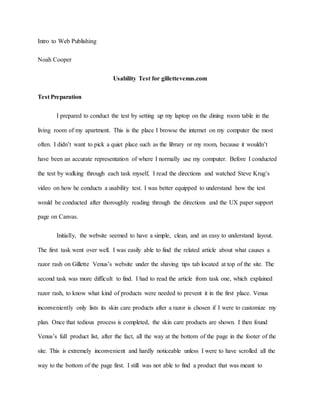
- 1. Intro to Web Publishing Noah Cooper Usability Test for gillettevenus.com Test Preparation I prepared to conduct the test by setting up my laptop on the dining room table in the living room of my apartment. This is the place I browse the internet on my computer the most often. I didn’t want to pick a quiet place such as the library or my room, because it wouldn’t have been an accurate representation of where I normally use my computer. Before I conducted the test by walking through each task myself, I read the directions and watched Steve Krug’s video on how he conducts a usability test. I was better equipped to understand how the test would be conducted after thoroughly reading through the directions and the UX paper support page on Canvas. Initially, the website seemed to have a simple, clean, and an easy to understand layout. The first task went over well. I was easily able to find the related article about what causes a razor rash on Gillette Venus’s website under the shaving tips tab located at top of the site. The second task was more difficult to find. I had to read the article from task one, which explained razor rash, to know what kind of products were needed to prevent it in the first place. Venus inconveniently only lists its skin care products after a razor is chosen if I were to customize my plan. Once that tedious process is completed, the skin care products are shown. I then found Venus’s full product list, after the fact, all the way at the bottom of the page in the footer of the site. This is extremely inconvenient and hardly noticeable unless I were to have scrolled all the way to the bottom of the page first. I still was not able to find a product that was meant to
- 2. prevent razor rash on their actual products page. Gillette’s PURE shaving cream might be my best bet, as it helps against irritation, but I couldn’t find the clear cut prevention product that I was looking for. Venus also recommends choosing an exfoliator before shaving and a moisturizing lotion after. However, both the Olay Pore Detox, which exfoliates the skin, and the body lotion products offered on Venus to help moisturize the skin are currently sold out. I knew this would likely create a major problem for both the participants of my usability test and for actual site visitors who might be searching for these products. The third task was even harder to find than the first two. Gifting a product also requires the consumer to scroll all the way down to the bottom of the page. It was already apartment to me that hardly anyone would look there in the first place. The total cost was quite easy to determine. The final task was easy to complete, but left me with a couple questions. I believe the recipient of the gift would be notified via email, because the site has the option to include an email, but it doesn’t clearly define if the recipient would be notified via email or not. I also assumed the blank text box under the email box would be where I could leave a note for the recipient, but the site doesn’t clearly mention if that is the case. It also doesn’t say if the recipient will receive the note with each shipment. Choosing Participants Tester Comparison Summary Chart Tester 1 (Christina) Tester 2 (Jet) Gender Female Male Age 34 20 Hours browsing / week 14 32 Browsing habits Often browses Facebook on her phone. Uses iPad to browse the internet with her son. Buys products from Amazon most often when shopping. Does a lot of social media browsing on his phone. Mostly uses his laptop for school related internet browsing. Spends the least time shopping online. Other observations Doesn’t seemto spend a lot of time on the internet in general each week. Spends a majority of his time on the internet gaming on his computer.
- 3. Tester 1 Details My first tester was one of my fiancé’s older cousins, Christina. I thought she would make a reasonable tester, because she’s a woman in her mid-30’s, making her seem like a reasonable visitor of gillettevenus.com. She isn’t familiar with this site specifically, but owns a massage business and has experience using similar personal grooming sites to purchase products. Aside from working a full-time job, Christina has a two-year-old son, so she doesn’t use the internet that often each week due to spending an abundance of time caring for her son after work. Environment for Tester 1 Location of test The test was conducted on the dining room table in her apartment. This location was chosen, because it was already a place she would normally browse the internet on her laptop. Physical Environment The lighting in the room was bright, since the dining room light was on overhead. She turned on the light immediately when we arrived in the dining room. Christina also had some extended family members over at the time of the test. She said it would be normal for both her son and other family members to be around, since it was the weekend. I didn’t want to have her move to a quieter location, because she said she regularly browses the internet on her computer in her living or dining room on a regular basis. Technical Environment
- 4. Christina used her personal Wi-Fi and computer to conduct the test. Without hesitation, she opened Firefox when prompted to open a browser. She completed the entire test using this web browser. Tester 2 Details My second tester was another one of my fiancés cousins, Jet. He is a 20-year-old male college student. I wanted to have a stark contrast in my testers, so I used asked two people who varied in age, gender, personality, and internet experience. I thought Jet would make a make for a reasonable tester, because he isn’t familiar with gillettevenus.com specifically, but could use the site at some point in the future to buy products for his girlfriend. Jet has little experience on personal grooming product sites, but often uses the internet to play games such as Call of Duty and Fortnite. He spends roughly a couple hours each day browsing social media. Location of test The test was conducted in the dining room at Jet’s parent’s house. He chose this location, because he browses the internet on his laptop here most often. Jet said he normally uses social media or plays video games in his room, but when using a computer he would normally be in the living or dining room, since he doesn’t have a desk or table in his room. Physical Environment The dining room light and a corner lamp was on, so lighting did not present issue for this test. Two of Jet’s younger siblings were home while we conducted the test, but he was never bothered. Overall, the environment was quiet for the duration of the test. Technical Environment
- 5. Jet performed the test on his personal laptop using his parent’s Wi-Fi connection. After I instructed him to go to gillettevenus.com, he opened Google Chrome. He completed the entire test on the same web browser. Test Results Initial Site Thoughts Tester 1: On first impression, Christina said the site looked minimal and not too cluttered. She thought the bright smiles seemed inviting. She also mentioned the models in the pictures had smooth skin, which seemed good to include on a razor website. Finally, Christina said that she noticed the site was really blue, which reminded her of water, and felt inviting. Tester 2: Jet’s first impression of the site was that there were refreshing visuals. He said the girls in the images seemed really happy. He said it was clear to him that you could buy shaving products. Finally, he said it seemed like it would be relatively easy to navigate, and didn’t seem too complex to use. Similarities and Differences: Both testers had similar first impressions of gillettevenus.com. The first thing that caught both of their eyes were the images of the models. They both mentioned the site seemed like it would be easy to find shaving products or razors. One main difference between the two testers, was Christina mentioning the color of the site that was most prevalent. Task 1: Determine whether there is any information available at Gillettevenus.com that explains what razor rash is and how to prevent it. You want to learn details here, not just superficial information. Summary of Both Testers:
- 6. Tester 1 Tester 2 Average Average Satisfaction 4 4 4 Success Rate 100% 100% 100% Tester 1 Task Completion Process This task took roughly one and a half minutes for Christina to complete. First, she went clicked on the “Customize Your Plan” tab at the top of the site before doing any scrolling. After quickly realizing she wouldn’t find any information on this page, she backed out and found the information she was looking for in “Shaving Tips” under the “Help” tab. Christina mentioned after the fact that she didn’t notice a search bar until later, and likely would have used that to help her complete this task if she saw it earlier. Throughout the whole process, she did no scrolling on the home page to find the information about razor burn, and solely used the navigation bar on the header of the site to find to complete the task. Tester 2 Task Completion Process This task took slightly over one minute for Jet to complete. Unlike Christina, he read some of the information on the home page before using the navigation bar at the top of the site. He read through roughly one-third of the information on the home page. When using the navigation bar, he first clicked on the “Customize Your Plan” tab as well. He quickly scrolled through the blade options before moving his cursor back to the navigation bar and utilizing the search tool. Jet typed in “Razor Rash,” but the results listed, he said, were pointless. Jet moved his cursor back to the navigation bar to find “Shaving Tips” under the “Help” tab and arrived upon the article about razor rash prevention.
- 7. Biggest Problem The biggest problem related to this task for my testers was the ineffective search tool in the navigation bar at the top of the site. Both testers either attempted to use the search bar to find more information related to razor rash or mentioned the option was available. Jet was presented with articles unrelated to the question he was looking to answer. Christina also had a similar issue on task two. The following screenshots show an example of both the search tool and the results page showing unrelated articles. Alignment to Heuristic: Consistency and standards The heuristic that best matches the biggest problem for my testers is consistency and standards. My testers were previously most accustomed to a shopping platform like Amazon. They were both used to searching for a topic or product and quickly finding an answer based on their idea of normal platform conventions. Gillettevenus.com did not offer the same easy search option. Instead, the site didn’t produce effective results. Task 2: Determine if Venus has any skin-care products available that can prevent razor rash. What are the products and how much do they cost?
- 8. Summary for Both Testers Tester 1 Tester 2 Average Average Satisfaction 1 2 1.5 Success Rate 0% 0% 0% Tester 1 Task Completion Process It took Christina nearly six minutes before giving up on finding an available product that could help prevent razor rash. She first clicked the “Customize Your Plan” tab and began scrolling through the various blade options. Christina said she picked the “Smooth Sensitive” blade, because the site mentioned it helped users with sensitive skin. Next, she arrived on the accessory page. She read the product descriptions out loud and scrolled through all the accessory products listed, but noted most of them were sold out and none of the descriptions mentioned anything about razor rash. After failing to find an answer she utilized the search tool in the navigation bar and typed in “razor rash products.” Christina then did a quick scroll up and down the page before asking “Why is the only thing on here articles when I searched for products?” Finally, she clicked on the FAQ tab on the navigation bar. After failing to find any mention of products on the FAQ page, she said “This website is useless,” before giving up on attempting to find products that helped to prevent razor rash. Tester 2 Task Completion Process This task proved to be difficult for both testers. It took Jet over five minutes to try and find products available that could help prevent razor rash. Like Christina, Jet immediately moved his cursor to “Customize Your Plan.” After going through the process of selecting a blade, he arrived at the accessory page. However, he noted there were no products available that
- 9. specifically stated they would help prevent razor rash. He began to grow frustrated that completing the question took this much searching. Jet said out loud, “This website sucks, I can’t find any details on here.” Next, he went back to the home page to try search for an answer. He scrolled throughout the page and arrived at the bottom, eventually finding the “Products” tab. “I thought this was just random stuff down here at first,” Jet said. After clicking on the products tab, he scrolled through the options and eventually clicked on the “Shave Cream” option. Jet seemed shocked there was only one product available on this page, and noted the product likely wasn’t what he was supposed to be searching for, but noticed it helped protect against irritation when shaving which he noted was, “Probably good enough.” Biggest Problem The biggest problem for this task was the product descriptions in the plan customizations not mentioning anything regarding protection against razor rash. They instead used descriptions that left both testers still searching for answers. This created confusion and frustration for both testers who likely expected to find a quick and easy answer to the task. Even if a sufficient product was available, many of them were sold out anyway. This allowed for even more frustration between the testers. The screenshot below shows an example of two products. Both of them had vague descriptions with to help out users who aren’t familiar with shaving products. Both products are also sold out. Christina specifically mentioned these products might help prevent razor rash, but said there wasn’t any way to know for sure about the products aside from
- 10. the description given. Alignment to Heuristic: Match between system and the real world The heuristic that best aligns best to the biggest problem is Match between system and the real world. In this heuristic, a the site should use words, descriptions, or phrases familiar to the user shopping on the site. Both testers attempted to navigate through gillettevenus.com to try and find a product to helped prevent razor rash, but weren’t sure if the products they found helped with prevention, because the descriptions weren’t familiar to them without specifically mentioning that the product helped prevent razor rash. A bottle of body lotion or exfoliator in the real world might include a description of what it helps to do or prevent. Gillettevenus.com didn’t show a match between the real world and the website. Task 3: You’ve decided you want to give your friend a one-year Venus subscription including handle, blades, and at least one razor-rash or sensitive-skin related product. Determine the total cost, including tax and shipping. Summary of Both Testers Tester 1 Tester 2 Average Average Satisfaction 2 2 2 Success Rate 100% 100% 100%
- 11. Tester 1 Task Completion Process Christina searched in the “Choose Your Starter Kit” tab to begin her search on this task. After completing each step in the process of choosing a kit, she selected the Olay foaming whip. She said she chose this product, because none of the products that were still available to buy mentioned they would help with sensitive skin, but the foaming whip would probably the one of the best options. After checking out, Christina seemed irritated that she had to make an account before selecting an option to gift the subscription. After making an account, she said the total would be $7.42, but didn’t give an option to gift the subscription. She seemed to become annoyed that the option wasn’t available to her in the checkout window. She went back to the home page, because she said she knew from the previous tasks that typing something in the search bar would have been useless. Upon scrolling all the way down to the bottom she finally found the gifting option. “Why would they put it all the way down here,” she said. She also noticed this was where the products were located from the previous task as well. Christina went through the entire process of selecting a subscription before coming to the conclusion that her total would be $23.32 after selecting the smooth sensitive blade and the Olay foaming whip with shea butter. It took Christina roughly five minutes to find the gifting tab and complete this task. Tester 2 Task Completion Process When beginning this task, Jet went back to the “Customize your plan” tab once again. After clicking through each step again, he went to place an order. The site then directed Jet to make an account. He became frustrated again and said that he, “Shouldn’t need an account to get the shipping cost.” Jet seemed confused when it didn’t allow him to select a gift option from the checkout window. He went back to the home page and found an option for gifting after scrolling to the bottom of the site. “Who even looks there first,” Jet said. Upon clicking on gifting he
- 12. seemed irritated when having to click through the entire process of selecting a blade and subscription package again. He selected the 12 month subscription when prompted, and proceeded to ask, “Why are all the body lotions sold out?” He selected the PURE shaving cream, and noted it was probably the best option they had available. He determined the total cost he would have spent that day to be $26.50. It took Jet roughly six minutes to walk through each step on this task. Biggest Problem The screenshot below shows the footer navigation bar, including the location of where a consumer would go to find available products or gift a subscription. Alignment to Heuristic: Consistency and Standards The heuristic that aligns closest to the biggest problem for both testers was consistency and standards. This heuristic should follow conventional platform methods used to help users find information on similar ecommerce sites. Both testers were used to finding answers quickly in the navigation bar at the top of most websites. Gillettevenus.com inconveniently lists both gifting and products at the bottom of the page, where neither tester looked before spending decent time on the site. The footer is poorly constructed as well, which left both testers thinking useless information was located there.
- 13. Task 4: Determine how your friend will be notified of your gift. Do you have the option to include a gift note? Will that note be sent with each shipment? Summary of Both Testers Tester 1 Tester 2 Average Average Satisfaction 3 5 4 Success Rate 100% 100% 100% Tester 1 Task Completion Process This task was completed the quickest of all four tasks for both testers. Christina completed it in less than one and a half minutes. She first mentioned that her friend would probably be notified in the mail, before scrolling to the bottom of the checkout page on the site and realizing the recipient would be notified via email. She said the site gives the option to include a gift note right under the email text box, but didn’t say if the note will be sent with each shipment or not. Tester 2 Task Completion Process Upon being asked the question for this task, Jet quickly answered that his friend would be notified of the gift via email. His cursor was already placed directly the email text box after completing the third task. Jet said he thought that the blank text box under the email text box would be where he could include a gift note, but said he wasn’t sure since it didn’t say specifically, and was confused on where there were two empty text boxes after the email text box and not just one. It took Jet roughly one minute to complete this task. Biggest Problem
- 14. The biggest problem with this task was that gillettevenus.com didn’t mention if the recipient of the gift would receive an note with each shipment. Both testers were not able to confidently answer that question. The following screenshot depicts two blank text boxes after the email text box, but fails to show consumers if the note will be sent with each shipment. Alignment to Heuristic: Help and documentation The heuristic that best aligns to the biggest problem for this task is help and documentation. Both users were left wondering whether the recipient of the gift would receive a note with each shipment. Simple help in the form of a short description or documentation about what gifting is, how recipients will be notified, and if the recipient will be notified with each shipment could have helped immensely. These inclusions could be easily laid out, and not too cluttered. Final Site Thoughts: How do you feel about your shopping experience at gillettevenus.com? Tester 1: Christina said that her shopping experience on gillettevenus.com was not like she expected it would be. She mentioned how she thought it looked easy to use at the beginning, but that the answers took too long to find. Christina also said she couldn’t find everything she was looking for. She mentioned how useless the search tool was and how the ribbon including products and gifting should have been on the top of the site like a “normal website.” One positive
- 15. she mentioned was that the prices seemed “decent,” but probably wouldn’t shop on the site due to her experience in the test. Tester 2: Jet said his shopping experience could have been better. He mentioned that he didn’t like where the products and the gifting were located. He also noted the “Customize Your Plan” tab could have included more information, and would have worked better if many of the products weren’t sold out. Jet said he won’t ever be using the site again after his experience taking the usability test. Similarities and Differences: Both testers had similar shopping experiences on gillettevenus.com. Their initial impression of the site was similar as well. They both thought the site appeared to be uncluttered, but when it came down to completing the tasks, they struggled and became frustrated to find what they were looking for. Jet even mentioned how the site looked easy to navigate at the beginning, but was actually the complete opposite. The biggest issue for both testers was the gifting and products tab being located in the simple footer at the bottom of the site’s homepage. The main difference between the testers was that Christina seemed to enjoy the pricing aspect of the site, whereas Jet said he likely wouldn’t visit the site again. Recommendations to improve user experience Single Problem Being Fixed The problem I’ll be fixing was the biggest issue both users had when attempting to complete tasks two and three of the usability test. Both users complained about the location of the products and gifting tabs located at the footer. Both testers were unable to find what they were looking for on numerous occasions and kept resorting to the navigation bar at the top of the
- 16. site when the tasks could have been completed much faster if they would have scrolled down to the bottom of the home page of the site at first. Problem Improvement To improve upon this problem, I’d recommend changing the footer of the website to a mini sitemap that would better help users navigate through the site to find what they’re looking for faster and easier. According to UX Movement, a sitemap is collection of all the links from the site on one page (Anthony). I’d be adding a mini sitemap which would include important links needed to find results and answer questions visitors might have. Gillettevenus.com has more of a traditional footer which only includes a short line of eight links. However, the inclusion of a mini site map would allow Venus’s users the ability to find all the products and information they need quicker. The products, account information, tips, and more will all be made available in one tap or click for gillettevenus.com users with a mini site map. The screenshot below shows a before image of the traditional footer on gillettevenus.com. My proposed fix would include distinctive category labels with corresponding links underneath. I would also provide excess spacing between each link, as UX Movement suggests, so users on mobile devices would have enough room to tap on the links (Anthony). The heuristic related closely to my proposed fix would be consistency in standards. It would help gillettevenus.com to follow platform conventions and be consistent with other e-commerce sites. The following Marvel App wireframe layout shows an example of what the mini site map with
- 17. added dropdowns would look like instead of the traditional footer. This recommended improvement indicates how easy it would be for users to navigate through the site and find the information they need quicker and easier. This method is more consistent with other e-commerce sites that allow users to navigate through the site in a simpler way with short, easy to read button options.
- 18. Works Cited Anthony. “Why the Footer Is the New Site Map.” UX Movement , UX Movement, 27 Sept. 2016, uxmovement.com/navigation/why-the-footer-is-the-new-site-map/.