
Recomendados
Mais conteúdo relacionado
Destaque
Mais de Nazish
Mais de Nazish (20)
Último
Último (20)
Analysis of Website Layout Cancer Research UK About us
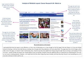
- 1. Logo is present so that you Analysis of Website Layout: Cancer Research UK- About us are aware of the campaign This page also had its own whilst you’re on the tabs across the top, and it website gives its audience/reader a lot more information. It had things like: Who we are/What we do/Fundraise etc. It had very limited writing on what it is. There are tabs Not only does it tell you present along the what they’ve done, it side through which also lets you in on their you can see all the success other things you can do within this campaign This page has a lot of images on it, which makes it look a lot They also have evidence of a fuller and makes it look fun. promotional technique that Also, they have images of they used, and they have included that on this page, to people participating in their events, or doing something for give further information on their campaign. what ‘Cancer Research UK’ actually is. My overall opinion on this layout: I personally think that this layout is very effective, as it has a lot of information on it. Even though on the first page of the tab ‘About us’ it has very limited amount of writing, it still has more tabs that you could go onto, through which they elaborate a lot more about them. This page alone has a lot of images, which adds a lot to the page, as it doesn’t make it look boring. Also, I like the way they have added more things along the right side, by having a sub-heading of ‘Find out more’. I would consider this layout, but I would tweak it a bit, for example I wouldn’t have the additional tabs as it would be too complicating for me to do, as I am new to creating websites. However, I am really fond of all the other things they have included, and how they have chosen to set everything out, as it’s very clear and easy to read as well as use.