![[object Object],[object Object]](data:image/gif;base64,R0lGODlhAQABAIAAAAAAAP///yH5BAEAAAAALAAAAAABAAEAAAIBRAA7)
Recomendados
Mais conteúdo relacionado
Destaque
Semelhante a Tinie tempah website
Semelhante a Tinie tempah website (19)
Mais de MitchElsey
Mais de MitchElsey (18)
Último
Último (20)
Tinie tempah website
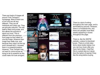
- 1. There are loads of images all around Tinie Tempah’s homepage. Most of them are of him and are all very different. They are all mid/shots and close ups. They are all quite colourful. The site itself is black and purple, and this allows the pictures to stand out more. This is different from the previous front page as they relied on one big image. However their image was really nice, and because they used it at the top and it showed all 3, I showed them in a powerful position. However, Tinie Tempah may not want to come across as trying to be to powerful as this could make him look arrogant. There is a lack of writing throughout the main page, and is dominated by pictures. However, there is a Facebook link, and there are peoples most liked tweets appearing in boxes throughout the page. There is, like the 30STM website, a place to download music. There is a trial video and a store button below it so you can buy music after you have had a listen. I feel that this is a great idea as it gives fans the option of seeing if they like the song before buying.