Math in the News: Issue 54
•Transferir como PPT, PDF•
0 gostou•577 visualizações

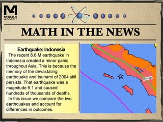
In this issue of Math in the News we look at the recent earthquake near Indonesia and compare it to the devastating earthquake of 2004.

Recomendados
Mais conteúdo relacionado
Mais de Media4math
Mais de Media4math (20)
Último
Último (20)
Math in the News: Issue 54
- 2. The Indonesian Earthquake This map shows the location of the earthquake, which is near Indonesia. (Source for all map graphics: http://www.usgs.gov.)
- 3. The Indonesian Earthquake This map shows the location of the epicenter relative to population density.
- 4. The Indonesian Earthquake This map shows the epicenter of the 2004 earthquake.
- 5. The Indonesian Earthquake A side-by-side comparison of the two epicenters shows that the 2004 earthquake was closer to land. Because it was a much stronger earthquake, its proximity also meant the potential for more damage. Note that both earthquakes occurred under water, which is what causes tsunamis.
- 6. The Indonesian Earthquake This graph compares the magnitude of the two earthquakes. The close numerical values of the two magnitudes (8.6 vs. 9.1) suggests comparably strong earthquakes. But magnitude uses a logarithmic scale. 0 1 2 3 4 5 6 7 8 9 10 2012 2004 Magnitude Comparison of Two Indonesian Earthquakes
- 7. The Indonesian Earthquake This graph compares the intensity of each of earthquake. Here you can see the dramatic difference in intensity. 0.00E+00 2.00E+08 4.00E+08 6.00E+08 8.00E+08 1.00E+09 1.20E+09 1.40E+09 2012 2004 Intensity Comparison of Two Indonesian Earthquakes
- 8. The Indonesian Earthquake The intensity of an earthquake is proportional to an exponential expression of base 10 whose exponent is the size of the earthquake magnitude. For simplicity, let’s assume this proportion is an equation.
- 9. The Indonesian Earthquake We can express the intensity of each earthquake using these expressions.
- 10. The Indonesian Earthquake To see how much more intense the 2004 earthquake was calculate the ratio of the two terms. You can see that the 2004 earthquake was three times more intense.