

Recomendados
Mais conteúdo relacionado
Mais procurados
Mais procurados (19)
Semelhante a Four video game box art diagrams
Semelhante a Four video game box art diagrams (20)
Mais de Josh Matthews
Mais de Josh Matthews (20)
Último
Último (20)
Four video game box art diagrams
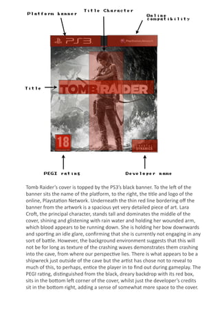
- 1. Platform banner Title Character Title PEGI rating Developer name Online compatibility Tomb Raider’s cover is topped by the PS3’s black banner. To the le; of the banner sits the name of the pla=orm, to the right, the @tle and logo of the online, Playsta@on Network. Underneath the thin red line bordering off the banner from the artwork is a spacious yet very detailed piece of art. Lara Cro;, the principal character, stands tall and dominates the middle of the cover, shining and glistening with rain water and holding her wounded arm, which blood appears to be running down. She is holding her bow downwards and spor@ng an idle glare, confirming that she is currently not engaging in any sort of baIle. However, the background environment suggests that this will not be for long as texture of the crashing waves demonstrates them crashing into the cave, from where our perspec@ve lies. There is what appears to be a shipwreck just outside of the cave but the ar@st has chose not to reveal to much of this, to perhaps, en@ce the player in to find out during gameplay. The PEGI ra@ng, dis@nguished from the black, dreary backdrop with its red box, sits in the boIom le; corner of the cover, whilst just the developer’s credits sit in the boIom right, adding a sense of somewhat more space to the cover.
- 2. Platform banner Title Television System Main Character ESRB rating Developer Publisher Bioshock: Infinite’s cover displays Xbox’s trademark banner at the top, it’s @tle siSng clearly against the white background, with a paIern of it’s tradi@onal colours to the right of the banner. The case is also coloured in Xbox’s bright green trademark colour. The television system, NTSC, which the game is compa@ble with, sits humbly above the game series’ @tle, which, plated against an an@que looking rusty shield, with patrio@c, loyal stars placed underneath, is sprawled confidently across the top of the cover. The “infinite” specifica@on acts almost like a sub header, separated on another shield, with the remnants of a US flag mel@ng off it. The combina@on of patrio@sm and destruc@on is con@nued within the background, with the wrecked, American flag dangling helplessly down the right side of the cover, on fire. This perhaps hints at the corrupt society featured in the game and degrading of the US government and their views in it. The predominant focal point of the cover is undoubtedly the protagonist, Booker DeWiI, who poses in a casual yet aggressive stance, with his shotgun slung over his shoulder, bandages wrapped around his wrist and great ar@s@c detail put into his clothing and aspects of his character as minute as the texture of his hair and his stubble. His figure is covered by an array of fire sparks that add a sense of ac@on to the seSng of the cover and therefore a certain “cool factor” to Booker’s character, as he looks so casual. The ESRB ra@ng sits in the covers boIom le; corner whilst the developer and the publisher’s logos sit equally sized in the boIom right.
- 3. Platform Online Compatibility Exclusive to platform Title Joel & Ellie ESRB rating Developer Publisher The Last of Us’ cover has smaller dimensions, being a PS3 game. The PS3’s black banner jets across the top of the cover, geSng lighter as it progresses to the right. On the le; of the banner sit the name of the pla=orm whilst the @tle and logo of the online, Playsta@on Network, sit clearly on the lighter, right side. Underneath the right of banner’s dis@nct and effec@ve thin red border, a panel emerges, emphasising how the game is a Playsta@on exclusive, not only to promote the game but the pla=orm as well. The en@re perspec@ve of the box art is @tled to the le;, to give it a rugged look. Both the environment and the aIen@on of the characters give the game a detailed and in depth feel on this over. The skyscrapers are tall and in@mida@ng and rise way above the individuals, the @tle and the banner of the box, whilst the characters, Joel and Ellie (who is standing nearer to perhaps aIain the focus of the player and to convey the importance of her character) stare on into the distance, to imply there is more in that environment than what meets our eyes. The @tle sits in a simple, bold, white font, emerging from the cover’s le; to fit in with western reading paIerns and is decorated with, rough, black smudges to subtly con@nue the rusty, abandoned themes of the game. The ESRB ra@ng is on the le;, the developer’s credits just a liIle bit larger than the publisher’s on the right. Underneath these credits across the boIom of the screen rise some blades of grass very near to our perspec@ve, perhaps to create a hands on approach or to convey how much nature is taking over the urban cityscape.
- 4. Platform banner Title Television system Awards sticker Main player types ESRB rating Developer Publisher Titanfall’s cover displays Xbox’s trademark banner at the top, it’s @tle siSng clearly against the white background, with a paIern of it’s tradi@onal colours to the right of the banner. The case is also coloured in Xbox’s bright green trademark colour. The television system, NTSC, which the game is compa@ble with, sits humbly above the game’s @tle, which, in black, bold, capital and futuris@c font, stands out across the top of the cover, complimented by a white, flame like, drop shadow. This is shown well against the beige shaded, cloudy sky of the skyline background, whose monotone and close rela@ons of colours and distant buildings add both neat design and depth to the percep@on of the game’s environment. Not too much space is le; for distance however, as in the gap on the right side of the cover, a label boasts the game’s status of winning over 60 awards. The size of the @tan preIy much covers the majority of the le; side of the box and yet it is sta@onary and open. The pilot seems to climbing out into the vast environment conveyed, demonstra@ng the game’s focus on the humans as well as the robots as well as the sense of adventure that the game holds. The black and white ESRB ra@ng sits in its tradi@onal spot, the boIom le; of the cover, whilst the publisher’s (EA) symbol sits in the right corner in a stylised, stamp like, transparent manner. This leaves the en@rety of the covers lower por@on to be claimed by the developer’s (Respawn) logo. The bold, white and orange font of their text and logo state how they certainly may want some credit for this @tle.