
Recomendados
Mais conteúdo relacionado
Mais de Mikey Masher
Mais de Mikey Masher (20)
Último
Último (20)
The Script TV Advert Analysis
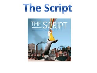
- 1. The Script
- 2. The advert opens with the song ‘The Man Who Can’t Be Moved’ be played whilst having glimpse outlines of the logo ‘The Script’ being shown. The shots then keep alternating from scenes from ‘We Cry’, ‘The Man Who Can’t Be Moved’ and to the logo becoming faster and showing more of the text. The sound then kicks into the chorus of ‘The Man Who Can’t Be Moved’ which then starts to build a faster tempo of the advert, switching from ‘The Man Who Can’t Be Moved’ to ‘We Cry’, which then changes the song from ‘The Man Who Can’t Be Moved’ to ‘We Cry’. Finally there is a shot of The Script’s logo, which then zooms out and we can then see the album cover of The Script.
- 3. The advert fits the characteristics of a pop/rock band, there is content from the music videos in which we see The Script performing. The logo looks very unique and it like it fits with the band because it does not contain any of the other characteristic that they don’t represent, such as the logo is basic because they were a new band bursting into the scene. The album is self titled, this could show that they called the album The Script so their name would be heard more which could have increased popularity figures.