
Recomendados
Mais conteúdo relacionado
Semelhante a Fhm powerpoint
Semelhante a Fhm powerpoint (20)
Fhm powerpoint
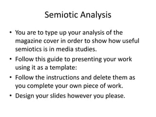
- 1. Semiotic Analysis • You are to type up your analysis of the magazine cover in order to show how useful semiotics is in media studies. • Follow this guide to presenting your work using it as a template: • Follow the instructions and delete them as you complete your own piece of work. • Design your slides however you please.
- 2. Semiotic analysis of a magazine cover Liam Paterson
- 3. Introduction to semiotics • What it is • Why it is important in media studies
- 4. Magazine cover • You are to present your semiotic analysis of your magazine cover. You can do this in one of two ways: 1.Insert your magazine cover photo here (find correct one on portal.) Using text boxes and arrows you can present your detailed semiotic analysis of the cover. 2. Alternatively you can crop certain parts of the cover and create a new slide for each section. • See examples of layout for more guidance:
- 5. Bold bright colours. The colour pink is a girly colour this contrasts the Barcode main audience of the magazine witch is mid aged males (18 – 35)+. Along with the masthead the same colour is used throughout the front The models name is cover pink white and displayed in big bold black to suttle colours writing so the reader with a outstanding knows from the start that colour to grab the this issue is about her this readers eye. The colour will target both male and pink is a reprsetion of female readers wealth and calmness this makes the reader feel upper class in some cases. The central image is model Kelly Brook wearing linger this straight away appeals to the target audience of a middle aged man. The way she is The puff, these usually have posed instigates sexual extra information in or meaning as she is looking chances to win prizes. This straight at the reader this one is a girly puff talking attracts the reader straight how not to get a beer belly away the copy is large and this will appeal to self there is no writing over her conscious women or who face or breast`s the two things care about there the reader will see. appearance
- 6. Conclusion. The target audience of FHM (for him magazine) is mid aged men ranging from 24 – 35 FHM readers read the magazine for the content of half dressed women and the latest gossip on computing and gaming and the full range of clothes and fast cars. This magazine can appeal to the female population but this magazine is prodomtly male, FHM magazine is a modern magazine and covers every point the modern reader wants (male) women, cars, football and alchoal.
- 7. Conclusion • What key information has a semiotic analysis given you? • Target audience of product. • Type / identity of product (in terms of content and delivery.) • How useful is semiotics in decoding magazine covers?
- 8. Upload to your blog • You need to use your slideshare or scribd account to upload the PowerPoint to the web. • You can then embed it on to your own blog on blogger. • You need to explain the PowerPoint in your blog entry post by using the title Semiotic Analysis of a Magazine Cover and explaining the task you were given and what is meant by semiotics.