The document discusses likes and dislikes of various design elements across different magazine covers, including a distorted face cover that is hard to read, a bold and easy-to-read text font, contrasting gold and white colors on a dark background that work well together, clarity of writing over a musician image, and use of a guitar as a text box. The document also expresses a liking for a black and white central image, green and white on a black background, and jagged text bubbles.
+971581248768>> SAFE AND ORIGINAL ABORTION PILLS FOR SALE IN DUBAI AND ABUDHA...
Mag Analysis
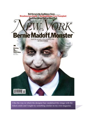
1. I like the way in which the designer has vandalised this image with the Jokers smile and I might try something similar on my own magazine. I don’t like the Image they used on this cover as faces appear to be distorted and the names are too hard to readI like the text font on this magazine cover as it is Bold, easy to read and yet still more interesting than the normal fonts I have been using.I might use this font on my magazine.I like the use of contrasting colours on the magazine cover the Gold and the white work well together and stand well on the dark background. I like the position of the Musician in the centre of the page and the clarity of the writing over the Musician which puts enthuses on the Guitar he is holding.I like the use of a Guitar as Text box on the bottom right and use of a Drawn/ Black and White image in the centre of the magazine.I like the way the designer has used green and white on a Black background I also like the way he has out some of the writing in a Jagged bubble I might use that in my magazine.