
Recomendados
Recomendados
Mais conteúdo relacionado
Semelhante a Visual Storytelling Tools and Techniques
Semelhante a Visual Storytelling Tools and Techniques (20)
Mais de Katherine-CWACanada
Último
Último (20)
Visual Storytelling Tools and Techniques
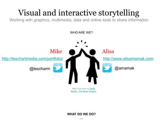
- 1. WHO ARE WE? Visual and interactive storytelling Working with graphics, multimedia, data and online tools to share information Mike Alisa @amamak http://leschartmedia.com/portfolio/ WHAT DO WE DO? … http://www.alisamamak.com @lescharm High Five Icon by Keith Mulvin, The Noun Project
- 3. Some examples from our work:
- 4. interactives We tell stories online by creating
- 5. Why is visual storytelling important?
- 6. Tactile/Kinesthetic Learn through moving, doing and touching... Or any combination of the above. If you want people to be engaged, engage their senses! Aural Learn through listening… Visual Learn through seeing… People have different learning styles:
- 7. SOURCE: This great interactive that explains why your brain craves infographics (http://neomam.com/interactive/13reasons/)
- 8. multimedia / long form stories So we tell stories through visual and sensory elements like
- 10. 1. Conceptualize project – Kick-off meeting with project sponsor – Brainstorm – Select point of contact/project manager 2. Design/proof of concept/mockups – Wireframes, storyboarding, and/or prototypes – Tools: Pen+Paper, image editing software (Photoshop, Illustrator), code 3. Development – Tools: HTML5, JavaScript, jQuery, CSS, Javascript libraries and APIs, – Gulp, NPM, Sass, PHP, cloud data storage 4. Test – Quality Assurance (QA) – Accessibility, device and browser compatibility 1. Project launches 2. Post-mortem discussion and feedback 3. Revisions, updates and new features (iterations) PROCESS: Long-term or large-scale interactive and multimedia projects
- 11. I need it now!!!” “But there’s breaking news and.. YOU can make it!!!
- 12. 1. Story identification. Reporters in the field may alert editors, or assigning editors will call the reporter. Photographers and visual journalists are alerted at the same time. Story location determines what happens next. The infographic/interactive artist might go to the scene to do their own reporting, or work from the office. 1. Once there is enough reporting to determine “what happened,” the infographic/interactive artist determines how to explain the events visually. Text, whether written by the artist or by a reporter, and visuals are created concurrently. 1. Content is fact-checked and edited, then sent to several platforms for publishing. The sizes and content of the material are different for use in video, mobile, desktop and other media. The artist would export several different versions, updating web and mobile versions of the graphics as the story develops. PROCESS: Breaking news – “quick hits” and fast infographics/interactives
- 13. Templates and third-party tools Some great DIY options exist! Or if you have the resources your newsroom may have templates for you. Start here! Google has a great suite of tools and tutorials for journalists! https://newslab.withgoogle.com/tools
- 14. Visual and interactive storytelling: a toolbox Could text enhance your story? 1) Big quotes Highlight key quotes or reader comments 2) Lists Could visuals enhance your story? 3) Infographics or single images Easy to implement and share 4) Image/photo galleries Often the most popular items on news sites. Tools: Flickr, In house galleries Could sound enhance your story? 5) Audio (Podcasts, MP3 files) Tools: itunes, SoundCloud, Audioboo, Broadcastr 6) Video (and audio slideshows) Tools: Youtube video editor, Vimeo, Vines, Soundslides Could dates enhance your story? 7) Timelines Tools: timeline.js Could location enhance your story? 8) Maps Tools: Google Maps, Google Fusion Tables, ArcGIS Online Could data enhance your story? 9) Data-driven graphics (charts, visualizations, etc.) Tools: Google Fusion Tables, Tableau, Google Trends Could a combination enhance your story? 10) Complex Interactives Any custom combination of multimedia tools/elements Could reader participation enhance your story? 11) Polls, quizzes, games Tools: Google forms, Poll Daddy, SurveyGizmo, Social Media Polls 12) Social media tools – more this coming up in 3…2…1…
- 15. Visual and interactive storytelling: a toolbox (cont’d) Using reader participation to enhance your story: Some tools you may want to try: • Storify: Aggregates content from different social media sources and presents them as a coherent story • Buffer: Schedule posts to the main social media networks at set times or intervals. • twXplorer: Explore and identify Twitter chatter by topic, and then see the most common links, images and hashtags used in those tweets. • Tagboard: Search a hash tag to quickly see an entire conversation across social media networks. • SocialMention: A free real-time search for user-generated content on blogs, comments. videos, etc. Sign up for email alerts (like Google alerts) or download the results as a .csv. • VerificationJunkie.com: A directory of tools to help you fact check, verify and assess the validity of user-generated content
- 16. Data visualization and data journalism
- 17. "The ability to take data—to be able to understand it, to process it, to extract value from it, to visualize it, to communicate it— that’s going to be a hugely important skill in the next decades, … because now we really do have essentially free and ubiquitous data. So the complimentary scarce factor is the ability to understand that data and extract value from it." - Hal Varian, Google's Chief Economist, opined in The McKinsey Quarterly, Jan 2009
- 18. Smarter people than us have spent a lot of time on this: http://datajournalismhandbook.org/
- 19. 1) Gather data Does your data exist? If not, how can you get it? SOURCE: http://onlinejournalismblog.wordpress.com/2011/09/06/gathering-data-a-flow-chart-for-data-journalists-2/
- 20. 2) Assess and interview your data What’s the quality of the data like (sample size, timely, from neutral source)? Is there a story? 3) Refine your data Is data messy or does it need to be in a different format? Google Refine: Helps you format, improve or remove messy elements from spreadsheets Tabula: Pulls data from PDF files and convert it into a spread sheet. Google maps or Google Fusion Tables: Best for map-based visualizations. Takes a spreadsheet of location-based information and shows it on a map. Can also generate charts and other types of visualizations but the “insert chart” option within Google spreadsheets is actually better and easier. Tableau: Has a bit of a learning curve, but can generate many types of rich data visualizations with no coding skills required. D3.js: Has LOTS of code, but you can come up with some really neat things if you’re keen. 4) Present your data What kind of visualization do you need? How will you prioritize visual elements? Should it be interactive?
- 21. Never underestimate the power of existing data. Statistics Canada has data for almost any topic you can imagine. http://www.statcan.gc.ca/start-debut-eng.html Most major cities in Canada (and around the world have also started open data initiatives and they are willing to add datasets upon request. http://www.toronto.ca/open/ http://data.vancouver.ca/ Also try: partnering with organizations, purchasing data from 3rd party vendors, collecting it yourself via crowdsourcing or hiring a pollster or data scientist, learning some code to scrape data (or pay someone to do it for you)
- 22. Challenges with data journalism You don’t need to be a statistician, but you do need to know basic statistics principles like “normalizing” data on maps and understanding the difference between corelation and causation. SOURCE: http://xkcd.com/1138/ SOURCE: http://xkcd .com/1138 /
- 23. Learn more (on a limited budget)
- 24. Join the MOOC movement MOOC = Massive Open Online Course. They’re usually free and generally run by professors at internationally-recognized universities and colleges. Some higher learning institutions also offer online course modules free of charge (i.e. MIT). Coursera - https://www.coursera.org/courses Take advantage of free online learning The Toronto Public Library offers the Lynda.com library of online courses FREE for all people with a library card. Libraries in other regions may offer similar. Over 3,500 video tutorial courses led by experts on web design, software development, photography, business skills, home and small office, project management, 3D + Animation, graphic design audio, music, video editing and more. http://www.torontopubliclibrary.ca/detail.jsp?Entt=RDMEDB01 87&R=EDB0187 Udacity - https://www.udacity.com/
- 25. Get involved in person Join groups or find organizations that run free or inexpensive workshops ONA Toronto The Online News Association meetup group. http://www.meetup.com/ONA-Toronto/ NEWS AND DATA MEETUP GROUPS IN TORONTO (FREE!): Look for groups that interest you at http://www.meetup.com/ INEXPENSIVE LEARN-TO-CODE WORKSHOPS ACROSS CANADA: FITC (Future. Innovation. Technology. Creativity.) Offer workshops and conferences (can be pricey but you can often win passes!) http://fitc.ca/events/ Ladies learning code (For men too! Encouraged that you accompany a lady) http://www.ladieslearningcode.com
- 26. On twitter? Get some inspiration! @TwitterForNews @CNNmultimedia @CBCinteractives @nytgraphics @BBCNewsGraphics GRAPHICS AND MULTIMEDIA: @PostGraphics TOOLS FOR JOURNALISTS: DATA AND VISUALIZATION: @AP_Interactive @quartzthings @Visually @nytdesign @nprdesign @GuardianData @mututemple (Digital Journalism) @HuffPostData