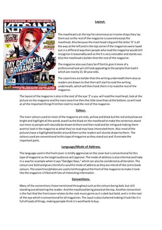
1. Layout.
The mastheadisat the top forconviniece asinsome shopsthey lay
themout sothe restof the magazine iscoveredexceptthe
masthead. Alsobecause the mastheadisbigand the letter‘K’isall
the way at the leftandin the top cornerif the magazineswere layed
out ina differentwaythenpeople whoreadthe magazine wouldstill
recognize itreasonablywell asthe Kis verynoticable andstandsout.
Alsothe mastheadisbolderthanthe restof the magazine.
The magazine alsousesSansSerif fontto give itmore of a
professionallookyetstilllookappealingtothe people thatreadit
whichare mostly15-34 yearolds.
The coverlinesare bolderthanthe writingunderneaththemalsoso
readersare drawn to that thenwill starttoread the writing
underneath,whichwill thenhookthemintoreadthe restof the
magazine.
The layoutof the magazine isalsointhe root of the eye ‘Z’o you will readthe masthead,lookat the
picture onthe magazine andthe maincoverline thenthe little coverlinesatthe bottom, sowill look
at all the Importantthingsfirstthenstartto readthe restof the magazine.
Colour.
The main coloursusedonmost of the magazine are reds,yellow andblackbutthe red andyelow are
brightand highlightall the words aswell asthe blackon the masthead tomake the sentencesatand
out more so people will naturallybe drawntothemand thenreadand be intriguedmaking them
wantto lookin the magazine aswhat they’ve readmayhave interestedthem.Also mostof the
pictureshave a highlightedborderaroundthemsothe readerswill alsobe drawntothem. The
coloursusedare conventional tothistype of magazine asthey standout and illuminate the
importantparts.
Language/Mode of Address.
The language usedinthe frontcover ismildlyaggressive onthe cover butisconventional forthis
type of magazine as the targetaudience will approve.The mode of addressisalsoinformal andlively
ina wayfor example whenitsays“DandgerDays,”whichcan also be conideredasalliteration.The
coloursare boldandgivesitkindof a youhful mode of addressastheyare mkindof like comicbook
colours. The coverlines/photosare usedalotthroughoutthe frontof the magazine tomake it look
like the magazine isfilledwithlotsof interestinginformation.
Conventions.
Many of the conventionsIhave mentionedthroughoutsuchasthe coloursbeingdark,but still
standingoutattractring the reader.Andthe mastheadbeingplacedatthe top.Anotherconvention
isthe fact thatthe frontcoverrelatestothe rock musicgenre asit isdark but bold,andis inthe root
of the eye whichisconventionalforall magazines.The layutisalsoclutteredmakingitlooklike itis
full of loadsof things,makingpeiople thinkitisworthwile tobuy.
2. Contents page.
Layout.
The fontson most of the contentspage are sansserif,whichiseasier
to readand reasonablyrelaxed.The contentspage alsohasa lotof
the thingson itwhichare alsoon the coverpage.It is alsoreasonably
clutteredonthe contentspage aswell makingthe readerthinkthere
ismore to read.
It relatestothe target audience asthe magazine istryingtoattract
tennagers anditdoesthisby makingall the people inthe photo
appearas beingimmature andpossiblydrunkwhichmaybe most16-
34 year oldscan relate to.
The house style isthat the coloursare the same throughoutandthe
language isslightlyaggressiveaswell asthe picturesall havingsome
slightlyaggressive thingsgingoninthem.Itsconventional alsothat
theyhave useda coloumnforthe contentlist.
Colours
The colourson the contentspage alsofollow the conventionsof the colourscheme whichare dark
colourssuch as redand black.The red highlightsthe titleof the page ‘KERRANG!CONTENTS’andthe
blackoutlinesthe namesof eachof the topicswhichare of impotance in the magazine.Redand
yellowalsoconnotesdangerandaggression.Blackconnoteslonelinessandisdarkso alsoconote
sadness.
Image
There are more imagesonthe cover page thanon the contentspage.Thismakesthe audience
approve of the organisationof the page and how it looksneater.Italsohighlightsthe importance of
the imagesthat are there as theyare obviouslyhighlightingthe important/mostinterestingpages.
The shot type of the image is a longshotwhichconnotesmayhemasitisshowingalot of whatis
happeninginthe image.
Double Page Spread.
Layout
The double page spreadisconventional because the textison
one side of the page andthe image isonthe othe.There isalso
the root of the eye soit goesfromthe main quote at the top
thenthe band then some of the writingthenthe restof the
band. Alsothe naughtsand crossesgridbecause itgoesover
the mainsingerinMCR and thenthe paragraphs/textalsoso it
highlightsall the impotantpartsof the pages.
3. Image
For the Image the shot type isa mid-shotwhchtheyhave usedsoyoucan see all the band
memebersandthe clothestheyare wearing. Alsothe costumestheyare wearingare brightand
comic-bookstyle to gowiththeirsongs/musicvideo.The paragraphsfollowthe house-style because
throughoutthe magazine all the large paragraphs/piecesof texthave ablackbox withwritingin.
alsothe couloursfor the paragraph andthe layoutare the same throughout.Alsothe coloursfollow
the house-style. The coloursare brightandfollow the house-style because the mainsingershairis
redand theirclothesare yellowandsome are dark,whichisconventional forthe genre.
Font
The font usedissansserif whichfollowsthe house style of the restof the magazine.The fontbeing
sans serif also isconventional forthe magazine asit relatestothe targetaudience andis
conventional forthisgenre. The coloursof the fontsandall the picturesare conventional alsoasthe
followthe housestyleof the restof the magazine.