
Recomendados
Recomendados
Mais conteúdo relacionado
Semelhante a LibTech 2014: Redesign On A Dime
Semelhante a LibTech 2014: Redesign On A Dime (20)
Último
Último (20)
LibTech 2014: Redesign On A Dime
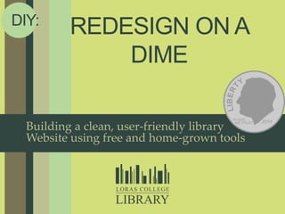
- 1. REDESIGN ON A DIME DIY: Building a clean, user-friendly library Website using free and home-grown tools
- 4. CONTEXT / CONSTRAINTS / NEEDS DIY
- 5. FIRST, A BIT OF BACKGROUND PAST
- 10. NAVIGATE TO YOUR WEBSITE: • BEST 3 THINGS • WORST 3 THINGS 5min
- 15. 2 Subpages
- 16. 2 Subpages
- 17. DESIGN DIY
- 18. 3 Inspiration
- 19. 4 WireframePro
- 20. 4 WireframePro
- 21. 3 Inspiration
- 22. 4 WireframePro
- 23. 4 WireframePro
- 24. MOCKFLOW.COM • DESIGN PROTOTYPE TO ADDRESS ONE OF THE WORST THINGS 10min
- 35. 6 Vendor Widgets
- 36. 6 Vendor Widgets
- 37. USABILITY DIY
- 38. 7 Card Sorts
- 39. 7 Card Sorts
- 40. CARD SORTS • ARRANGE CARDS INTO CATEGORIES THAT MAKE SENSE TO YOU 5min
- 41. 8 Jing
- 42. 8 Jing
- 43. 8 Jing
- 44. 8 Jing
- 45. JING • IN PARTNERS: RECORD ONE PERSON COMPLETING TASKS ON YOUR HOMEPAGE 10min
- 54. DIY: All this adds up to big change for the library’s website! THE BIG REVEAL
- 55. THE BIG REVEAL DIY“Utilizing limited space on the template allotted” “Instructions are brief but also intuitive and sufficient” “Less really is more” “Navigation is quick and easy” “As a user you have no trouble finding what you need” ACRLCollege LibrariesSection Websiteofthe Month
Notas do Editor
- Arrange participants in pairs spread throughout roomFn + Extend view, THEN check box for Presenter ViewEra of budget cutsLots of free and adaptable tools
- Slow-reveal style of a makeover show
- College provided Website structureHad control, but interface limitingNo flexibility; no ability to innovateCould add/change links, that’s about it
- Developed around 2004 – WebTwist CMSBased on other institutions’ sitesLibrarycreated menu below College bar navigation, with Library banner (designed by College Marketing)Two website domains/servers, confusing URL structure (depts.loras.edu)URL redirects because of an embedded rotating image widget
- College site redesign (worked with developers to get our site designed, but…)Moved content/links to web CMS templateCollege banner and menuMore control, but very limited options because of CMS (no access to HTML or CSS, no ability to embed scripts)
- Spent some time noting what we liked, what we didn’tHelps to look at print-out of homepageDraw Here – annotation tool for websites
- Another constraint…
- Needed to work within College branding requirementsBannerNavigation menusOrganizational structure within CMS / consistency with academic departmentsHow does the Library fit??
- Needed to work within College branding requirementsBannerNavigation menusOrganizational structure within CMS / consistency with academic departmentsHow does the Library fit??
- When switched to new CMS, Library links were dumped into blank page
- NEEDED: More control over our subpages – info changes frequentlyAbility to insert widgets, databases, images easilyTABS:Way to fit LOTS of info on small spaceMore aesthetically pleasing/clean/visually organized
- NEEDED: More control over our subpages – info changes frequentlyAbility to insert widgets, databases, images easilyTABS:Way to fit LOTS of info on small spaceMore aesthetically pleasing/clean/visually organized
- Once we knew what we needed, then we could focus on what we wanted
- Inspiration from other library websitesTop 10 lists, libraries we worked at, well-known librariesEach librarian picked websites and noted specific things they liked about itLooked for commonalities
- Needed a way to express to College web designers exactly what we wanted
- Design 1
- Design 2
- Could even show different tabs/configuration options
- Your turn!
- Can create an account with any email address, or use your Google account
- Give your project a name
- Scroll down to see all component options
- Drag and drop to add componentsResize objects by hovering and dragging corners
- To add pages (up to 4)
- Used jQuery to create tabbed navigation boxes
- After lots of frustration and less elegant attempts…
- Free, open source JavaScript libraryMultiple configurations availableTab colors/sizes were easily manipulated in HTML/CSSCould copy source code and save on server
- Saved file on another server (that could handle the JavaScript) and pulled into CMS using an iFrame tagEdited to make College’s official colors
- Why reinvent the wheel?
- Vendor widgets (Ebscohost, LibraryH3lp, LibGuides)Google search for codeInsert institutional session IDsCustomize search optionsAdjust size when embedding
- Now that we had our new site, it was time to make sure users could actually use it!Ideally happens before/with old site before changes are madeOurs was already gone; knew the new one was not good
- Like rearranging the furniture!
- Why reinvent the wheel?
- Your turn!
- Hands-free documentationClosest way to see what users do when they’re on their own
- Easy to record one window, or an entire screen
- Recording is easy, though there is a 5-minute limit
- Jing is especially great for recording usability testsAgain: Steve Krug’s adaptable usability tests available onlineInclude: checklists, administrator script, tasks, and top 3 usability problems for observers
- Your turn!In pairs: Person administering test should navigate to their website, then in same tab, navigate to Google.comPerson administering test should get script, consent form, and copy of the questions.JULIE: Read usability administrator script aloud; answer any questionsREMEMBER: 5-minute limit!
- What did we learn from usability tests?Needed a more visually-striking way to set apart commonly used links
- Redesign: Shapes instead of square buttonsColor that stands out from rest of page (not purple)
- Redesign: Shapes instead of square buttonsColor that stands out from rest of page (not purple)
- Something else we learned from usability tests:Number one thing users want to find on the Library’s homepage?HOURS
- Scrolling/formatting issuesSlow load time
- Clarified regular hours
- It’s good to have friendsNW Missouri State
- Dynamically displays today’s hours
- Launched site: February 2013Selected: April 2013This month's web site comes to us from Loras College Library. What was most striking about the site was how they managed to fit into the overall design of the college's web site, while efficiently utilizing the limited space on the template allotted. The landing page of the library is quite simple but manages to contain the most important elements and links. A large tabbed search box takes up the top half of the page while the bottom portion is devote to four main categories of links, Resources, Services, About Us, and Help. They even manage to include a fairly large chat widget on the page without overcrowding it. Labeling and instructions are brief but also intuitive and sufficient. LibGuides are also put to good use as second level pages. What can't be said on the main page can be explained in ample detail when one clicks on a link, which then takes you to a multi-tabbed LibGuide. In this case less really is more. Navigation is quick and easy and as a user you have no trouble finding what you need.
- Era of budget cutsLots of free and adaptable tools