
Recomendados
Mais conteúdo relacionado
Mais procurados
Mais procurados (19)
Semelhante a Josh poster analysis
Semelhante a Josh poster analysis (20)
Mais de Josh Woodburn
Mais de Josh Woodburn (6)
Último
Último (20)
Josh poster analysis
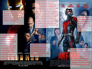
- 1. The marvel film posters all have the same style and layout they are basically all copy paste of each other.. They all have the same stylistic approach with having dark background. The main heroes are center page but wearing masks with their secret identity's at the side of them larger than everybody else showing there their importance. The size of the image shows the importance of the actor within the film. There is an unmasked version of the hero next to the hero so the audience do not get confused as to who is under the mask. This is so the audience know who the actors are playing so they can see who's going to get the most screen time which results in the audience members becoming drawn toward the film if there favorite actor is the lead role The side characters are people that are associated with the hero in some way unknown to the audience but they are famous actors that will attract certain audience members that are fans of the previous work. The helicopters and fighter jets in the posters show that there will be large elements of action within these films. The credit blocks and actors names are done in white and red so they standout on the poster so audiences who want to go watch the film can examine them and find out who is in the film which make certain people want to go watch the film Marvel do this because then the audience know its part of a franchise, this benefits them because then audiences know what there getting when looking at the poster.
- 2. The font also connects to the characters of the film for example Deadpools font and colour is big bold and blood covered just like his film, you can tell by the faking of the colour at the top and the deep red which gets darker the deeper down the font you go which is the same as blood when scabbing. This suits the audience because people who want to go watch Deadpool know of Deadpool and what he is like which is an unpredictable, unstable and psychotic killer. Thors font is similar to ancient runes found in fantasy games this is because he from Asguard a mythological place where gods live. This background and font shows the audience that it will be set in Asgard and earth and the two realms will cross over and sets a mystical style to the film with Thor being the God of thunder in mythology The pose Deadpool is pulling is also a reflection on the film because unlike Thor the dark world Deadpool doesn't’t take itself seriously and is a comedy where as Thor is a serious superhero action film tis is shown through how Thor is stood. The pose suits the audience because they already know who Deadpool is from his comic. This pose also displays that the narrative will be be as messed up as a murder pulling this pose covered in blood. This poster tell us as an audience that this character is mentally unstable and the film will follow suit.
- 3. Sci-fi films also have a dark overtone and lighting this is because Superhero films and Sci-fi films share similar aspects of film with them both being beyond belief and could never happen. Although the MCU franchise is set in the real world this is so people can get lost in the fantasy of superheroes. The colour scheme used for the back to the future font is something that has become associated with the film franchise as it has been used In the previous two films. Though the main thing in most film posters of either the action, Sci-fi and superhero genre is that they all have the main characters on the posters. This is because these are the people the audience come to see and they are the main protagonist of the film, this tells the audience that this film is a story from this characters life, the audience are the people who admire or like these people and want to see them in another film. The captain America civil war poster cannot feature just cap alone because he is at war with his friend Iron man. These films are both sequels to previous films of there francise which is why in order to understand what's happening in the poster you must watch the previous films. This is why in both posters there are things happening such as the sparks and reflection of Iron man in the civil war poster and the fire and people dressed as cowboys in the back to the future poster. This is because these things would not make sense to someone who has not watched the prequels as iron man and captain America are fiends and would not fight and 2 cowboys entering a futuristic car doesn't’t make sense without the previous films. The poster communicate to the audience that there will be some sort of problem due to the expression of the characters these