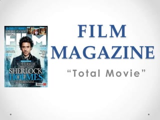
2. I will have to remember a lot of
things whilst creating a film
magazine as I need to make sure it
doesn’t end up looking like
something else rather then a
magazine e.g. Poster. As a thriller
film I need to make sure I can
bring this across in my magazine,
to start off with I had a film
magazine on a tab so I could relate
to it as much as I could. The one I
had opened was the one on the
first slide.
I selected the sizes that I wanted
and added a new fill solid layer
which was dark grey as if was a
light colour thriller wouldn’t come
out of it as much.
3. I used a paint brush tool and
made the colour a very light grey,
I changed the size and hardness of
the brush as I wanted a spotlight
effect instead of a hard white
circle. Some people may have
different interpretations on this
this as the spotlight could be on
someone who's done something
bad or vice verse someone who
has done something good.
This could be an ideal way to
draw readers in as they want to
know what's happening and
what's really going on. This is
clever as that’s how we want
people watching the film to think.
4. For ‚MOVIE‛ I created a text box
and just wrote movie then
changed colour, font, size etc. I
then rasterized the layer so that I
could move the movie so it wasn’t
on a straight line. As it was the
title of the magazine it had to
stand out the most as I want
peoples eyes to draw straight to
this magazine rather than any
other. I then added another layer
to write total in I got this idea
from…
5. A slogan is very catchy and will draw people in as it will stick in their head. A
slogan is a memorable motto or phrase used in a any context as a repetitive
expression of an idea or purpose.
As it clearly states that it’s ‘the greatest film magazine ever’ more readers will be
drawn well into this as they will know that it’s the best one in shops so why buy a
not as good one to a greatest. It may also draw readers in who don’t read film
magazines as they might want to see why it’s the greatest and how's it different to
any others.
6. ‚The‛ I Chose to not put ‘the’ in capitals
as everything else is so far. I done this is
that the ‘HEADLINE’ in red and capitals
stands out the most and as headlines of
stories will stand out a lot. Rather having
‘the’ stand out I just focused on the
‘headline’ standing out this is so that its
effective and doesn’t give to much away
by the title.
I chose red as I want the actor in a Red
coat to make an impact on the trailer and
it will give people something to always
remember.
7. On the left hand side of the magazine I've
added films that would be in the magazine,
this will bring people in who are interested
in watching these films, also might make
people go watch them who haven’t seen
them.
The * and capital letters on ‘the headline’ is
because that’s what's on the main cover of
the page. I used red to make it bold to
shows that’s not just what the magazine has
to offer to draw more readers in.
I made a new layer to create EXCULSIVE
this was because I wanted to make it look as
effect as I have. Using the drop down
shadow tool so that it stands out as well as
the inner shadow.
8. Adding the film website in could be essential for weekly readers, but I
believe a website shouldn’t give much away from what's going to be in that
magazine else it will ruin it and will lose money. It will be a good idea to
show a quick brief of what is in this weeks magazine or what to expect in
next weeks. Communication is very essential for anyone so they might be
able to right reviews and blogs to recommend to people on a film that’s came
out.
At the bottom of my magazine a date is always needed so that everyone is
keeping up to date with their magazines also so people may want to collect
them. The price needs to be on it so new readers will know how much it is
weekly. The only thing I need to add next to it is the barcode.