
Recomendados
Mais conteúdo relacionado
Mais procurados
Mais procurados (20)
Destaque
Destaque (18)
Semelhante a Zodiac Film Poster Analysis
Semelhante a Zodiac Film Poster Analysis (20)
Mais de JenniferEse
Mais de JenniferEse (10)
Último
Último (20)
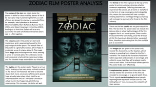
Zodiac Film Poster Analysis
- 1. ZODIAC FILM POSTER ANALYSIS These are the few credits we are given about this film. The fact that the poster does not include the release date or actual tagline/slogan of the film suggests that it is a teaser poster. These credits increase the films bankability, since the director of this film has clearly directed other successful films, therefore insinuating that this film could be just as successful. The names of the stars are listed above the poster in white for clear visibility. Names of the A list stars also help in promoting the film, as each of them are known for starring in successful films, for example, Jake Gyllenhaal in Brokeback Mountain (2005), Mark Ruffalo in Rumour Has It (2005), and Robert Downey Jr. in Gothika (2003), leading us to think that Zodiac will be a very successful film with all of these renowned actors cast in a film together. The images we are given in this poster only include the characters and the location, which helping in providing hints related to this film’s narrative. The faces of the characters have been taken separately and compiles in one image, and edited in a way that they will be placed neatly next to each other. This technique allows space in the poster to be used effectively. The tagline on this poster reads: “Based on a true story” making us feel even more inclined to watch it- if a story is non-fictional, we tend to become drawn to it more, since some of the events would have actually taken place. Also, it will be an informative film since it’s narrative is based on actual events that happened, whilst being entertaining. This increases it’s ability sell well. Complementary quotes from those who have already viewed the premiere of this film are included to encourage us to go and watch it too. This is a good marketing ploy because people reporting from reputable sources such as “The Rolling Stones” here, increases the reliability of their opinion. The colours used in this poster are dark and mysterious, and is appropriately used for this psychological thriller genre. The overall filter of the poster is a green/blue colour, which helps in creating a sense of enigma about it. The image looks foggy and the background is black, evoking a sense of curiosity about the unknown; we do not know what is behind the mysterious bridge, and the clouded image exacerbates our interest. The format of the film is placed at the top of the poster to entice customers to enjoy a better cinematic experience. Offering consumers an experience the cannot get at home or elsewhere in the form of new convergence technology like this, means the consumer will have a unique viewing experience, and illegal things such piracy will no longer be as much of a threat to the film industry.
- 2. The layout of the poster is very effective, as it used up most of the space without looking too overproduced; it provides the consumer with enough information about the atmosphere or mood of the film. It looks very well thought out, and everything has been placed logically in order to increase the coherence of the poster’s comprehensive message. The poster has been made to look mysterious and therefore match the nature of the film's genre, without looking too overdone. The colours delineate the thrilling, yet enigmatic nature of physiological thrillers, therefore adhering to the conventions of this genre. LAYOUT FONT The font colours and style correlate with the overall house style of this poster. The title of the film is glowing, which creates a sense of mystery; sticking with the foggy theme that the poster has, and the glowing lights on the bridge, the glow on the text helps to create an eerie feel to the poster. This glow appears to be present on all of the texts on this poster. Also, the “Widescreen” text is spaced out to emphasises the ‘width’, as it were, that this film will be played on. The sizes of the fonts vary according to the importance of the text, for example, the cast has a medium font size, while the review and credits are smaller. The title has the biggest font size, as it is what is most important to the poster, and is what defines the film. These various font sizes correlate well with each other, and coupled with the glow and the colour, helps to retain uniformity in this poster.
- 3. UNIQUE SELLING POINT It could be said that the film's unique selling point are the actors that star in it. The main stars of Zodiac have come from different backgrounds of entertainment, for example, Robert Downey Jr. released his debut album on 23rd November 2004 called Futuristic by Sony Classical. Two of these songs were played in films, ‘Broken’ in Kiss Kiss Bang Bang (2005) and ‘Hannah’ in Wonder Boys (2000). In the same way, Mark Ruffalo is an actor as well as a, producer, director and a screenwriter. Synergy can be defined as a “strategy of synchronising and actively forging connections between directly related areas of entertainment”, and indicates that, by the actors coming from different areas of the enterainment industry, it can attract a range of different audiences too, and therefore acts as a unique selling point for the film. It may not have been supposed to be in order, but the names of the stars could have been placed above the images of the actual characters so that it correlates, and adds more uniformity to the poster, because it looks slightly out of place in my opinion. WHAT I WOULD CHANGE