1. The mast head’s colour is in correlation to
the colour scheme shown by the text and
the paint of his finger nails with this colour
scheme going on throughout the front cover
it gives the reader a sense of familiarity
when looking at it.
The Skrillex line, again, gives the reader a
sense of familiarity on the cover. The writing
of the name Skrillex is in a larger font than
the rest of the text making us notice that as
the main attraction.
This feature is called a ‘Selling
Line’. In this case it has been
used to show what this issue
is about, in the case it is ‘The
Dance Issue’ it is in capital
letters to match the rest of
the cover, however the box is
black, not green. This could
be to match the colour of his
hair/glasses.
This is here to show you who the photography
is by, either just on the cover or throughout
the magazine. This could increase sales from
fans of his photography, or he could be
famous, again, increasing sales.
Here, we are told who is featured in the
magazine, other than Skrillex. They have put
the biggest names of those featured such as
Justice and Deadmau5 on the cover to get
increased interest from electronic music fans,
as these artist have a huge fan base.
This is called a cover line and in this case it is
inviting the reader to buy the issue and in
return they get a free Soundtrack. This will
increase sales because you assume that the
soundtrack is created by people in the issue,
and fans of their music will be looking out
for this particular issue.
The main image is of Skrillex, who’s name is
the in the biggest font of the whole cover. In
the picture we see mainly black clothing,
which goes well with his hair, this also
contrasts to his pale skin. We also have his
nail polish which is significant because it is
not only messy, giving a sense of
informality, but it is also orange and green,
Green being the main colour in the colour
scheme of this magazine cover.
What you may notice, is that
there is no barcode on the
cover of this magazine. This
may be to give the cover a
hint of minimalism, or maybe
just to make it look neater.
The only downfall of this is
that we do not know how
much it costs.
2. The cover line on this issue invites to reader
of this magazine to buy it, even more so if
they are a fan of Blur because it creates and
enigma, they want to find out when ‘Blur’
are recording and what are they recording.
Is it an EP, is it an Album?
Here we see, the main feature
of the magazine, which says
‘The Strokes’ in bright pink
writing. This fits to the colour
scheme that is going on, on
this cover. With only black,
white and pink being used.
This gives the reader a sense
of identity and familiarity
when looking at the cover.
The use of the word ‘World
Exclusive’ makes the reader
feel special when buying it.
Giving the impression that
only THIS magazine has the
information about The Strokes
that everybody wants!
The mast head is fitting the colour scheme
provided in this issue, it is also the same
font as the text on the cover, however it
looks as though the rest is using italics. It is
positioned here so that when picking it up
off of the shelves, NME is the first thing
that you see.
The selling line of the magazine says
‘New Musical Express’ but with only
‘New Mu’ showing, this may give off
the impression to someone who has
never seen it before, that the magazine
is well known and so good that people
already know this. Also the fact that it is
NEW musical express if gives the reader
a sense that that they are reading
about music that is up and coming, not
just music that everyone already knows
and is old news.
The barcode is use in every magazine,
although it is not always placed in the same
place. The barcode is needed in order to sell
the product, but not just that it gives the
buyer of the magazine information too,
information on how much is costs, web
addresses, contact details and issue
numbers.
This cover line is abiding the
colour scheme of the
magazine, with the pink and
white. The cover line is being
used somewhat as a lure,
luring readers to find out
what The Strokes have to
say. The fact that it is a quote
suggests that there is an
interview that you may want
to read.
This attracts us to the
magazine because we
want to find out who are
the weirdest band, how
weird can they be?
We also have a list of bands that are featured,
also continuing on with the colour scheme. This
attracts readers due to the bands that are listed
being popular therefore increasing the
readership, because their fans are going to buy
this issue.
3. The cover line on this issue says Revealed!
Slipknot their darkest years. This is going to
attract the readers because they want to be
nosey, they want to know why they were
their darkest days, what did they do?
This will also attract readers to the
magazine, but this time they want to know
how intimate was the interview with Andy
Sixx? Also fans of Black Veil Brides will buy
this issue.
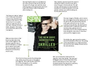
The huge font of SKRILLEX seems to be,
plastered on. Giving it an informal
appearance, whilst still sticking to the
uniform of the magazine with the blue text.
This is going to attract Skrillex fans and
Dubstep fans because they want to read
about Skrillex and what he has to say.
The barcode is use in every magazine,
although it is not always placed in the same
place. The barcode is needed in order to
sell the product, but not just that it gives
the buyer of the magazine information too,
information on how much is costs, web
addresses, contact details and issue
numbers. For example this costs £3.99 and
is the November 2011 issue.
The Free Posters and Stickers
lure, draws in a reader
because they will want free
posters of their favourite
bands. This again sticks to the
colour scheme.
This shows a brief contents of
who is in this issue. They use
the biggest names that are in
it to gain the most readership
possible.
This offer is giving away 15 songs
from over 5 different bands. This
will increase sales because you
assume that the songs are created
by people in the issue, and fans of
their music will be looking out for
this particular issue.
The fact that it says ‘His name is
Skrillex’ gives Skrillex fans who are
reading this a sense of irony. Due
to his EP ‘My Name Is Skrillex’.
This pun will increase readership
because Skrillex fans will want to
know what they have to say about
him.
The main imagine again, is sticking the uniform of the magazine.
You can see that he is only really wearing black, which not only
contrasts with his pale skin, but also matches the font colour
used on the cover.
This lure is being use throughout
the magazine. The word FREE is
used 3 times over the cover, using
the rule of three and is more likely
to imprint into the readers mind.
This will increase sales because
the reader will want the free
stickers and posters, and the
Exclusive Free CD makes the
reader feel special. Like nobody
else will ever have this CD as it is
exclusive to the magazine.
4. This Q can be seen
throughout the Q Magazine.
This gives it informality with
it always being there. It gives
the reader something familiar
on every page.
This is telling us what issue
number the magazine is.
By using quotes, it gets the
reader intrigued by what it
means and who said it. They
are more likely to buy this
magazine if they are flicking
through it in a shop because
they want to know what it is
about.
The language used here is
clever. By saying Q Review, it
rhymes. This may make it
easier for the reader to
remember what is in Q or it
could just be a simple bit of
word play.
This shows what is being reviewed, also that Q is
not just a music magazine, it also features best
films, books and ever crosswords. Which
reaches out to many readers, from young to old.
Magazines will often have
famous musicians on their
contents page, they also
make them the main
attractions, for instance here
we have Bono singing. This
gives us the impression that
there are exclusive interviews
with him and we can find out
thing we never knew before.
This shows us when the magazine
was published, in the case it was
published in the Summer of 2001.
We can see that the layout of
Q’s contents is rather messy.
This gives it a more informal
look about it, with the
numbers on the pictures
always being in different
places. This contrasts to the
formality of the Q in the top
left corner and before the
review.
We can see that around this
area the pictures being to get
very messy and clumped up
together, This again, gives an
informal look about it, whilst
the Q keeps the overall look
in check.
5. This is trying to get the readers of this magazine
to subscribe, thereby making the magazine
more money. They claim to save you over £45.
The use of the word UK’s No 1 Gig Guide makes
the reader buy the magazine because they want
to have the best, not settle for second best.
We can see here the main
article in this issue of NME.
The p6 is keeping the red
colour scheme of the
contents and the text’s
background is a block of
white, which makes it look
like more of a newspaper
rather than a music
magazine. This may give it an
element of formality whilst
making the reader thing they
are reading about the latest
musical news.
This shows us the news and
what the magazine contains,
it will often feature famous
bands to increase readership
from fans of them, as well as
the mainstream. You may
also notice that there are
general news featured here
as well.
Here we can see the reviews
of albums and tracks, which
will often be of big albums
that are soon to be released
and everyone wants to know
how good it will be.
Here we can see the NME logo, which is setting
the uniform for this contents with it being red,
and all the main text corresponding to this
colour scheme.The band index here is not
usually found in the contents,
usually you would find the
them in the back. This is
useful for the magazine
because readers can look
down the list and find their
favourite band, and then they
will want to buy the magazine
to see what is said by them.
The features section let’s us
know what the main features
in the magazine are, we
usually flick straight to this
section as this is where we
are most likely to see our
favourite bands.
6. Here we can what the key
features of the magazine are,
this directs the reader to
what they will most likely
want to read.
This directs the readers most
interested in fashion to the
fashion section.
This informs the reader of
what issue number this
magazine is, this one is
October 2008
This shows us who designed
the clothes in which Beyoncé
is wearing, giving credit to
the designers. The fact that
the text is placed here gives
the magazine a sense of
informality, but the black
writing fits to the colour
scheme, so whilst being
informal, it gives the
magazine a sense of
uniformity.
The V that is shown here, at
first glance, makes Beyoncé
look like she has been strung
up like a puppet. This could
give clues as to what the
article is about, maybe her
Label is playing her about?
The title of the contents page
is again, informal. With the
writing being uneven, but it
still sticks to the black and
white colour scheme, which
gives the reader familiarity
with this magazine.
The image of Beyoncé is with
her with her legs up in the air
pulling a V shape. This V
stands for Vibe which is the
magazines name.
7. The large image of Lady
Gaga is taking up half of
this double page spread.
This is because when
flicking through the
magazine in a shop, they
want you too see that
they have big names in
the magazine, making you
more likely to buy it. The
fact that she is touching
herself makes it seem
informal and seductive,
with the black and white
picture aiding that.
This big L represents ‘Lady Gaga’. The
Fact that it is red is fitting to the colour
scheme of the magazine, with it’s red,
black white colour pallet. The text saying Lady
Gaga is placed here, so
that when a reader is
flicking through, it is
the first thing that they
see.
The text in the double
page spread is layed
out as more of a new
article than a general
music article. This
makes it look more
formal, which contrasts
with the picture and
the Big L.
The Q logo in the
bottom right corner is
featured throughout
the magazine, giving a
sense of familiarity and
it also shows us what
page it is, and what
issue it is, the case
being April 2010.
The large S featured here is called a Drop
cap. This makes us more aware of the text
and makes us more likely to read it. It also
makes the magazine look more
professional and better layed out.
8. The image featured is
large and is taking up half
of this double page
spread. This is because
when flicking through the
magazine in a shop, they
want you too see that
they have big names in
the magazine, making you
more likely to buy it. She
has a super smiler, smile
as seen in the Male Gaze.
With the super smiler
effect you will find that
the models have a lot of
teeth showing when they
do a huge grin or smile
but can sometimes be
done subtly and will often
be a close shot with their
heads tilted forwards or
backwards and their hair
quite wind swept. In this
case we can see her
‘Poofing’ up her hair.
Here we can see the page number, this is
quite unusual, due to the fact that it is in
the bottom left corner. Usually you will find
the page number on the bottom right
corner.
Here we can see the red colour scheme coming into play when
looking at the interview. We can see that the names are written
larger than the other text and is in red. This makes it stand out
as we want to know who is being interviewed, and who is doing
the interviewing.
Here we can see the
subtitle, written in
burgundy, again fitting
the red theme. This
separates the main title
from the block of text,
that that we have a more
distinct Idea of where the
texts starts and the title
ends.
The title here attracts the
reader because they may
not know who ‘Bronte’ is
and how she made her
‘Climb to fame’ The text is
written in plain black
writing until the word
Fame, this makes it stand
out and intrigues the
reader
The offer of a new single from Bronte makes the
magazine, and Bronte more money, from text charges,
plus gives the reader a bonus of a song. The text Bronte 1
and 80880 is highlighted in red to make is stand out more
from the other text, attracting the readers attention to it.
Here at the top right of the double page spread, we see
‘Bronte The Voice Of 2011’ This will be one of the first
things the reader will see. If this is the case then they will
want to read on, why was she the voice of 2011?
9. Here we have an image of
the band being featured
in this double page
spread. The image is
taking up a whole page,
half of the double page
spread. We see them
quite relaxed and looking
very casual, one even has
his hand in his pocket and
his other arm resting his
head, they are dressed as
if it is an normal day in
their everyday life. This
could be done to reflect
their genre of music.
This box is linking to the colour pallet used
within the magazine. The blue white and
black is featured throughout this double
page spread. The box says NEED TO KNOW:
this grabs our attention, what do we need
to know?
This article has been written in blocks,
making it seem like more of a newspaper
than an actual music article, this gives it the
impression that we are reading about the
latest in the their music.
Alex Turner has been
featured to gain
readership. We have fans
of Arctic Monkeys
wanting to know what he
has to say about ‘The
Rascals’ who are his new
favourite band. We now
know that Alex Turner
then went on to form a
duo with the lead singer
Miles Kane of the Rascals
to make ‘The Last
Shadow Puppets’
Here we have an extract
of what they have said.
This is used to make the
article look more
interesting than just a
block of text. Yet again.
This is sticking to the
uniform of the contents
page’s colour scheme,
with it being blue, white
and black.
The title of the page ‘The Teenagers’ lets the reader know what the
page is about. The text is large so you cannot miss it. Also it says ‘NME
loves’ which makes the reader want to know what it is about this band
that they love. This again, is sticking to the colour scheme of the
contents with it being blue and black.
Here it says ‘Everyone’s
talking about…’ this
makes the reader want
to read this section
because they want to
know what every is
talking about, and why.
In the top left of the
corner we have the title
of the page RADER in a
large font. This is placed
here so it is one of the
first things that the
reader reads when
flicking onto this page.
The background of this
article is a different
colour so we know that it
is not relating to the
main article.