1. Having the band’s name bold at the top of the page
By the poster all being in black and white in black to really stand out to the audience and
it really gives it a classic look and automatically show the audience which band this is.
something the audience are not used to Below that they have their debut album’s name
seeing and will stand out to them. ‘Happiness’ straight away showing the audience what
it’s called so hopefully they will remember it.
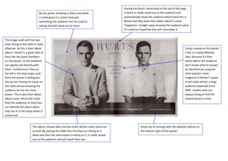
The image used with the two
boys sitting at the table is really
effective. As this is their debut Using a quote on this poster
album I think it’s a great idea to I feel is a really effective
have the two band members idea, because it’s their
on the poster, so the audience debut album the audience
can signify and identify with don’t know what to except
them. Furthermore Theo on so therefore by using the
the left is the lead singer and I most popular music
think the poster is telling you magazine in Britain’s quote
this by him having his hands on it will really attract a large
the table almost showing the audience especially from
audience he has the most NME readers who are
power. This is also their debut always trying to find the
album cover which will really newest band or artist.
help the audience so that they
can identify the album when
they see it in the shops when it
comes out.
The album release date and pre-order details really stand out Good use of synergy with the website address at
as well. By putting the table that the boys are sitting at in the bottom right of the poster.
black and then the information in white on it, it really stands
out to the audience and will catch their eye.