
Recomendados
Mais conteúdo relacionado
Mais procurados
Mais procurados (19)
Destaque
Semelhante a Stages of Production - Double Page Spread Article Design
Semelhante a Stages of Production - Double Page Spread Article Design (20)
Mais de GregoryMcLaney
Mais de GregoryMcLaney (8)
Último
Último (20)
Stages of Production - Double Page Spread Article Design
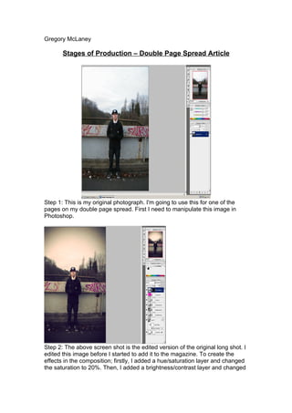
- 1. Gregory McLaney Stages of Production – Double Page Spread Article Step 1: This is my original photograph. I'm going to use this for one of the pages on my double page spread. First I need to manipulate this image in Photoshop. Step 2: The above screen shot is the edited version of the original long shot. I edited this image before I started to add it to the magazine. To create the effects in the composition; firstly, I added a hue/saturation layer and changed the saturation to 20%. Then, I added a brightness/contrast layer and changed
- 2. Gregory McLaney it to 20%. I also added a sepia tint using hue and saturation. Finally, I added a vignette to create a dark hip-hop feel. Step 3: In this next step I added my page number, mast head and date in the bottom left hand corner. I used the original .png file mast head and I used the text tool to add the date. Step 4: Here is the edited main image of graffiti in Photoshop. I edited this
- 3. Gregory McLaney image by adjusting the curves, brightness, contrasts hue and saturation. Plus, I added a vignette to create a grungy feel. This image is going to be used for my right hand page of the double page spread. Step 5: Once I had both images in the composition I decided I needed some typography. So, I added this text from 'dafont.com'. I then added a drop shadow and stroke using blending modes in Photoshop. Once I had done this I inserted it back in to indesign. I then added a flasher in the top right saying 'Impact Sounds' I designed this by using Photoshop brushes to create a paint splash. Once this was done I added the text then placed the image in to indesign and positioned it in the top right with the move tool.
- 4. Gregory McLaney Step 6: In this step of my article production I added the article, which I had previously, wrote. I used white text with a drop shadow so it's readable against any colours. I then added the first letter drop caps and I made it red to stand out even more. I finally added a caption with a red background (using the shape tool) The caption text is 'Myrid Pro', bold italics with a drop shadow. Step 7: In this step I added two shapes in the background of the first image using the shape tool in Photoshop. I also added text with two lines going off the artists. I did all this in Photoshop using the shape and text tools. However, I wasn't happy with this design and thought it didn't fit the genre of hip-hop so I changed it in the following steps.
- 5. Gregory McLaney Step 8: In this step I replaced the small text and shapes with a large text, which has a shadow reflection. To create this effect I put the text in Photoshop and blended it with the ‘exclusion’-blending blending mode. I then flipped the text vertically and made it in to a shadow reflection with the opacity turned down to make it look faded. Finally I added an ocean ripple water filter to make the text look even more like a reflection. Step 9: I felt now that my article was nearly finished it needed to have more of a link between the two images. So, using Photoshop brushes I created various paint splodges with the intentions to place them over my double page article.
- 6. Gregory McLaney Step 10: I placed the paint splodges over the double page article and it created the effect I was looking for. It links with the themes and connotations of the hip-hop genre and it also brings both pages together so they don't look like two separate pages. They're both linked now and it creates an overall better composition. Step 11 (Final Step): Now that my double page spread is almost complete I need to add the writer of the article. So I added 'Writer: Greg McLaney' in the
- 7. Gregory McLaney bottom right. I used 'Myrid pro' font with white and bold. This finished my whole image creating a professional look.