SlideShare uma empresa Scribd logo
1 de 1
Baixar para ler offline
> Why use Tableau?
> Tableau Versions
Learn Data Skills Online at www.DataCamp.com
> Getting started with Tableau
> Visualizing Your First Dataset
> Creating dashboards with Tableau
The Canvas
Upload a dataset to Tableau
Launch Tablea
In the Connect section, under To a File, press on the file format of your choice
For selecting an Excel file, select .xlsx or .xlsx
Creating your first visualization
Once your file is uploaded, open a Worksheet and click on the Data pane on the left-hand sid
Drag and drop at least one field into the Columns section, and one field into the Rows section at the top
of the canva
To add more detail, drag and drop a dimension into the Marks card (e.g. drag a dimension over the color square
in the marks card to color visualization components by that dimension
To a summary insight like a trendline, click on the Analytics pane and drag the trend line into your visualization
You can change the type of visualization for your data by clicking on the Show Me button on the top right
Dashboards are an excellent way to consolidate visualizations and present data to a variety of stakeholders. Here is a
step by step process you can follow to create a dashboard.
When working with Tableau, you will work with Workbooks. Workbooks contain sheets, dashboards, and stories.
Similar to Microsoft Excel, a Workbook can contain multiple sheets. A sheet can be any of the following and can be
accessed on the bottom left of a workbook

Worksheet
A worksheet is a single
view in a workbook. You
can add shelves, cards,
legends, visualizations,
and more in a worksheet

Dashboard
A collection of multiple
worksheets used to
display multiple views
simultaneously

story
A story is a collection of
multiple dashboards and/
or sheets that describe a
data story

There are two main versions of Tableau
Tableau Public
A free version of Tableau that lets you connect to limited
data sources, create visualizations and dashboards, and
publish dashboards online

Tableau Desktop
A paid version of tableau which lets you connect to
all types of data sources, allows you to save work
locally, and unlimited data sizes

> Data Visualizations in Tableau
Tableau provides a wide range of data visualizations to use. Here is a list of the most useful visualizations you
have in Tableau
Launch Tablea
In the Connect section under To A File, press on your desired file typ
Select your fil
Click the New Sheet at the bottom to create a new shee
Create a visualization in the sheet by following the steps in the previous sections of this cheat shee
Repeat steps 4 and 5 untill you have created all the visualizations you want to include in your dashboar
Click the New Dashboard at the bottom of the scree
On the left-hand side, you will see all your created sheets. Drag sheets into the dashboar
Adjust the layout of your sheets by dragging and dropping your visualizations

> Creating stories with Tableau
A story is a collection of multiple dashboards and/or sheets that describe a data story
Click the New Story at the bottom of the scree
Change the size of the story to the desired size in the bottom left-hand corner of the screen under Siz
Edit the title of the story by renaming the story. To do this, right-click on the story sheet at the bottom
and press Renam
A story is made of story points, which lets you cycle through different visualizations and dashboard
To begin adding to the story, add a story point from the left-hand side. You can add a blank story poin
To add a summary text to the story, click Add a caption and summarize the story poin
Add as many story points as you would like to finalize your data story

Bar Charts: Horizontal bars used for comparing specific values across categories (e.g. sales by region)
Stacked Bar Chart: Used to show categorical data within a bar chart (e.g., sales by region and department)

Side-by-Side Bar Chart: Used to compare values across categories in a bar chart format (e.g., sales by
region comparing product types)

Line Charts: Used for looking at a numeric value over time (e.g., revenue over time)

Scatter Plot: Used to identify patterns between two continuous variables (e.g., profit vs. sales volume)

The canvas is where you’ll create data visualizations
Histogram: Used to show a distribution of data (e.g., Distribution of monthly revenue)

Box-and-Whisker Plot: Used to compare distributions between categorical variables (e.g., distribution of
revenue by region)

Heat Map: Used to visualize data in rows and columns as colors (e.g., revenue by marketing channel)

Highlight Table: Used to show data values with conditional color formatting (e.g., site-traffic by marketing
channel and year)

Symbol Map: Used to show geographical data (e.g., Market size opportunity by state)

Map: Used to show geographical data with color formatting (e.g., Covid cases by state)

Treemap: Used to show hierarchical data (e.g., Show how much revenue subdivisions generate relative to
the whole department within an organization)

Dual Combination: Used to show two visualizations within the same visualization (e.g., profit for a store each
month as a bar chart with inventory over time as a line chart)

What is Tableau?
Tableau is a business intelligence tool that allows you to
effectively report insights through easy-to-use
customizable visualizations and dashboards
Easy to use—no coding
involved
Integrates seamlessly with
any data source
Fast and can handle large
datasets
Tableau Basics Cheat Sheet
Tableau for Business Intelligence
Learn Tableau online at www.DataCamp.com
In the sidebar, you’ll find useful panes for working with dat
Data: The data pane on the left-hand side contains all of the fields in the currently selected data sourc
Analytics: The analytics pane on the left-hand side lets you add useful insights like trend lines, error bars,
and other useful summaries to visualizations


When opening a worksheet, you will work with a variety of tools and interfaces
Tableau provides a deep ability to filter, format, aggregate, customize, and highlight specific parts of your data
visualizations
The Sidebar
Tableau Data Definitions
>
>
The Anatomy of a Worksheet
Customizing Visualizations with Tableau
When working with data in Tableau, there are multiple definitions to be mindful o
Fields: Fields are all of the different columns or values in a data source or that are calculated in the
workbook. They show up in the data pane and can either be dimension or measure field
Dimensions: A dimension is a type of field that contains qualitative values (e.g. locations, names, and
departments). Dimensions dictate the amount of granularity in visualizations and help reveal nuanced details
in the data

1. Tableau Canvas: The canvas takes up most of the screen on Tableau and is where you can add visualizations

2. Rows and columns: Rows and columns dictate how the data is displayed in the canvas. When dimensions
are placed, they create headers for the rows or columns while measures add quantitative values  

3. Marks card: The marks card allows users to add visual details such as color, size, labels, etc. to rows and columns.
This is done by dragging fields from the data pane into the marks card  

Once you’ve created a visual, click and drag your mouse over the specific portion you want to highlight
Filtering data with highlights
Right-click on a measure field in the Data pan
Go down to Default properties, Aggregation, and select the aggregation you would like to use
In the Format menu on the top ribbon, press on Select Workbook. This will replace the Data pane and
allow you to make formatting decisions for the Workboo
From here, select the font, font size, and color
Create a visualization by dragging fields into the Rows and Columns section at the top of the scree
Drag dimensions into the Marks field, specifically into the Color squar
To change from the default colors, go to the upper-right corner of the color legend and select Edit Colors. This
will bring up a dialog that allows you to select a different palette
Aggregating data
Changing colors
When data is dragged into the Rows and Columns on a sheet, it is aggregated based on the dimensions in the sheet.
This is typically a summed value. The default aggregation can be changed using the steps below:
Color is a critical component of visualizations. It draws attention to details. Attention is the most important
component of strong storytelling. Colors in a graph can be set using the marks card.
Changing fonts
Fonts can help with the aesthetic of the visualization or help with consistent branding. To change the workbook’s font,
use the following steps
Stories examples in Tableau
Dashboard examples in Tableau
2. Once you let go, you will have the option to Keep Only or Exclude the data
3. Open the Data pane on the side bar. Then, you can drag-and-drop a field into the fitlers card just to the
left of the pane.
Open the Data pane on the left-hand-sid
Drag-and-drop a field you want to filter on and add it to the Filters car
Fill out in the modal how you would like your visuals to be filtered on the data
Filtering data with filters
3. Measures: A measure is a type of field that contains quantitative values (e.g. revenue, costs, and
market sizes). When dragged into a view, this data is aggregated, which is determined by the
dimensions in the view

4. Data types: Every field has a data type which is determined by the type of information it contains.
The available data types in Tableau include text, date values, date & time values, numerical values,
boolean values, geographical values, and cluster groups

Mais conteúdo relacionado

Semelhante a Data camp - Tableau basics cheat sheet.pdf

Excel Graphs Charts
Excel Graphs ChartsExcel Graphs Charts
Excel Graphs Chartssimply_coool
 
Lesson11 working with charts
Lesson11 working with chartsLesson11 working with charts
Lesson11 working with chartsricsanmae
 
Introduction to Microsoft Access2.ppt
Introduction to Microsoft Access2.pptIntroduction to Microsoft Access2.ppt
Introduction to Microsoft Access2.pptJoshCasas1
 
Exp2003 exl ppt_03
Exp2003 exl ppt_03Exp2003 exl ppt_03
Exp2003 exl ppt_03lonetree
 
Datastream charting getting started
Datastream charting   getting startedDatastream charting   getting started
Datastream charting getting startedIta Kamis
 
Introduction to Excel
Introduction to ExcelIntroduction to Excel
Introduction to ExcelNajma Alam
 
excel charts and graphs.ppt
excel charts and graphs.pptexcel charts and graphs.ppt
excel charts and graphs.pptChemOyasan1
 
Creating & Editing Charts In Microsoft Excel 2003
Creating & Editing Charts In Microsoft Excel 2003Creating & Editing Charts In Microsoft Excel 2003
Creating & Editing Charts In Microsoft Excel 2003bud_00
 
03 microsoft office (creating charts)
03 microsoft office (creating charts)03 microsoft office (creating charts)
03 microsoft office (creating charts)benchhood
 
Excel notes by satish kumar avunoori
Excel notes by satish kumar avunooriExcel notes by satish kumar avunoori
Excel notes by satish kumar avunooriSatish Kumar
 
Lesson 16 Working With Charts
Lesson 16   Working With ChartsLesson 16   Working With Charts
Lesson 16 Working With Chartsguevarra_2000
 

Semelhante a Data camp - Tableau basics cheat sheet.pdf (20)

Excel Graphs Charts
Excel Graphs ChartsExcel Graphs Charts
Excel Graphs Charts
 
Tableau data terminology
Tableau   data terminologyTableau   data terminology
Tableau data terminology
 
Lesson11 working with charts
Lesson11 working with chartsLesson11 working with charts
Lesson11 working with charts
 
Introduction to Microsoft Access2.ppt
Introduction to Microsoft Access2.pptIntroduction to Microsoft Access2.ppt
Introduction to Microsoft Access2.ppt
 
Introduction to Microsoft Access2.ppt
Introduction to Microsoft Access2.pptIntroduction to Microsoft Access2.ppt
Introduction to Microsoft Access2.ppt
 
Exp2003 exl ppt_03
Exp2003 exl ppt_03Exp2003 exl ppt_03
Exp2003 exl ppt_03
 
Advanced excel
Advanced excelAdvanced excel
Advanced excel
 
Datastream charting getting started
Datastream charting   getting startedDatastream charting   getting started
Datastream charting getting started
 
Dashboard
DashboardDashboard
Dashboard
 
Introduction to Excel
Introduction to ExcelIntroduction to Excel
Introduction to Excel
 
excell.pdf
excell.pdfexcell.pdf
excell.pdf
 
manual.docx
manual.docxmanual.docx
manual.docx
 
Computer midterms
Computer midtermsComputer midterms
Computer midterms
 
excel charts and graphs.ppt
excel charts and graphs.pptexcel charts and graphs.ppt
excel charts and graphs.ppt
 
excel.ppt
excel.pptexcel.ppt
excel.ppt
 
Creating & Editing Charts In Microsoft Excel 2003
Creating & Editing Charts In Microsoft Excel 2003Creating & Editing Charts In Microsoft Excel 2003
Creating & Editing Charts In Microsoft Excel 2003
 
03 microsoft office (creating charts)
03 microsoft office (creating charts)03 microsoft office (creating charts)
03 microsoft office (creating charts)
 
Excel notes by satish kumar avunoori
Excel notes by satish kumar avunooriExcel notes by satish kumar avunoori
Excel notes by satish kumar avunoori
 
Lesson 16 Working With Charts
Lesson 16   Working With ChartsLesson 16   Working With Charts
Lesson 16 Working With Charts
 
Microsoft Excel Tutorial
Microsoft Excel TutorialMicrosoft Excel Tutorial
Microsoft Excel Tutorial
 

Último

Audience Researchndfhcvnfgvgbhujhgfv.pptx
Audience Researchndfhcvnfgvgbhujhgfv.pptxAudience Researchndfhcvnfgvgbhujhgfv.pptx
Audience Researchndfhcvnfgvgbhujhgfv.pptxStephen266013
 
1:1原版定制伦敦政治经济学院毕业证(LSE毕业证)成绩单学位证书留信学历认证
1:1原版定制伦敦政治经济学院毕业证(LSE毕业证)成绩单学位证书留信学历认证1:1原版定制伦敦政治经济学院毕业证(LSE毕业证)成绩单学位证书留信学历认证
1:1原版定制伦敦政治经济学院毕业证(LSE毕业证)成绩单学位证书留信学历认证dq9vz1isj
 
edited gordis ebook sixth edition david d.pdf
edited gordis ebook sixth edition david d.pdfedited gordis ebook sixth edition david d.pdf
edited gordis ebook sixth edition david d.pdfgreat91
 
Atlantic Grupa Case Study (Mintec Data AI)
Atlantic Grupa Case Study (Mintec Data AI)Atlantic Grupa Case Study (Mintec Data AI)
Atlantic Grupa Case Study (Mintec Data AI)Jon Hansen
 
如何办理英国卡迪夫大学毕业证(Cardiff毕业证书)成绩单留信学历认证
如何办理英国卡迪夫大学毕业证(Cardiff毕业证书)成绩单留信学历认证如何办理英国卡迪夫大学毕业证(Cardiff毕业证书)成绩单留信学历认证
如何办理英国卡迪夫大学毕业证(Cardiff毕业证书)成绩单留信学历认证ju0dztxtn
 
basics of data science with application areas.pdf
basics of data science with application areas.pdfbasics of data science with application areas.pdf
basics of data science with application areas.pdfvyankatesh1
 
Formulas dax para power bI de microsoft.pdf
Formulas dax para power bI de microsoft.pdfFormulas dax para power bI de microsoft.pdf
Formulas dax para power bI de microsoft.pdfRobertoOcampo24
 
如何办理新加坡国立大学毕业证(NUS毕业证)学位证成绩单原版一比一
如何办理新加坡国立大学毕业证(NUS毕业证)学位证成绩单原版一比一如何办理新加坡国立大学毕业证(NUS毕业证)学位证成绩单原版一比一
如何办理新加坡国立大学毕业证(NUS毕业证)学位证成绩单原版一比一hwhqz6r1y
 
2024 Q2 Orange County (CA) Tableau User Group Meeting
2024 Q2 Orange County (CA) Tableau User Group Meeting2024 Q2 Orange County (CA) Tableau User Group Meeting
2024 Q2 Orange County (CA) Tableau User Group MeetingAlison Pitt
 
NOAM AAUG Adobe Summit 2024: Summit Slam Dunks
NOAM AAUG Adobe Summit 2024: Summit Slam DunksNOAM AAUG Adobe Summit 2024: Summit Slam Dunks
NOAM AAUG Adobe Summit 2024: Summit Slam Dunksgmuir1066
 
Easy and simple project file on mp online
Easy and simple project file on mp onlineEasy and simple project file on mp online
Easy and simple project file on mp onlinebalibahu1313
 
一比一原版西悉尼大学毕业证成绩单如何办理
一比一原版西悉尼大学毕业证成绩单如何办理一比一原版西悉尼大学毕业证成绩单如何办理
一比一原版西悉尼大学毕业证成绩单如何办理pyhepag
 
Aggregations - The Elasticsearch "GROUP BY"
Aggregations - The Elasticsearch "GROUP BY"Aggregations - The Elasticsearch "GROUP BY"
Aggregations - The Elasticsearch "GROUP BY"John Sobanski
 
如何办理哥伦比亚大学毕业证(Columbia毕业证)成绩单原版一比一
如何办理哥伦比亚大学毕业证(Columbia毕业证)成绩单原版一比一如何办理哥伦比亚大学毕业证(Columbia毕业证)成绩单原版一比一
如何办理哥伦比亚大学毕业证(Columbia毕业证)成绩单原版一比一fztigerwe
 
Genuine love spell caster )! ,+27834335081) Ex lover back permanently in At...
Genuine love spell caster )! ,+27834335081)   Ex lover back permanently in At...Genuine love spell caster )! ,+27834335081)   Ex lover back permanently in At...
Genuine love spell caster )! ,+27834335081) Ex lover back permanently in At...BabaJohn3
 
The Significance of Transliteration Enhancing
The Significance of Transliteration EnhancingThe Significance of Transliteration Enhancing
The Significance of Transliteration Enhancingmohamed Elzalabany
 
Generative AI for Trailblazers_ Unlock the Future of AI.pdf
Generative AI for Trailblazers_ Unlock the Future of AI.pdfGenerative AI for Trailblazers_ Unlock the Future of AI.pdf
Generative AI for Trailblazers_ Unlock the Future of AI.pdfEmmanuel Dauda
 
Toko Jual Viagra Asli Di Malang 081229400522 COD Obat Kuat Viagra Malang
Toko Jual Viagra Asli Di Malang 081229400522 COD Obat Kuat Viagra MalangToko Jual Viagra Asli Di Malang 081229400522 COD Obat Kuat Viagra Malang
Toko Jual Viagra Asli Di Malang 081229400522 COD Obat Kuat Viagra Malangadet6151
 
ℂall Girls Kashmiri Gate ℂall Now Chhaya ☎ 9899900591 WhatsApp Number 24/7
ℂall Girls Kashmiri Gate ℂall Now Chhaya ☎ 9899900591 WhatsApp  Number 24/7ℂall Girls Kashmiri Gate ℂall Now Chhaya ☎ 9899900591 WhatsApp  Number 24/7
ℂall Girls Kashmiri Gate ℂall Now Chhaya ☎ 9899900591 WhatsApp Number 24/7komalsharmaa480
 

Último (20)

Audience Researchndfhcvnfgvgbhujhgfv.pptx
Audience Researchndfhcvnfgvgbhujhgfv.pptxAudience Researchndfhcvnfgvgbhujhgfv.pptx
Audience Researchndfhcvnfgvgbhujhgfv.pptx
 
1:1原版定制伦敦政治经济学院毕业证(LSE毕业证)成绩单学位证书留信学历认证
1:1原版定制伦敦政治经济学院毕业证(LSE毕业证)成绩单学位证书留信学历认证1:1原版定制伦敦政治经济学院毕业证(LSE毕业证)成绩单学位证书留信学历认证
1:1原版定制伦敦政治经济学院毕业证(LSE毕业证)成绩单学位证书留信学历认证
 
edited gordis ebook sixth edition david d.pdf
edited gordis ebook sixth edition david d.pdfedited gordis ebook sixth edition david d.pdf
edited gordis ebook sixth edition david d.pdf
 
Atlantic Grupa Case Study (Mintec Data AI)
Atlantic Grupa Case Study (Mintec Data AI)Atlantic Grupa Case Study (Mintec Data AI)
Atlantic Grupa Case Study (Mintec Data AI)
 
如何办理英国卡迪夫大学毕业证(Cardiff毕业证书)成绩单留信学历认证
如何办理英国卡迪夫大学毕业证(Cardiff毕业证书)成绩单留信学历认证如何办理英国卡迪夫大学毕业证(Cardiff毕业证书)成绩单留信学历认证
如何办理英国卡迪夫大学毕业证(Cardiff毕业证书)成绩单留信学历认证
 
basics of data science with application areas.pdf
basics of data science with application areas.pdfbasics of data science with application areas.pdf
basics of data science with application areas.pdf
 
Formulas dax para power bI de microsoft.pdf
Formulas dax para power bI de microsoft.pdfFormulas dax para power bI de microsoft.pdf
Formulas dax para power bI de microsoft.pdf
 
如何办理新加坡国立大学毕业证(NUS毕业证)学位证成绩单原版一比一
如何办理新加坡国立大学毕业证(NUS毕业证)学位证成绩单原版一比一如何办理新加坡国立大学毕业证(NUS毕业证)学位证成绩单原版一比一
如何办理新加坡国立大学毕业证(NUS毕业证)学位证成绩单原版一比一
 
2024 Q2 Orange County (CA) Tableau User Group Meeting
2024 Q2 Orange County (CA) Tableau User Group Meeting2024 Q2 Orange County (CA) Tableau User Group Meeting
2024 Q2 Orange County (CA) Tableau User Group Meeting
 
NOAM AAUG Adobe Summit 2024: Summit Slam Dunks
NOAM AAUG Adobe Summit 2024: Summit Slam DunksNOAM AAUG Adobe Summit 2024: Summit Slam Dunks
NOAM AAUG Adobe Summit 2024: Summit Slam Dunks
 
Easy and simple project file on mp online
Easy and simple project file on mp onlineEasy and simple project file on mp online
Easy and simple project file on mp online
 
一比一原版西悉尼大学毕业证成绩单如何办理
一比一原版西悉尼大学毕业证成绩单如何办理一比一原版西悉尼大学毕业证成绩单如何办理
一比一原版西悉尼大学毕业证成绩单如何办理
 
Aggregations - The Elasticsearch "GROUP BY"
Aggregations - The Elasticsearch "GROUP BY"Aggregations - The Elasticsearch "GROUP BY"
Aggregations - The Elasticsearch "GROUP BY"
 
如何办理哥伦比亚大学毕业证(Columbia毕业证)成绩单原版一比一
如何办理哥伦比亚大学毕业证(Columbia毕业证)成绩单原版一比一如何办理哥伦比亚大学毕业证(Columbia毕业证)成绩单原版一比一
如何办理哥伦比亚大学毕业证(Columbia毕业证)成绩单原版一比一
 
Machine Learning for Accident Severity Prediction
Machine Learning for Accident Severity PredictionMachine Learning for Accident Severity Prediction
Machine Learning for Accident Severity Prediction
 
Genuine love spell caster )! ,+27834335081) Ex lover back permanently in At...
Genuine love spell caster )! ,+27834335081)   Ex lover back permanently in At...Genuine love spell caster )! ,+27834335081)   Ex lover back permanently in At...
Genuine love spell caster )! ,+27834335081) Ex lover back permanently in At...
 
The Significance of Transliteration Enhancing
The Significance of Transliteration EnhancingThe Significance of Transliteration Enhancing
The Significance of Transliteration Enhancing
 
Generative AI for Trailblazers_ Unlock the Future of AI.pdf
Generative AI for Trailblazers_ Unlock the Future of AI.pdfGenerative AI for Trailblazers_ Unlock the Future of AI.pdf
Generative AI for Trailblazers_ Unlock the Future of AI.pdf
 
Toko Jual Viagra Asli Di Malang 081229400522 COD Obat Kuat Viagra Malang
Toko Jual Viagra Asli Di Malang 081229400522 COD Obat Kuat Viagra MalangToko Jual Viagra Asli Di Malang 081229400522 COD Obat Kuat Viagra Malang
Toko Jual Viagra Asli Di Malang 081229400522 COD Obat Kuat Viagra Malang
 
ℂall Girls Kashmiri Gate ℂall Now Chhaya ☎ 9899900591 WhatsApp Number 24/7
ℂall Girls Kashmiri Gate ℂall Now Chhaya ☎ 9899900591 WhatsApp  Number 24/7ℂall Girls Kashmiri Gate ℂall Now Chhaya ☎ 9899900591 WhatsApp  Number 24/7
ℂall Girls Kashmiri Gate ℂall Now Chhaya ☎ 9899900591 WhatsApp Number 24/7
 

Data camp - Tableau basics cheat sheet.pdf

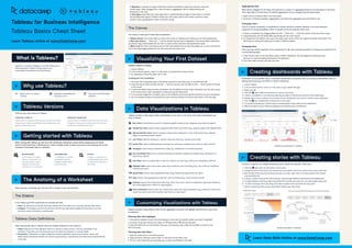
  • 1. > Why use Tableau? > Tableau Versions Learn Data Skills Online at www.DataCamp.com > Getting started with Tableau > Visualizing Your First Dataset > Creating dashboards with Tableau The Canvas Upload a dataset to Tableau Launch Tablea In the Connect section, under To a File, press on the file format of your choice For selecting an Excel file, select .xlsx or .xlsx Creating your first visualization Once your file is uploaded, open a Worksheet and click on the Data pane on the left-hand sid Drag and drop at least one field into the Columns section, and one field into the Rows section at the top of the canva To add more detail, drag and drop a dimension into the Marks card (e.g. drag a dimension over the color square in the marks card to color visualization components by that dimension To a summary insight like a trendline, click on the Analytics pane and drag the trend line into your visualization You can change the type of visualization for your data by clicking on the Show Me button on the top right Dashboards are an excellent way to consolidate visualizations and present data to a variety of stakeholders. Here is a step by step process you can follow to create a dashboard. When working with Tableau, you will work with Workbooks. Workbooks contain sheets, dashboards, and stories. Similar to Microsoft Excel, a Workbook can contain multiple sheets. A sheet can be any of the following and can be accessed on the bottom left of a workbook Worksheet A worksheet is a single view in a workbook. You can add shelves, cards, legends, visualizations, and more in a worksheet Dashboard A collection of multiple worksheets used to display multiple views simultaneously story A story is a collection of multiple dashboards and/ or sheets that describe a data story There are two main versions of Tableau Tableau Public A free version of Tableau that lets you connect to limited data sources, create visualizations and dashboards, and publish dashboards online Tableau Desktop A paid version of tableau which lets you connect to all types of data sources, allows you to save work locally, and unlimited data sizes > Data Visualizations in Tableau Tableau provides a wide range of data visualizations to use. Here is a list of the most useful visualizations you have in Tableau Launch Tablea In the Connect section under To A File, press on your desired file typ Select your fil Click the New Sheet at the bottom to create a new shee Create a visualization in the sheet by following the steps in the previous sections of this cheat shee Repeat steps 4 and 5 untill you have created all the visualizations you want to include in your dashboar Click the New Dashboard at the bottom of the scree On the left-hand side, you will see all your created sheets. Drag sheets into the dashboar Adjust the layout of your sheets by dragging and dropping your visualizations > Creating stories with Tableau A story is a collection of multiple dashboards and/or sheets that describe a data story Click the New Story at the bottom of the scree Change the size of the story to the desired size in the bottom left-hand corner of the screen under Siz Edit the title of the story by renaming the story. To do this, right-click on the story sheet at the bottom and press Renam A story is made of story points, which lets you cycle through different visualizations and dashboard To begin adding to the story, add a story point from the left-hand side. You can add a blank story poin To add a summary text to the story, click Add a caption and summarize the story poin Add as many story points as you would like to finalize your data story Bar Charts: Horizontal bars used for comparing specific values across categories (e.g. sales by region) Stacked Bar Chart: Used to show categorical data within a bar chart (e.g., sales by region and department) Side-by-Side Bar Chart: Used to compare values across categories in a bar chart format (e.g., sales by region comparing product types) Line Charts: Used for looking at a numeric value over time (e.g., revenue over time) Scatter Plot: Used to identify patterns between two continuous variables (e.g., profit vs. sales volume) The canvas is where you’ll create data visualizations Histogram: Used to show a distribution of data (e.g., Distribution of monthly revenue) Box-and-Whisker Plot: Used to compare distributions between categorical variables (e.g., distribution of revenue by region) Heat Map: Used to visualize data in rows and columns as colors (e.g., revenue by marketing channel) Highlight Table: Used to show data values with conditional color formatting (e.g., site-traffic by marketing channel and year) Symbol Map: Used to show geographical data (e.g., Market size opportunity by state) Map: Used to show geographical data with color formatting (e.g., Covid cases by state) Treemap: Used to show hierarchical data (e.g., Show how much revenue subdivisions generate relative to the whole department within an organization) Dual Combination: Used to show two visualizations within the same visualization (e.g., profit for a store each month as a bar chart with inventory over time as a line chart) What is Tableau? Tableau is a business intelligence tool that allows you to effectively report insights through easy-to-use customizable visualizations and dashboards Easy to use—no coding involved Integrates seamlessly with any data source Fast and can handle large datasets Tableau Basics Cheat Sheet Tableau for Business Intelligence Learn Tableau online at www.DataCamp.com In the sidebar, you’ll find useful panes for working with dat Data: The data pane on the left-hand side contains all of the fields in the currently selected data sourc Analytics: The analytics pane on the left-hand side lets you add useful insights like trend lines, error bars, and other useful summaries to visualizations When opening a worksheet, you will work with a variety of tools and interfaces Tableau provides a deep ability to filter, format, aggregate, customize, and highlight specific parts of your data visualizations The Sidebar Tableau Data Definitions > > The Anatomy of a Worksheet Customizing Visualizations with Tableau When working with data in Tableau, there are multiple definitions to be mindful o Fields: Fields are all of the different columns or values in a data source or that are calculated in the workbook. They show up in the data pane and can either be dimension or measure field Dimensions: A dimension is a type of field that contains qualitative values (e.g. locations, names, and departments). Dimensions dictate the amount of granularity in visualizations and help reveal nuanced details in the data 1. Tableau Canvas: The canvas takes up most of the screen on Tableau and is where you can add visualizations 2. Rows and columns: Rows and columns dictate how the data is displayed in the canvas. When dimensions are placed, they create headers for the rows or columns while measures add quantitative values 3. Marks card: The marks card allows users to add visual details such as color, size, labels, etc. to rows and columns. This is done by dragging fields from the data pane into the marks card Once you’ve created a visual, click and drag your mouse over the specific portion you want to highlight Filtering data with highlights Right-click on a measure field in the Data pan Go down to Default properties, Aggregation, and select the aggregation you would like to use In the Format menu on the top ribbon, press on Select Workbook. This will replace the Data pane and allow you to make formatting decisions for the Workboo From here, select the font, font size, and color Create a visualization by dragging fields into the Rows and Columns section at the top of the scree Drag dimensions into the Marks field, specifically into the Color squar To change from the default colors, go to the upper-right corner of the color legend and select Edit Colors. This will bring up a dialog that allows you to select a different palette Aggregating data Changing colors When data is dragged into the Rows and Columns on a sheet, it is aggregated based on the dimensions in the sheet. This is typically a summed value. The default aggregation can be changed using the steps below: Color is a critical component of visualizations. It draws attention to details. Attention is the most important component of strong storytelling. Colors in a graph can be set using the marks card. Changing fonts Fonts can help with the aesthetic of the visualization or help with consistent branding. To change the workbook’s font, use the following steps Stories examples in Tableau Dashboard examples in Tableau 2. Once you let go, you will have the option to Keep Only or Exclude the data 3. Open the Data pane on the side bar. Then, you can drag-and-drop a field into the fitlers card just to the left of the pane. Open the Data pane on the left-hand-sid Drag-and-drop a field you want to filter on and add it to the Filters car Fill out in the modal how you would like your visuals to be filtered on the data Filtering data with filters 3. Measures: A measure is a type of field that contains quantitative values (e.g. revenue, costs, and market sizes). When dragged into a view, this data is aggregated, which is determined by the dimensions in the view 4. Data types: Every field has a data type which is determined by the type of information it contains. The available data types in Tableau include text, date values, date & time values, numerical values, boolean values, geographical values, and cluster groups