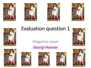
3. Layout Emulates conventional
Sight and Sound
Magazine with logo and
barcode/date boxes in
the same place.
Main image occupies right
side of cover; typical not
only of Sight and Sound but
other magazines too
Cover lines on left of
cover; again typical of
the genre
The title relating to the
main image is larger this is
seen in other examples of
the publication
This ‘plus’ box can be
recognised on other Sight and
Sound magazines.
4. Evaluation of layout
The layout of my magazine cover can be recognised to
conform to the conventions of the Sight and Sound Magazine
as well as other magazines. When compared to my research
findings it can be seen that my magazine cover conforms to
the folowing:
• Main image occupying right side of cover
• Cover lines on the left
• Main line in a bolder/larger font over the image to show a
link/connection
• Use of Sight and Sound logos in traditional place
• The ‘plus’ box appears at the bottom of the cover to
portray its perhaps lower importance. This is seen in other
examples of the Sight and Sound publication.
5. Font
Sans-serif font is bold and easily read;
typical of other titles
Text underneath the title is less bold and of
a different colour which can be seen in
other publications when compared to my
research
Main title is bold
and red; typical of
the Sight and Sound
publication
I emulated the colour choices of
the Sight and Sound magazine
using yellow, black and red font.
The yellow didn’t show up over
this particular image so I created
a partially transparent box.
6. Evaluation of font
Again, my magazine appears to conform to
conventions rather than challenge them in
terms of the font used. This can be evidenced by
the following points:
• I use a sans-serif font
• I follow the red/yellow/black colour theme
• The main title is bold and red, and again sans-
serif
7. Main image
White horse typical of
the genre
Occupies the right side of
the cover; conforming to
conventions
Woodland background
again conforming to the
genre; therefore
conforming to conventions
by being well linked to the
film
Girl is riding horse, with
blonde hair, wearing a
dress making it typical of
the fantasy genre
8. Lexical choices
Linking it back to my research I discovered that
many film magazines use phrases such as “talks
about”, speak of “the making” and frequently
use names. I considered this when creating my
own magazine cover and this can be evidenced
where I have mentioned the “making of” as well
as the phrases “talks about” and “the return of”.
I have also used a lot of names, obviously they
are not recognisable names due to the
independent nature of my trailer.
9. Does my magazine cover conform or
challenge conventions?
From the features that I have analysed it would
appear that my magazine cover conforms to the
conventions of real media products. Although the
main image is somewhat pixelated it still occupies
the right side of the cover and meets genre
conventions also. I follow the colour theme of the
Sight and Sound publication as well as using bold
sans-serif fonts. My lexical choices are typical of the
lexis evidenced on the covers of other magazines
whilst the overall layout again conforms to the
conventions of the Sight and Sound Magazine as
well as other publications.