Inequality
•Transferir como PPTX, PDF•
2 gostaram•1,156 visualizações

Talk by Danny Dorling held at the 21st Century Challenges Conference, Mathematics Institute, University of Oxford, February 7th 2015

Recomendados
Recomendados
Mais conteúdo relacionado
Semelhante a Inequality
Semelhante a Inequality (20)
Mais de Danny Dorling
Mais de Danny Dorling (20)
Último
Último (20)
Inequality
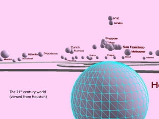
- 1. The 21st century world (viewed from Houston)
- 2. And what about worldwide – ‘top’ universities drawn on a population base
- 3. ‘top’ universities spread over a world where area is proportional to GDP Drawn by Ben Hennig: Unequal Elite: The THE World University Rankings
- 4. http://www.bbc.co.uk/news/world-24866265 But we also live in a physical world, not just a world of GDP, universities, life chances and prizes. And that physical world is changing too. Typhoons are becoming stronger and more frequent. Super Typhoon Haiyan:
- 7. The lights are turning on all the way up the Nile, as people crowd into less and less space …To finish with let’s look at what happens when you take a composite of many satellite images like this and draw them over the map of the planet, but with that map stretched to give everyone equal space so we can see who is wasting light and who is not (or has none)? http://images.nationalgeographic.com/wpf/ media-live/photos/000/620/overrides/new- view-earth-at-night-nile_62008_600x450.jpg
- 8. Cartography by Ben Hennig At the end of 2012 NASA updated its image of the sky at night. Cairo/Alexandria appeared to shine brighter than Tokyo. This map will grow, it needs to become duller. A few years earlier the world map looked like this…
- 9. An image of the world at night taken a few years ago, before the Tsunami hit Japan. Try to spot the four tiny spots of light in NZ and compare them to London… Try to see the world as being made up of people. The vast majority of the planet shrinks away as most land is unoccupied and the wildernesses are vast. Rural populations are already falling and set to fall further. The map of human beings is becoming a map of a sea of cities, and a few people in a few cities consume most.
- 10. But now take away The oceans
- 11. And then you might find you are on the edge of the world again 7 billion people rising to 10 billion in your lifetime
- 12. I don’t think we’ll get to 10 billion. But I don’t think that is what matters most. The planet cannot support 1 billion people behaving badly ?
- 13. Global Inequality 24 of the richest countries of the world (by GDP per capita) which are home to at least two million people, they are home to 13% of the world’s population, and almost 50% of world income (GDP)
- 14. Global Population Japan Germany France Spain UK USA This is a reprojection of the population distribution, showing where most people are living A few countries are highlighted to make it easier to read.
- 15. Global Wealth The world resized according to each country’s gross domestic product Source: modified and updated map from www.worldmapper .org Japan Germany France Spain UK USA
- 16. Inequality in the rich world best-off/worse-off 10% income ratio from UNDP 17.7 Singapore 15.9 United States 15.0 Portugal 13∙8 United Kingdom 13.4 Israel 12.5 Australia 12.5 New Zealand 11.6 Italy 10.3 Spain 10.2 Greece 9.4 Canada 9.4 Ireland 9.2 Netherlands 9.1 France 9.0 Switzerland 8.2 Belgium 8.1 Denmark 7.3 Slovenia 6.9 Austria 6.9 Germany 6.2 Sweden 6.1 Norway 5.6 Finland 4.5 Japan Japan 4∙5 Germany 6∙9 France 9∙1 Spain 10∙3 UK 13∙8 USA 15∙9
- 17. What could be the effects of the effects… of economic inequality We are going to look at Meat consumption Water consumption Waste production Number of Flights Ecological impact in each of the most affluent countries. You might think: "Surely, if a few people hold most of the wealth we all consume less?"
- 18. Inequality and meat 20 40 60 80 100 120 140 160 2 4 6 8 10 12 14 16 18 20 Meatconsumptioninkgperyearperperson Inequality Not if you are concerned about how much meat we farm and consume Japan Germany France Spain UK USA
- 19. Inequality and water 2.0 3.0 4.0 5.0 6.0 7.0 8.0 2 4 6 8 10 12 14 16 18 20 waterinm3peryearperperson Inequality Not if you are concerned about how much water we use (apart from the UK!) Japan Germany France Spain UK USA
- 20. 300 400 500 600 700 800 900 2 4 6 8 10 12 14 16 18 20 Inequality and waste Not if you are concerned about how much waste we each produce Japan Germany France Spain UK USA Inequality Singapore 1100 Municipalwastecollected(kgpercapitaperyear)
- 21. Inequality and flights 0 5 10 15 20 25 30 35 40 2 4 6 8 10 12 14 16 18 20 60 Norway Ireland New Zealand annualaircraftdeparturesperthousandpeople Inequality Not if you are concerned about how many flights we each take (on average) Japan Germany France Spain UK USA Italy Canada
- 22. Inequality and ecology 3 4 5 6 7 8 9 10 11 2 4 6 8 10 12 14 16 18 20Inequality Ecologicalfootprintinglobalhectarespercapita Japan Germany France Spain UK USA Singapore Not if you are concerned about how many planets we might need to exist: An Ecological Footprint of 2.1 global hectares per capita equals one-planet living
- 23. Data sources UNDP/FAO http://www.worldmapper.org/display.php?selected=126 UNDP/LPR http://www.worldmapper.org/display.php?selected=104 UNSD http://unstats.un.org/unsd/ENVIRONMENT/qindicators.htm World Bank World Development Indicators 2005 (IS.AIR.DPRT) WWF Living Planet Index 2008 More and more geographical data is becoming available, often for the first time.
- 24. For many issues (such as Walking and Cycling) How do we compare? Human life on earth