7 New Maps of the World
•
1 gostou•325 visualizações

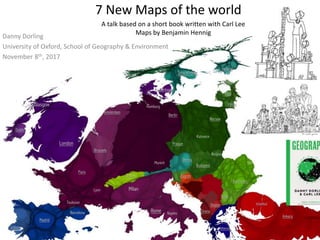
A talk based on a short book written with Carl Lee Maps by Benjamin Hennig Danny Dorling University of Oxford, School of Geography & Environment November 8th, 2017

Recomendados
Mais conteúdo relacionado
Mais procurados
Mais procurados (11)
Semelhante a 7 New Maps of the World
Semelhante a 7 New Maps of the World (20)
Mais de Danny Dorling
Mais de Danny Dorling (20)
Último
Último (20)
7 New Maps of the World
- 1. 7 New Maps of the world Danny Dorling University of Oxford, School of Geography & Environment November 8th, 2017 A talk based on a short book written with Carl Lee Maps by Benjamin Hennig
- 2. This is a map of Europe with area drawn in proportion to population. Each area is shaded by the proportion of people living there not born in the state the region is in (data for 2014).
- 4. Because of differential turnout, a narrow majority of Leave voters lived in the South of England and most were middle class. Areas of high immigration voted to remain (albeit there was a minor ‘change’ effect where areas not used to migration voted leave).
- 5. Old maps in Geography textbooks used to look like this one – area not proportional to anything, but compass directions persevered as straight lines on a flat map.
- 6. So – let’s look at seven new maps of the world starting with - Map 1: Humankind's migration This map shows the migration of humanity across the world based on what we currently know from mitochondrial DNA tracking. The map also shows approximate dates for arrival and dispersal in key locations. The underlying projection shows the relative population density on Earth today, resizing the land area based on the number of people living in each space.
- 7. Map 2: Global connectivity This map is a picture of the maiden voyage of MSC Oscar, which in 2015 was the world's largest container ship: it went from Dalian, China to Rotterdam, Netherlands and is shown here in the context of the most frequent global shipping routes that can be seen in the background shown on an equal-population projection of the world. The projection shows the relative population density on Earth, resizing the land area based on the number of people living in each space.
- 8. Map 3: World's remotest places This map shows the most remote places on the planet, the spaces where a 'lonely planet' can still be found. It shows areas larger, the further it takes to get to them via land travel from the nearest large city. This map and all the others shown in these slides was drawn by Ben Hennig who now works at the University of Iceland – a place that does not look that remote compared to Greenland, or the North of Canada or Tibet, but is if viewed from Europe.
- 9. You can zoom in and in to these maps and they sometimes change shape when you do so – because areas are affected by areas outside of the mapping box – here are the most remote places in Europe and then in the UK and Ireland – the more remote a place the larger it is drawn.
- 10. Map 4: A modern mappa mundi This is a 'mappa mundi' of the modern world: in the map every small area is drawn in proportion to the population that lives there. Oceans are reduced in size to a minimum leaving almost no space between the continents. It shows today's centre of the human planet to lie in India.
- 11. Map 5: Global croplands Feeding a global population of 10 billion is one of the great challenges of the 21st century. This map is drawn to show where the most productive croplands are by increasing the size of those areas that are currently used for farming agricultural produce, while omitting those areas that are less suitable for agriculture or used for other purposes.
- 12. Map 6: Earth at night This shows Earth at night on a population density map. Instead of highlighting the geographical land areas that are shining brightest at night, this map highlights where people live with and without light. The projection shows the relative population density in the world, resizing the land area based on the number of people living in each space.
- 13. Map 7: Global precipitation patterns This map shows the annual precipitation mapped onto a population distribution map. The underlying projection shows the relative population density on Earth today, resizing the land area based on the number of people living in each space.
- 14. If you are interested in more http://www.dannydorling.org/books/betterpolitics/ It’s free