
Recomendados
Mais conteúdo relacionado
Mais procurados
Mais procurados (19)
Destaque
Semelhante a Magazine Cover Design Process
Semelhante a Magazine Cover Design Process (20)
Mais de Preston Manor
Mais de Preston Manor (20)
Magazine Cover Design Process
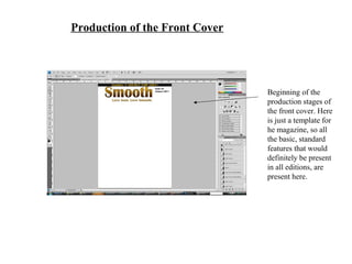
- 1. Production of the Front Cover Beginning of the production stages of the front cover. Here is just a template for he magazine, so all the basic, standard features that would definitely be present in all editions, are present here.
- 2. The picture I had decided would be the main image for my front cover. However, this picture is not perfect, as the artists need to be positioned closer together in order to make them fit into the page and be clearly visible at an ideal range. The background also casts too many and too strong shadows, which does not work well for the front cover.
- 3. The artists have now been cropped out and placed right beside each other, however the artist ‘Denise Greene’ is squished between the other two artists, and this does not bode well for the cover as she is the lead to the group, therefore she requires the most attention and that has to therefore be presented visually.
- 4. The artist ‘Denise Greene’ has now been positioned ideally and placed in front of the other two artists, allowing her to stick out from them, however not to too much of a drastic extent which would make the other two artists stick out too little and make the picture look odd.
- 5. I added effects to the image in order to allow the cover artists to stick out better more vividly from the cover, but also create a far more appealing and aesthetically pleasing look as the artists now look more vibrant and warm, and they even appear to look smoother in tone and complexion, connoting the magazine to a great ambit. The main cover title has also been added, however is looking rather bland at the moment so will be developed upon.
- 6. More cover lines have been added to help finalise the magazine cover. He main cover line has now been highlighted with glow effects, and other standard features such as the barcode has now been added to the cover as well. I am pleased with how it is looking, however I believe there are still many changes in need to be done, in order to finally have an official front cover.
- 7. Final Stage of the Front Cover The final production stage of the main cover. The background has been filtered with a cream/ white gradient as I believed this would convey a more smoother and warmer affect, that would fit in powerfully with the magazine. He presentation of the text has also been shaped and formed around ‘Denise Greene’ in order to not only create a pleasing visual effect, but to also allow her to be highlighted and stick out more clearly, without any of the cover lines being negatively affected or sacrificed.