SlideShare uma empresa Scribd logo
1 de 4
Evaluation:<br />In what ways does your music magazine use, develop or challenge forms and conventions of real music magazines?  <br />My music magazine challenges the conventions of other music magazines because it does not follow the generic conventions. Firstly, I have not chosen any image taken during a studio shoot simply because I find it more interesting when people are interviewed in different environments and so I have done this. <br />I decided to use images I already had instead of setting up a professional photo shoot, simply because of timing issues. My magazine does not typically look like a music magazine and therefore the target audience many not be instantly identified.  I have used mainly medium close ups with one close up for the front cover and two mid shots for the double page spread. <br />I used Photoshop a lot to make the photos look more enhanced and give a brighter, lighter effect. I did not use any costumes/props for my chosen artist since I based the photos around the nature of the double page spread article that was that of a famous artist whilst on her holiday in Thailand. <br />The main article was on an Italian American girl aged 17-20 years old. This could target my audience in a way that members of a similar age would find this interesting and would therefore buy my product. My decision for fonts and styles was to use simplistic fonts that do not clutter the pages. <br />From my research I have found that a variety is important, as it is better for the audience to read and understand. My style of language chosen for my audience is that of a young writer and since they were talking to a young artist the language styles mix. This is to clearly establish an audience age range, which is from 14+. Anyone is welcome to the magazine as it is an easy read. The genre of my magazine is mixed with fashion, world events, music and movies. Titled BeatzTime it is a cross between a modern music magazine and Time magazine as is also reflects on current events. <br />For my front cover I have stuck to the color scheme of green, white, yellow/orange, black and red. The image chosen here has been modified to bring out more vibrant colors and again, with the photography looking non-professional on purpose due to the nature of the article. I have placed all of the text on the left side of the page since the image dominates the right side. The barcode sits on the bottom right corner of the page like a typical magazine and the price sits above it. I have priced my magazine due to the audience research from my audience questionnaire. From my front cover research I have attempted to avoid the “crowded” feel of a typical magazine cover. <br />Overall I have not followed the generic conventions of other music magazines and in doing so, may have slightly misled or confused the audience. However, without having a clear theme advertised on the cover, the audience is intrigued and would take a further look into my magazine since the articles advertised cover more than just music issues. Here for my double page spread I have chosen to credit the author of the article, used fonts which look like they have been hand written, and images which have not been taken professionally. All of this has been intentional to tie in with the Summer theme of my magazine and the nature of the article, that the artist in question was found last minute and out of the blue.My contents page has adopted a more simplistic look such as that of Rock Sound more than NME’s contents pages, which often look cluttered and unclear. I have chosen to use a lot of white for this contents page because it also stands for simplicity. My magazine does not follow the generic conventions of a typical music magazine, perhaps because it does not contain any freebies on the cover, nor does it clearly advertise the genre of the magazine. I prefer to think of it much like Rolling Stone, since it is primarily a music magazine that reaches out to other topics such as film and has made a reputable name in doing so. <br />Looking back at your preliminary task, what do you feel you have learnt in the progression from it to the full product?<br />From looking back at the preliminary task I feel as though I have made some progression through to my final product. I have found that constructing my audience questionnaire was extremely helpful since I could gather from it what to include and what not to include in my magazine. I would not say that I understand the conventions of magazines any better since, however I would agree that the research allowed me to take ideas for my own magazine and I have drawn on previous issues for example the Rock Sound contents page consisted of one main image and limited text which is something I picked up on and used. <br />I have done my best to make my magazine look professional however I do believe that if I had the chance to do it again I would make it look even better and spend more time planning my layout, rather than just getting stuck in. I have advanced in my understanding of the InDesign software, and Photoshop, even though I have used it previously I have learnt new techniques and have found InDesign to be useful software. <br />Since I did not use photographs from an organized shoot I cannot comment on how much I believe I have learnt from it however I can say that my editing skills have progressed nonetheless. <br />Through the use of my settings I have established with an audience who also like to travel and escape their busy lives once in while. That is what the summer issue is all about, escaping the normality’s of everyday life for a few weeks, relaxing and so the magazine will take that into thoughtful consideration. The social groups targeted are students/teenagers/young adults who are interested in a combination of music, films and world affairs. I would relate my magazine to something like Rolling Stone or Rock Sound as they go for simplistic clarity and have major names. <br />What kind of media institution might distribute your media product and why?<br />Distribution companies that may distribute my magazine would be Rock Sound, Rolling Stone, Q Music Magazine, Mojo Music Magazine and Billboard Magazine. This is because I have taken inspiration from all these magazines, the idea for my front cover came from Billboard, my contents page from Rock Sound, the content from Rolling Stone, the bands reviewed from Mojo Music Magazine and the double page spread from Q Music Magazine. Such companies have enough experience in the entertainment industry and worldwide affairs to deal with the complex themes of my magazine. <br /> <br />Who would be the audience for your media product?<br />The core buyer for my magazine would be teenagers, students and young people, of both sexes. In general, anyone who is interested in the topics my magazine cover and enjoy the content and layout of my magazine. I would expect more females than males to be interested however, since the idea of a ‘Summer Themed’ issue is perhaps more feminine, and that the choice for my main feature has been a female artist that has not been portrayed in a way to attract any “extra” male attention. From my audience research I have understood that apart from price and giveaways, male and female audience members generally look for different themes. I would like to think that the audience would consist of male and female readers however one cannot help but realize that the magazine looks as though it was to be targeted at a more female audience. I would like to think my magazine reaches out to reformers more than mainstreamers. <br />How did you attract/address your audience?<br />My main method for audience attraction was through the use of the front cover image. Such a large image would attract an audience and the bright colors are so visually pleasing that readers would be drawn instantly. My language techniques prove to be sharp and to the point, with little discussed on the cover but a lot to offer on the inside. My contents page is simple and informative; as it helps the audience go to where they want to and explains all and more about what is featured on the front cover. I have not used any banners or call-outs since I did not want to produce that type of magazine, even though they are the most typical examples of magazines. By talking about the environment I have targeted a social group of thinkers and young people who take an interest in the environment. By talking about famous artists I have attracted those who are more involved with the mainstream lifestyle, following certain celebrities at their every move. By reviewing bands and following them on live gigs, I have attracted those more suited to a music lifestyle, involved with bands and up-and-coming musical influences. <br />What have you learnt about technologies from the process of constructing this product?<br />For this project I used a variety of programs such as Photoshop and InDesign. I have used Photoshop before however not InDesign. I have found that the two complement each other, which is something I was unaware of before. I used a lot of image enhancement for my images used via Photoshop to make them more appealing and eye-catching for the audience. <br />
Evaluation
Evaluation
Evaluation

Mais conteúdo relacionado

Mais procurados (13)

Kieron's Media evaluation
Kieron's Media evaluationKieron's Media evaluation
Kieron's Media evaluation
 
Katys final evaluation
Katys final evaluation Katys final evaluation
Katys final evaluation
 
Evaluation
EvaluationEvaluation
Evaluation
 
Evaluation
EvaluationEvaluation
Evaluation
 
Media evaluation questions
Media evaluation questionsMedia evaluation questions
Media evaluation questions
 
Evaluation
EvaluationEvaluation
Evaluation
 
Presentation1 Evaluation
Presentation1 EvaluationPresentation1 Evaluation
Presentation1 Evaluation
 
Media evaluation task
Media evaluation taskMedia evaluation task
Media evaluation task
 
My evaluation
My evaluationMy evaluation
My evaluation
 
Final full evalation. [autosaved]
Final full evalation. [autosaved]Final full evalation. [autosaved]
Final full evalation. [autosaved]
 
Full evalation.
Full evalation.Full evalation.
Full evalation.
 
AS Media Final Evaluation
AS Media  Final EvaluationAS Media  Final Evaluation
AS Media Final Evaluation
 
Evaluation powerpoint
Evaluation powerpointEvaluation powerpoint
Evaluation powerpoint
 

Destaque

Pbs go presentación exposición
Pbs go presentación exposiciónPbs go presentación exposición
Pbs go presentación exposición
minusjohannabal
 
Contents page analysis
Contents page analysisContents page analysis
Contents page analysis
EloiseMackreth
 
Web version polling
Web version pollingWeb version polling
Web version polling
Mike Walsh
 
Automatic transmission dodge
Automatic transmission dodgeAutomatic transmission dodge
Automatic transmission dodge
Marcos Menezes
 
Generic polling pres.
Generic polling pres.Generic polling pres.
Generic polling pres.
Mike Walsh
 

Destaque (13)

Pbs go presentación exposición
Pbs go presentación exposiciónPbs go presentación exposición
Pbs go presentación exposición
 
Final
FinalFinal
Final
 
Final4
Final4Final4
Final4
 
Contents page analysis
Contents page analysisContents page analysis
Contents page analysis
 
Final3
Final3Final3
Final3
 
Web version polling
Web version pollingWeb version polling
Web version polling
 
Venta directa
Venta directaVenta directa
Venta directa
 
Final
FinalFinal
Final
 
Automatic transmission dodge
Automatic transmission dodgeAutomatic transmission dodge
Automatic transmission dodge
 
Generic polling pres.
Generic polling pres.Generic polling pres.
Generic polling pres.
 
Final2
Final2Final2
Final2
 
SOA Based Enterprise Mobility Solution - whitepaper
SOA Based Enterprise Mobility Solution -  whitepaperSOA Based Enterprise Mobility Solution -  whitepaper
SOA Based Enterprise Mobility Solution - whitepaper
 
Vision 2020 + Legacy Fort Wayne
Vision 2020 + Legacy Fort WayneVision 2020 + Legacy Fort Wayne
Vision 2020 + Legacy Fort Wayne
 

Semelhante a Evaluation (20)

Media evaluation pdf
Media evaluation pdfMedia evaluation pdf
Media evaluation pdf
 
Maria Presentation1 Mediaaaa
Maria Presentation1 MediaaaaMaria Presentation1 Mediaaaa
Maria Presentation1 Mediaaaa
 
Evaluation
EvaluationEvaluation
Evaluation
 
Music Magazne
Music MagazneMusic Magazne
Music Magazne
 
Evaluation
EvaluationEvaluation
Evaluation
 
Media Evaluation tom standen
Media Evaluation tom standenMedia Evaluation tom standen
Media Evaluation tom standen
 
Evaluation
EvaluationEvaluation
Evaluation
 
Evaluation
EvaluationEvaluation
Evaluation
 
Evaluation
EvaluationEvaluation
Evaluation
 
Evaluation
EvaluationEvaluation
Evaluation
 
Music evaluation
Music evaluationMusic evaluation
Music evaluation
 
Music evaluation
Music evaluationMusic evaluation
Music evaluation
 
Evaluation
EvaluationEvaluation
Evaluation
 
Evaluation
EvaluationEvaluation
Evaluation
 
Evaluation
EvaluationEvaluation
Evaluation
 
Media evaluation
Media evaluation Media evaluation
Media evaluation
 
Evaluation
EvaluationEvaluation
Evaluation
 
Evaluation
EvaluationEvaluation
Evaluation
 
Evaluation
EvaluationEvaluation
Evaluation
 
Evaluation
Evaluation Evaluation
Evaluation
 

Mais de EloiseMackreth (19)

Other Images
Other ImagesOther Images
Other Images
 
Preliminary Photos
Preliminary PhotosPreliminary Photos
Preliminary Photos
 
Shots, Editing & Contact Detials
Shots, Editing & Contact DetialsShots, Editing & Contact Detials
Shots, Editing & Contact Detials
 
Shots & Editing
Shots & EditingShots & Editing
Shots & Editing
 
Preliminary Task
Preliminary TaskPreliminary Task
Preliminary Task
 
Preliminary Task
Preliminary TaskPreliminary Task
Preliminary Task
 
Flat Plan
Flat PlanFlat Plan
Flat Plan
 
Final
FinalFinal
Final
 
Mood Board
Mood BoardMood Board
Mood Board
 
Contents page mock up
Contents page mock upContents page mock up
Contents page mock up
 
Double page spread mock up
Double page spread mock upDouble page spread mock up
Double page spread mock up
 
Mock up front cover
Mock up front coverMock up front cover
Mock up front cover
 
Mind map
Mind mapMind map
Mind map
 
Double page spread analysis
Double page spread analysisDouble page spread analysis
Double page spread analysis
 
Front cover analysis
Front cover analysisFront cover analysis
Front cover analysis
 
Evaluation + research for prelimenary task
Evaluation + research for prelimenary taskEvaluation + research for prelimenary task
Evaluation + research for prelimenary task
 
Evaluation + research for prelimenary task
Evaluation + research for prelimenary taskEvaluation + research for prelimenary task
Evaluation + research for prelimenary task
 
Cover (repaired)
Cover (repaired)Cover (repaired)
Cover (repaired)
 
Cover (repaired)
Cover (repaired)Cover (repaired)
Cover (repaired)
 

Evaluation

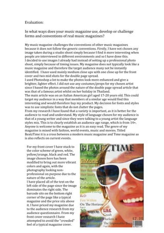
  • 1. Evaluation:<br />In what ways does your music magazine use, develop or challenge forms and conventions of real music magazines?  <br />My music magazine challenges the conventions of other music magazines because it does not follow the generic conventions. Firstly, I have not chosen any image taken during a studio shoot simply because I find it more interesting when people are interviewed in different environments and so I have done this. <br />I decided to use images I already had instead of setting up a professional photo shoot, simply because of timing issues. My magazine does not typically look like a music magazine and therefore the target audience many not be instantly identified. I have used mainly medium close ups with one close up for the front cover and two mid shots for the double page spread. <br />I used Photoshop a lot to make the photos look more enhanced and give a brighter, lighter effect. I did not use any costumes/props for my chosen artist since I based the photos around the nature of the double page spread article that was that of a famous artist whilst on her holiday in Thailand. <br />The main article was on an Italian American girl aged 17-20 years old. This could target my audience in a way that members of a similar age would find this interesting and would therefore buy my product. My decision for fonts and styles was to use simplistic fonts that do not clutter the pages. <br />From my research I have found that a variety is important, as it is better for the audience to read and understand. My style of language chosen for my audience is that of a young writer and since they were talking to a young artist the language styles mix. This is to clearly establish an audience age range, which is from 14+. Anyone is welcome to the magazine as it is an easy read. The genre of my magazine is mixed with fashion, world events, music and movies. Titled BeatzTime it is a cross between a modern music magazine and Time magazine as is also reflects on current events. <br />For my front cover I have stuck to the color scheme of green, white, yellow/orange, black and red. The image chosen here has been modified to bring out more vibrant colors and again, with the photography looking non-professional on purpose due to the nature of the article. I have placed all of the text on the left side of the page since the image dominates the right side. The barcode sits on the bottom right corner of the page like a typical magazine and the price sits above it. I have priced my magazine due to the audience research from my audience questionnaire. From my front cover research I have attempted to avoid the “crowded” feel of a typical magazine cover. <br />Overall I have not followed the generic conventions of other music magazines and in doing so, may have slightly misled or confused the audience. However, without having a clear theme advertised on the cover, the audience is intrigued and would take a further look into my magazine since the articles advertised cover more than just music issues. Here for my double page spread I have chosen to credit the author of the article, used fonts which look like they have been hand written, and images which have not been taken professionally. All of this has been intentional to tie in with the Summer theme of my magazine and the nature of the article, that the artist in question was found last minute and out of the blue.My contents page has adopted a more simplistic look such as that of Rock Sound more than NME’s contents pages, which often look cluttered and unclear. I have chosen to use a lot of white for this contents page because it also stands for simplicity. My magazine does not follow the generic conventions of a typical music magazine, perhaps because it does not contain any freebies on the cover, nor does it clearly advertise the genre of the magazine. I prefer to think of it much like Rolling Stone, since it is primarily a music magazine that reaches out to other topics such as film and has made a reputable name in doing so. <br />Looking back at your preliminary task, what do you feel you have learnt in the progression from it to the full product?<br />From looking back at the preliminary task I feel as though I have made some progression through to my final product. I have found that constructing my audience questionnaire was extremely helpful since I could gather from it what to include and what not to include in my magazine. I would not say that I understand the conventions of magazines any better since, however I would agree that the research allowed me to take ideas for my own magazine and I have drawn on previous issues for example the Rock Sound contents page consisted of one main image and limited text which is something I picked up on and used. <br />I have done my best to make my magazine look professional however I do believe that if I had the chance to do it again I would make it look even better and spend more time planning my layout, rather than just getting stuck in. I have advanced in my understanding of the InDesign software, and Photoshop, even though I have used it previously I have learnt new techniques and have found InDesign to be useful software. <br />Since I did not use photographs from an organized shoot I cannot comment on how much I believe I have learnt from it however I can say that my editing skills have progressed nonetheless. <br />Through the use of my settings I have established with an audience who also like to travel and escape their busy lives once in while. That is what the summer issue is all about, escaping the normality’s of everyday life for a few weeks, relaxing and so the magazine will take that into thoughtful consideration. The social groups targeted are students/teenagers/young adults who are interested in a combination of music, films and world affairs. I would relate my magazine to something like Rolling Stone or Rock Sound as they go for simplistic clarity and have major names. <br />What kind of media institution might distribute your media product and why?<br />Distribution companies that may distribute my magazine would be Rock Sound, Rolling Stone, Q Music Magazine, Mojo Music Magazine and Billboard Magazine. This is because I have taken inspiration from all these magazines, the idea for my front cover came from Billboard, my contents page from Rock Sound, the content from Rolling Stone, the bands reviewed from Mojo Music Magazine and the double page spread from Q Music Magazine. Such companies have enough experience in the entertainment industry and worldwide affairs to deal with the complex themes of my magazine. <br /> <br />Who would be the audience for your media product?<br />The core buyer for my magazine would be teenagers, students and young people, of both sexes. In general, anyone who is interested in the topics my magazine cover and enjoy the content and layout of my magazine. I would expect more females than males to be interested however, since the idea of a ‘Summer Themed’ issue is perhaps more feminine, and that the choice for my main feature has been a female artist that has not been portrayed in a way to attract any “extra” male attention. From my audience research I have understood that apart from price and giveaways, male and female audience members generally look for different themes. I would like to think that the audience would consist of male and female readers however one cannot help but realize that the magazine looks as though it was to be targeted at a more female audience. I would like to think my magazine reaches out to reformers more than mainstreamers. <br />How did you attract/address your audience?<br />My main method for audience attraction was through the use of the front cover image. Such a large image would attract an audience and the bright colors are so visually pleasing that readers would be drawn instantly. My language techniques prove to be sharp and to the point, with little discussed on the cover but a lot to offer on the inside. My contents page is simple and informative; as it helps the audience go to where they want to and explains all and more about what is featured on the front cover. I have not used any banners or call-outs since I did not want to produce that type of magazine, even though they are the most typical examples of magazines. By talking about the environment I have targeted a social group of thinkers and young people who take an interest in the environment. By talking about famous artists I have attracted those who are more involved with the mainstream lifestyle, following certain celebrities at their every move. By reviewing bands and following them on live gigs, I have attracted those more suited to a music lifestyle, involved with bands and up-and-coming musical influences. <br />What have you learnt about technologies from the process of constructing this product?<br />For this project I used a variety of programs such as Photoshop and InDesign. I have used Photoshop before however not InDesign. I have found that the two complement each other, which is something I was unaware of before. I used a lot of image enhancement for my images used via Photoshop to make them more appealing and eye-catching for the audience. <br />