UI Origin
•Transferir como PPTX, PDF•
1 gostou•563 visualizações

Have you ever wondered where did our digital UI language/s come from? This PPT is the untold story of how modern GUI came to be and how's behind it. (**download to view notes embedded in the slides...)

Recomendados
Mais conteúdo relacionado
Destaque
Destaque (17)
Semelhante a UI Origin
Semelhante a UI Origin (20)
Último
Último (20)
UI Origin
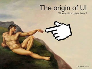
- 1. The origin of UI Where did it come from ? Udi Waizer, 2013
- 2. HUMANITY is the only species on earth which uses visual imagery as a method of COMMUNICATION
- 3. + = Sailor + = Hunter = = Eons before we developed verbal abilities and languages, we were already mastering the basic rule of ‘an image is worth a thousand words’
- 4. icons
- 6. Our innovative progression is motivated by examining our surrounding world and adopting physics & biology best practices.
- 7. DANGER
- 8. AND THEN IT HAPPEND the first graphic digital display came to be and humanity went back to square one
- 11. = Tools
- 13. YOUR MISSION perform a simple task in a short amount of time be efficient YOUR TOOL
- 15. YOUR MISSION develop a software with a nice UI simple to use WITH THIS TOOL
- 18. WE NEED A HERO! …well…more like 3 heroes …
- 20. Ask Analyze Verify BuildIdea Prototype Launch Test Analyze Refine/Fix The Practice UXFeedback Process+ +
- 21. USABLE UI DESIGN PRINCIPLES That and more on the next PPT…
Notas do Editor
- No, this is not me dismissing the entire array of animals on the planet who use cool courting rituals or behavioral communication based on color and objects;Humanity developed a much more profound and rich language which with we are able to describe instructions, ideas and thought processes or in short – communicate!
- Earliest caveman drawings, dating back over 15,000 years clearly show how advanced visual perception and iconic vocabulary evolution.Even then, with limited tools and materials we rose above all other species with our visual edge.First icons where born, turning into murals, and full blown scenes and scenarios with consistent simplicity.
- Out first languages on the face of the earth, all started as series of…icons!
- Later in history, as our intelligence, society, tools and materials evolved so did out visual language.Out visual interfaces became more advanced and complex and many different “UI languages” supported them all.
- In the same way that we have adopted the material 3D world around us to our day to day lives…
- So did we align with nature and physics on our visual language.
- 1958, SAGE (Semi-Automatic Ground Environment) - linked hundreds of radar stations in the United States and Canada in the first large-scale computer communications network. An operator directed actions by touching a light gun to the screen.1974, Researchers at the Xerox Palo Alto Research Center designed the Alto — the first work station with a built-in mouse for input.1972, The Apple II1984, Apple Computer launched the Macintosh, the first successful mouse-driven computer with a graphic user interface.
- These golden years took us back almost 15,000 years.Back to that old puzzle, the sacred art of iconography and simplicity but this time, instead of a stone-canvas with had a digital screen full of pixels. Oh yes, one more thing – the mural had become an interactive tool!So how do you teach humanity to talk with this interactive & productive mural?How do you associate between the real world and the virtual one?
- You associate!It’s quite simple really – familiarity reduces insecurity; and we needed more then a handful taking our first steps into HCI (human computer interaction).Scrolling, files, folders, trash and file-systems where all visual associations of our tangible world – we simply used objects as icons and object operations as digital interactions.
- The computer was never meant to be a mural; every computer ever built had the purpose of either being used as a tool or a tool-box. Applications are our tool sets of our today’s and tomorrows digital world.
- So how far can we go?Where do we draw the line (if at all) between making our suites rich and keep our users…happy?There is a point where a great tool becomes too complicated but how can you recognize that tipping point and if you can, what would be your next step?
- Users in big companies are confronted each day with software that runs all or parts of their company.They each have a function and based on that function a set of tasks to perform, some of which have to do with a tool…
- Imagine this interface in English…do you feel it will be simpler to understand then…?There is order here, iconography and UI principles are what this screen is all about but…could you get from point A to point B on your own?
- Funny enough, software UI developers (those who built the previous UI) are confronted each day with the exact same mind dazzling problem…
- Looking at the tools we use to build other tools - is it really that surprising our user-interfaces suck?!Technology was there first!The first computer had no display, early software was all about getting the tool to work…the “look nice” came in second.We’re not fully recovered from that era but we’re getting much better!
- Now here’s what “bad UI” mean:Users are frustrated working with your interfaceYou suffer from bad reputation when benchmarked against competition.You may say “oh well” but there is one thing that your customers and management care about most of all – TCO!When you need classes to teach people how to work with your software, the cost of owning your software goes up and becomes less attractive to your customers.You lose sales to competition and…well…you get the picture.Bugs on UX and bugs in code are both bad for business in the App-Store era; people may excuse a technical bug or two when the app is usable, failing on both too often might get you out of the game.
- Yes, we need marketing, sales, legal and senior management too but at the core of each good product we have the top tri and the people they serve (i.e. users).There is no single superhero to save us all, it’s the collaboration between design, build and product strategy that can produce a solid tool.Add a dash of user-centric approach and you are a winner!
- The product life cycle may vary from company to company, one thing stays the same – user centric touch points.The only way to achieve a usable product build is by highlighting the points of UX across the project.Call it design-led-innovation, usability, simplicity or good-UI – user experience involvement and awareness in every project is the route to victory!