Habits of Effective Designers - Handout
•
0 gostou•762 visualizações

PDF handout to accompany to presentation

Recomendados
Recomendados
Mais conteúdo relacionado
Mais procurados
Mais procurados (20)
Destaque
Destaque (13)
Semelhante a Habits of Effective Designers - Handout
Semelhante a Habits of Effective Designers - Handout (20)
Mais de DUSPviz
Mais de DUSPviz (20)
Último
Último (20)
Habits of Effective Designers - Handout
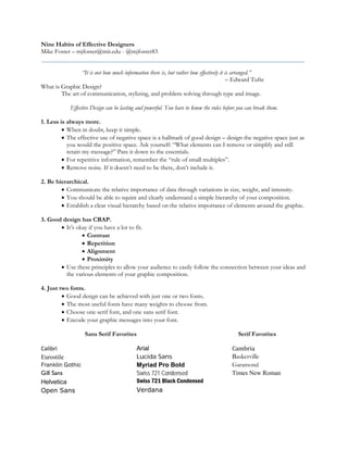
- 1. Nine Habits of Effective Designers Mike Foster – mjfoster@mit.edu - @mjfoster83 “It is not how much information there is, but rather how effectively it is arranged.” – Edward Tufte What is Graphic Design? The art of communication, stylizing, and problem solving through type and image. Effective Design can be lasting and powerful. You have to know the rules before you can break them. 1. Less is always more. • When in doubt, keep it simple. • The effective use of negative space is a hallmark of good design – design the negative space just as you would the positive space. Ask yourself: “What elements can I remove or simplify and still retain my message?” Pare it down to the essentials. • For repetitive information, remember the “rule of small multiples”. • Remove noise. If it doesn’t need to be there, don’t include it. 2. Be hierarchical. • Communicate the relative importance of data through variations in size, weight, and intensity. • You should be able to squint and clearly understand a simple hierarchy of your composition. • Establish a clear visual hierarchy based on the relative importance of elements around the graphic. 3. Good design has CRAP. • It’s okay if you have a lot to fit. • Contrast • Repetition • Alignment • Proximity • Use these principles to allow your audience to easily follow the connection between your ideas and the various elements of your graphic composition. 4. Just two fonts. • Good design can be achieved with just one or two fonts. • The most useful fonts have many weights to choose from. • Choose one serif font, and one sans serif font. • Encode your graphic messages into your font. Sans Serif Favorites Serif Favorites Calibri Eurostile Franklin Gothic Gill Sans Helvetica Open Sans Arial Lucida Sans Myriad Pro Bold Swiss 721 Condensed Swiss 721 Black Condensed Verdana Cambria Baskerville Garamond Times New Roman
- 2. 5. Magic number 12. • The human mind looks for natural proportions of 2, 3, and 4. • As the least common denominator, 12 is an extremely useful number for column layout, and it’s a good point size multiple for fonts. • Rule of thumb for prose and text blocks, text should be no more than 60 characters wide. • Print graphics: use no smaller than 6 point • Screen-based graphics: use no smaller than 10 point 6. Imitate. (But don’t copy.) • Beg, borrow – but don’t steal – ideas for beautiful logos, graphics, and graphics from experienced and respected designers. • One of the best ways to learn. Over time you will see what you like, and your own style will emerge. 7. Be color conscious. • Like a well-written paragraph, each graphic should have a singular message. Use color in a consistent manner to create a coherent and complete message for your graphic composition. • Use color and contrast to highlight differences. • Color often helps form the first impression of your design composition, and sometimes the first impression is the lasting impression. • Color encodes implied meaning and bias. Be aware of the unintentional meanings. 8. Don’t go off the grid. • Effective graphics follow strict principles of alignment, justification, and position. • Layout matters: grid your design for a clean and professional finish. • Create a template that you can use and refer to moving forward. • Visual center of the page is slightly higher than the geometric center. 9. Design at size. • Layout your graphics at the proper size before you proceed with your creation process. • Goal: Never scale your graphics up or down. Links and Resources Color Adobe Color CC – http://color.adobe.com Color Hex – http://www.color-hex.com Color Scheme Designer – http://colorschemedesigner.com Color Brewer – http://www.colorbrewer.org Color Palette Generator – http://www.degraeve.com/color-palette/ HCL Picker – http://tristen.ca/hcl-picker Typography and Font Google Fonts – http://www.google.com/fonts Typography Deconstructed – http://www.typographydeconstructed.com/ What the font?! – http://www.myfonts.com/WhatTheFont/ Fantastic Fonts (Plato Web Design) – http://platowebdesign.com/articles/fonts/ CSS Font Stack – http://www.cssfontstack.com Design blogs/Influencers/Prominent Design-related Media Francesco Franchi, About information design/data visualization. 2013 – http://www.ffran.ch/id.pdf Additional Readings Robert Bringhurst, Elements of Typographic Style, Second Edition. 2002. Edward Tufte, Envisioning Information. 1990. Edward Tufte, The Visual Display of Quantitative Information, Second Edition. 2001. Donald A. Norman, The Design of Everyday Things, Second Edition. 2013.