
Recomendados
Mais conteúdo relacionado
Mais procurados
Mais procurados (14)
Destaque
Destaque (20)
Semelhante a WOMEN emma
Semelhante a WOMEN emma (20)
Mais de DB3igs
Mais de DB3igs (20)
Último
Último (20)
WOMEN emma
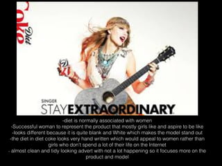
- 1. -diet is normally associated with women -Successful woman to represent the product that mostly girls like and aspire to be like -looks different because it is quite blank and White which makes the model stand out -the diet in diet coke looks very hand written which would appeal to women rather than girls who don't spend a lot of their life on the Internet - almost clean and tidy looking advert with not a lot happening so it focuses more on the product and model
- 2. -motivational and feminist which appeals to women -healthy food and weight loss is usually associated due to todays societies expectations -bold colours that stand out against the background as if the product makes the ordinary outstanding. -clear font that emphasises the confidence achieved by trying the product. -colours are less appealing to women but the model chosen is a confident happy woman which will Make them want to buy it to feel the same
- 3. -colours are very feminine shades such as pink and purple -the font of the product is bold and looks like it would appeal to girls more than boys -good looking model that makes the product look better than it actually is due to photoshop and editing programs
- 4. -classically feminin colours such as pink purple and red are used a lot -a mum is referred to proving it is for women of her age and the model looks happy to be wearing it and confident in it which would make women want to buy it to feel the same way -the font is very girly and thin and not too bold or demanding and very handwritten which would appeal to women rathe than girls
- 5. -expensive looking furniture which would appeal to older more Successful people than young adults and teenagers -female model of around the same age as target audience possibly slightly younger and she looks like a very confident successful person which some women like in their style. -women's clothing scattered around and the colours are very subtle and formal which older women would like as they get less interested in bright adverts young adults and teenagers would like and like things more classy. -font is bold and stands out against the background
- 6. -confident woman for a model that's attracted the attention of a man which implies you will get the same if you wear the perfume which women will like -they use very dark formal colours for older richer audiences than young adults -the slogan is 'secret code for women' which supports the idea that it is for women and men can buy it for their wife/ girlfriend
- 7. -it is usually mums at home that cook and they are associated with healthy eating and cooking -in the advert their is a man giving a woman a balloon made of salad -the font is very handwritten and scrawled which would appeal to older women who use less technology than the younger generation
- 8. -advert for handbags which is classically a woman's accessory -the model is a woman of a similar age to the target audience -the model looks very rich and formal due to the jewels in her headband and earrings which women aspire to be like so if you had one of the handbags you would look very successful.
- 9. -minis are quite a feminine car due to their size and shape compared to other cars -if they have children it would appeal to them because of the Star Wars theme and they would pester their mum to buy it
- 10. -it has 30% less fat and is healthy which is usually associated with women more than men -very simple design for a household product that mums would buy so it doesn't need to be over-exaggerated