Evaluation questions.docx
•Transferir como PPTX, PDF•
0 gostou•64 visualizações

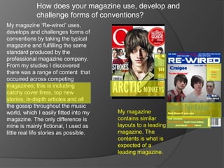
My magazine takes typical magazine conventions like catchy headlines, articles, and gossip, and fulfills expectations of layout and content from a professional publication. Photos were improved using Photoshop to better represent the music industry. A patriotic design in red, white, and blue uses teaser lines and banners to draw in readers, presenting a magazine that could stand alongside leading publications.

Recomendados
Mais conteúdo relacionado
Mais procurados
Mais procurados (17)
Destaque
Destaque (12)
Semelhante a Evaluation questions.docx
Semelhante a Evaluation questions.docx (20)
Mais de Craig Hunt
Último
Último (20)
Evaluation questions.docx
- 1. How does your magazine use, develop and challenge forms of conventions? My magazine ‘Re-wired’ uses, develops and challenges forms of conventions by taking the typical magazine and fulfilling the same standard produced by the professional magazine company. From my studies I discovered there was a range of content that occurred across competing magazines; this is including catchy cover lines, top new stories, in-depth articles and all the gossip throughout the music world, which I easily fitted into my My magazine magazine. The only difference is contains similar mine is mainly fictional, I used as layouts to a leading little real life stories as possible. magazine. The contents is what is expected of a leading magazine.
- 2. The magazine includes a selection of images, this has developed from taking poor pictures with an irrelevant background to pictures where the scene is set, the costumes fit the genre of the magazine. When needed I was able to put techniques and abilities of using Photoshop to alter things. I tried to represent this on the double page, using the snow to my benefits getting some good shots to show the extravagant shots the professional photographers would get for Q and NME. This was also show where as I This image shows no wanted the effect of a concert so I had to relevance to the edit it in to the best of my abilities; this was music industry. quite difficult as I was a complete novice to Photoshop before I started media. This is the out come of my attempt at photo-shop.
- 3. My magazine would be able to go up along side a leading magazine like Q as it has the same sort of practicality, I have stuck to a very strong house style of red, blue and white, give it a very patriotic feel, this sets a fairly indie feel to it giving the impression of ‘best of British’ this would also then attract the American audience as they generally enjoy stereotypical jolly old England. I have also used teaser cover lines to introduce bands that will be influencing the weekly read. Banner’s are used as they are eye catching and they lay right on the route of the eye so I have including more interesting information to grab the reader. A patriotic feel could give the impression it is much better than another magazine, it shows real strength.