Cocoon Group Case Study Rich Fruit Puree for kids (Russia)
•
2 gostaram•1,645 visualizações

This is a case study showing how we approached packaging design for fruit puree sold in pouches. We think it looks great! Plus our client, Multon Russia, is reporting very good sales results and that's what counts, yey!

Recomendados
Recomendados
Mais conteúdo relacionado
Mais de Cocoon Group Branding
Mais de Cocoon Group Branding (20)
Último
Último (20)
Cocoon Group Case Study Rich Fruit Puree for kids (Russia)
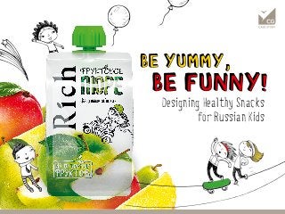
- 1. Designing Healthy Snacks for Russian Kids
- 2. Rich - high quality fruit juices - when launched in 2002 went against stereotype of how Russian premium should look (golden, ornamental…). Its stylish packag- ing featuring laconic modern visual style with bright colours and appetising fruits has been a breakthrough. Multon (part of The Coca-Cola Company) successfully addressed young urban consumers valuing new experiences and outstanding impres- sions, and actually created the segment of the up-market juices. Being a pioneer in its category in Russia Rich has always strived for innovation which is why in 2007 they were the first Russian producer to launch a healthy snack in convenient pouches – Rich Fruit Mix 200g – promising consumers a feeling of well being on the go. diverse enjoyi ng life creative 10 year anniversary design by Cocoon Group current design 2002initialdesign 2012
- 3. kindness new experiences generosity enjoyment safe choice active fun At the beginning of 2013 Rich came to CG with an idea to create a new version of Rich Fruit Mix to more appropriately address pro- spective group of children and teenagers, yet keep the yuppies in the game as a secondary target. We had to think of playful, friendly, but still laconic design, i.e. not too childish. Actually exciting design challenge appeared, when Multon took into consideration two different brands – premium Rich and value-for- money Dobry. Same substance,but different positioningSame substance,
- 4. We cranked up creative engines and explored many ways of creating appetising and playful design. Starting with doodles and visual references gave us the freedom to think out of the pouch and develop beautiful yet relevant to the brand position- ing concepts. Rich appetising fruit brand recognition playful friendly vivid Dobry Be fresh, be playfulBe fresh, be playful
- 5. Finally it was time to fine-tune the concept, in which we put together tasty fruit images and lovely cool doodles depicting a kid’s world, and launch it under the Rich brand. It is now more powerful in assuring mothers about the high quality, and making the product attrac- tive to kids. Moreover, it has been still relevant to young urban people, and , and last but not least, it perfectly matches the product positioning built on a masterful mix of fruits. And the winner is...And the winner is...
- 6. Inspirational brand linked with fun and active life enjoyment had followed its essence and extended the brand experience from the moment of consumption to an enjoyable activity - it let small consumers play! After a yummy puree is eaten kids can play with special constructor brick caps and build whatever their fantasy finds appropriate at the moment. What a smart idea of how to bring the brand values to life. KIDS LOVE TO PLAYKIDS LOVE TO PLAY
- 7. The product was launched in smaller packaging (110 g) at a more available price which made it more attactive for the consumers and increased consumption fre- quency. New tastes are supposed to make sure that the masked fruits are not only tasty and fun but also healthy which is a priority for parents. CG also took care of the in-store communication by creating a dynamic key visual and prepared different POS formats, which support an optimistic and lively mood. It is almost impossible not to try a new fun and tasty Rich Fruit Puree. IN-STOREIN-STORE Never forget about