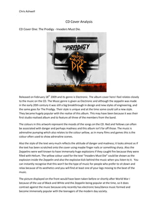
1. CD Cover Analysis<br />1322070243205CD Cover One: The Prodigy - Invaders Must Die.<br />Released on February 18th 2009 and its genre is Electronic. The album cover here I feel relates closely to the music on the CD. The Music genre is given as Electronic and although the zeppelin was made in the early 20th century it was still a big breakthrough in design and new styles of engineering, and the same goes for The Prodigy. Their style is unique and at the time some could call a new style. They became hugely popular with the realise of this album. This may have been because it was their first studio realised album and to feature all three of the members from the band.<br />The colours in this artwork represent the moods of the songs on the CD. Red and Yellows can often be associated with danger and perhaps madness and this album isn’t far off those. The music is adrenaline pumping which also relates to the colour yellow, as in many films and games this is the colour often used to show adrenaline scenes. <br />Also the style of the text very much reflects the attitude of danger and madness; it looks almost as if the text has been scratched onto the cover using maybe finger nails or something sharp. Also the Zeppelins were well known to have immensely huge explosions if they caught fire because they were filled with Helium. The yellow colour used for the text “Invaders Must Die” could be shown as the explosion inside the Zeppelin and also the explosive kick behind the music when you listen to it. You can instantly recognise that this won’t be the type of music for people who prefer to sit down and relax because of its aesthetics and you will find at least one of your legs moving to the beat of the music.<br />The picture displayed on the front would have been taken before or shortly after World War I because of the use of Black and White and the Zeppelin being popular at the time, so it does contrast against the music because only recently has electronic bass/dance music formed and become immensely popular with the teenagers of the modern day society.<br />CD Cover Two: Chase and Status – Pieces1238250415290<br />Released 29th September genre as dubstep/darkstep and also electronic. This album reached number one on the UK Dance Chart in 2009. Obviously the first thing you notice about this album is the image in your head of broken glass. This is given by the use of words and the artwork. It looks almost as if the words are broken or smashed pieces of glass. Again this shows almost caution when picking the album up and perhaps a pre warning to the genre of music the song is.<br />The base colour of white on black also shows well with the genre of ‘darkstep’ and then the splattering of green onto the white of the letters. It shows the music as being something different and not your average pop or rock music. It shows that the music as being corrupt and may appeal the teenage population and as some people stereotypically call us teenagers as being corrupt.<br />The style also of parts or pieces falling away at the sides relates to the song and how his heart is breaking and now longer feels the love that was once there. All in all it’s a very depressing song if you actually listen to the lyrics rather than the beat and the album artwork helps to reflect the mood and attitude of the song.<br />The way the green looks like it’s been slopped onto the broken glass shows little effort and a very urban feel, this already gives an indication that the music will appear to those who, being stereotypical, live in the urban towns and cities rather than rural locations. This album cover gives a good reflection of the music type that is entailed on the CD.<br />