
Recomendados
Mais conteúdo relacionado
Mais procurados
Mais procurados (20)
Destaque
Semelhante a Digipaks
Semelhante a Digipaks (20)
Último
Último (20)
Digipaks
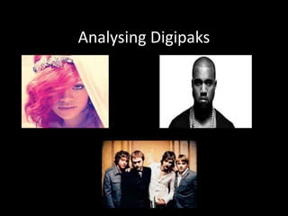
- 2. Kasabian - Empire This is Kasabians digipak for their album ‘Empire’ the feature image is a hand drawn picture of a king which looks as if it has been taken from a playing card as there is a little sign in either corner which has a capital ‘K’ and a club sign which again represents the playing card theme , however it can be argued that the ‘K’ is representing the first letter of their band name ‘Kasabian’. This image is used very cleverly as the name of the album and the image on the digipak link very well for example a King would own an empire therefore the link. A main image of the band itself has not been featured which suggests that as a band their image is not as important as their music therefore they would rather concentrate on their music than focus on their image and fame. This is a trait of many indie/rock bands as it appeals to their fans who do not like commercial and manufactured bands and by Kasabian not featuring on the cover shows that they are trying to encourage the idea of music being the most important factor.
- 3. Kanye West – My Beautiful Dark Twisted Fantasy This is Kanye West’s Digipak for ‘My Beautiful Dark Twisted Fantasy’ , This digipak is very detailed as we can see from the three images above. The first image shows how Kanye’s name has been written across the four panels using different objects to spell out his name these objects used look very arty and high class which could reflected Kanye’s interests. It can be argued that Kanye’s personality is reflected through these images and that there is an art and fashion feel to it. The second image shows the full layout of the digipak , Kanye has featured five different posters which can be slotted into the front to act as the front cover which is shown in the third picture therefore is giving his fans the chance to change the front cover . The posters featured also relate to a different video of a song which is featured on the album. The pictures on the album are all very weird and strange and could even possibly relate to lyrics which are featured on tracks in the album. Kanye has very cleverly chosen these images as they may reflect many things such as beliefs , interest and opinions but they also allow his fans to relate with him and possibly allow them to share and engage the same interest as him either through art or fashion.
- 4. Rihanna - Loud This is the digipak for Rihanna’s album Loud , it is very evident that Rihanna is all about her image as she is the main feature of this album which is shown through very large close up images of her face. The red lipstick signifies both her innocence and beauty and also the red hair could signify a sign of attractiveness and beauty as the colour is closely linked with love. The close ups show that she takes pride in her appearance and that she doesn't shy away from the camera. The album cover is obviously more aimed at the female audience due to her hair and make up being a main feature however as Rihanna uses the colours red which are linked with love the male audience also have to be considered and that her physical appearance comes across as very sexy not only can we see red lipstick but also the bare shoulder this combined creates a sexual interest and will appeal to the male audience. The whole theme throughout is closely linked with love and romance and from the image on the back three panels we can see a high angle shot of Rihanna which reflects her vulnerability and that maybe she has been let down in love. In this image Rihanna is laying very innocently in a field of red roses which we can be related to love she is also wearing white which reflects purity and gives an angelic feel to the photo.