
Recomendados
Mais conteúdo relacionado
Mais procurados
Mais procurados (20)
Destaque
Semelhante a Qanalysis
Semelhante a Qanalysis (20)
Mais de CallumYork
Qanalysis
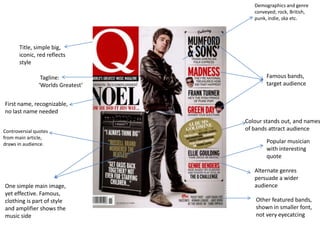
- 1. Demographics and genre conveyed; rock, British, punk, indie, ska etc. Title, simple big, iconic, red reflects style Tagline: Famous bands, ‘Worlds Greatest’ target audience First name, recognizable, no last name needed Colour stands out, and names Controversial quotes of bands attract audience from main article, draws in audience. Popular musician with interesting quote Alternate genres persuade a wider One simple main image, audience yet effective. Famous, clothing is part of style Other featured bands, and amplifier shows the shown in smaller font, music side not very eyecatcing
- 2. Range of good quality and Comical little drawings, part of the style intriguing photos House style Cover story not exclusively promoted, giving other stories room to shine. Overall, clear, Shows layout, this section is for those who Page numbers, understandable regularly pick up magazine, areas that are titles and layout Advertisement Small labels, stand out, consistent in style throughout descriptions, easy of magazine style. to comprehend
- 3. High quality photo, Nice looking feature – ribbon style article title conveys genre Name of section and Magazine ‘Adam Ant’ bold, along side quote More quotes Professional and captions layout Consistent style, bold Excerpt in large red box, fits in with Older photo reflects former years question, normal font house style and also catches answer. attention of reader. They’d read quotes then want to read article
- 4. Introduction; establishes Large, off centre, main image, style, uniform, simple interesting layout and choice of Name promoted image. Caption of picture Stylish box for quote Interview style article, formal content, like a conversation
- 5. Pictures frequently Keeping in line with captioned in layout and style. Range of quality images magazines Musicians name Curved not pointed promoted edges Continuation of Q and A Issue month and page number Recurring housestyle and consistency of fonts: format, very formal. Attract a target audience
- 6. Conclusion Overall the magazine looks like a good example of a professional magazine. There are some issues with the front cover with reference to the amount of space that is left unused, but this could have been a purposeful aesthetic choice. Although I really like it, I’m not sure if I want to use it as a style model, as I still need to use questionnaires to figure out what my audience wants.