SlideShare uma empresa Scribd logo
1 de 8
Baixar para ler offline
Bootstrap 3 CSS Classes Desk Reference
Free Bootstrap Video Tutorial Course
BootstrapCreative.com/bootstrap-tutorial/
1/8
Grid
Basic grid - full width is 12 columns wide
<!-- change .container to .container-fluid
to be full width -->
<div class="container">
	<!-- Columns are always 50% wide, on
mobile and desktop -->
	<div class="row">
	 <div class="col-xs-6">.col-xs-6</div>
	 <div class="col-xs-6">.col-xs-6</div>
	</div>	
	<!-- nested columns example -->
	<div class="row">
	 <div class="col-xs-6">.col-xs-6</div>
	 <div class="col-xs-6">.col-xs-6
		 <div class="row">
		 <div class="col-md-6">100% mobile 50%
everywhere else</div>
		 <div class="col-md-6">100% mobile 50%
everywhere else</div>
		 </div>
	 </div>
	</div>
</div>
Media queries
/* Extra small devices (phones, less than
768px) No media query since this is the
default in Bootstrap */
/* small (tablets, 768px and up) */
@media (min-width: @screen-sm-min) { ... }
/* medium (desktops, 992px and up) */
@media (min-width: @screen-md-min) { ... }
/* large (large desktops, 1200px and up) */
@media (min-width: @screen-lg-min) { ... }
Text & Images
.text-left Left aligned text
.text-center Center aligned text
.text-right Right aligned text
.text-justify Justified text
.text-nowrap No wrap text
.text-lowercause Lowercase text
.text-uppercase Uppercase text
.text-capitalize Capitalized text
.lead Good for first paragraph of article
.list-unstyled Removes default list margin/
padding
.list-inline Makes list items inline
.dl-horizontal Makes list items two columns
.img-responsive Make an image responsive
.img-rounded Adds rounded corners to image
.img-circle Crops image to be circle
.img-thumbnail Adds rounded corner and
border to an image
.pull-left Floats item left
.pull-right Floats item right
.center-block Set an elemennt to block with
auto left and right margin
.clearfix Clear floats by adding this class
to the parent container
Blockquote
<blockquote><p>Lorem ipsum dolor</p>
<footer>Someone famous in <cite
title="Source Title">Source Title</cite></
footer></blockquote>
Headings
<h1>h1. Bootstrap heading <small>Secondary
text</small></h1>
<p class="h1">Paragraph that looks like
heading</p>
Bootstrap 3 CSS Classes Desk Reference
Free Bootstrap Video Tutorial Course
BootstrapCreative.com/bootstrap-tutorial/
2/8
Navbar
<!-- Fixed top navbar with brand as logo image tags -->
<nav class="navbar navbar-default navbar-fixed-top">
<div class="container-fluid">
<!-- Brand and toggle get grouped for better mobile display -->
<div class="navbar-header">
<button type="button" class="navbar-toggle collapsed" data-toggle="collapse" data-
target="#bs-example-navbar-collapse-1" aria-expanded="false">
<span class="sr-only">Toggle navigation</span>
<span class="icon-bar"></span>
</button>
<a class="navbar-brand" href="#"><img alt="Brand" src="..."></a>
</div>
<!-- Collect the nav links, forms, and other content for toggling -->
<div class="collapse navbar-collapse" id="bs-example-navbar-collapse-1">
<ul class="nav navbar-nav">
<li class="active"><a href="#">Link <span class="sr-only">(current)</span></a></
li>
<li><a href="#">Link</a></li>
<li class="dropdown">
<a href="#" class="dropdown-toggle" data-toggle="dropdown" role="button" aria-
haspopup="true" aria-expanded="false">Dropdown <span class="caret"></span></a>
<ul class="dropdown-menu">
<li><a href="#">Action</a></li>
<li role="separator" class="divider"></li>
<li><a href="#">Separated link</a></li>
</ul>
</li>
</ul>
</div><!-- /.navbar-collapse -->
</div><!-- /.container-fluid -->
</nav>
Bootstrap 3 CSS Classes Desk Reference
Free Bootstrap Video Tutorial Course
BootstrapCreative.com/bootstrap-tutorial/
3/8
Forms
<form>
<div class="form-group">
<label for="exampleInputEmail1">Email address</label>
<input type="email" class="form-control" id="exampleInputEmail1" placeholder="Email">
</div>
<div class="form-group">
<label for="exampleInputPassword1">Password</label>
<input type="password" class="form-control" id="exampleInputPassword1"
placeholder="Password">
</div>
<div class="form-group">
<label for="exampleInputFile">File input</label>
<input type="file" id="exampleInputFile">
<p class="help-block">Example block-level help text here.</p>
</div>
<div class="checkbox">
<label>
<input type="checkbox"> Check me out
</label>
</div>
<button type="submit" class="btn btn-default">Submit</button>
</form>
Buttons
.btn Needs to be added to all buttons because it adds padding and margin
.btn-default The default button style
.btn-primary The button that has the primary action in a group
.btn-success Could be used on the last submit button in a form
.btn-info Informational button
.btn-link Removes background color and add text color
.btn-lg Large buttom
.btn-sm Smaller than default button
.btn-xs Even smaller
.btn-block Button that spans full width of parent
<a class="btn btn-default"
href="#" role="button">Link</a>
<button class="btn btn-primary"
type="submit">Button</button>
Bootstrap 3 CSS Classes Desk Reference
Free Bootstrap Video Tutorial Course
BootstrapCreative.com/bootstrap-tutorial/
4/8
Carousel
<div id="carousel-example-generic" class="carousel slide" data-ride="carousel">
<!-- Indicators -->
<ol class="carousel-indicators">
<li data-target="#carousel-example-generic" data-slide-to="0" class="active"></li>
<li data-target="#carousel-example-generic" data-slide-to="1"></li>
</ol>
<!-- Wrapper for slides -->
<div class="carousel-inner" role="listbox">
<div class="item active">
<img src="..." alt="...">
<div class="carousel-caption">
...
</div>
</div>
<div class="item">
<img src="..." alt="...">
<div class="carousel-caption">
...
</div>
</div>
...
</div>
<!-- Controls -->
<a class="left carousel-control" href="#carousel-example-generic" role="button" data-
slide="prev">
<span class="glyphicon glyphicon-chevron-left" aria-hidden="true"></span>
<span class="sr-only">Previous</span>
</a>
<a class="right carousel-control" href="#carousel-example-generic" role="button" data-
slide="next">
<span class="glyphicon glyphicon-chevron-right" aria-hidden="true"></span>
<span class="sr-only">Next</span>
</a>
</div>
Bootstrap 3 CSS Classes Desk Reference
Free Bootstrap Video Tutorial Course
BootstrapCreative.com/bootstrap-tutorial/
5/8
Jumbotron
<div class="jumbotron">
<h1>Hello, world!</h1>
<p>...</p>
<p><a class="btn btn-primary btn-lg" href="#" role="button">Learn more</a></p>
</div>
To make the jumbotron full width, and without rounded corners, place it outside all
.containers and instead add a .container within.
<div class="jumbotron">
<div class="container">
...
</div>
</div>
Page header
<div class="page-header">
<h1>Example page header <small>Subtext for header</small></h1>
</div>
Breadcrumbs
<ol class="breadcrumb">
<li><a href="#">Home</a></li>
<li><a href="#">Library</a></li>
<li class="active">Data</li>
</ol>
Responsive embed
<!-- 16:9 aspect ratio - change aspect ratio by replacing 16by9 with 4by3 -->
<div class="embed-responsive embed-responsive-16by9">
<iframe class="embed-responsive-item" src="..."></iframe>
</div>
Bootstrap 3 CSS Classes Desk Reference
Free Bootstrap Video Tutorial Course
BootstrapCreative.com/bootstrap-tutorial/
6/8
.active
.affix
.alert
.alert-danger
.alert-dismissible
.alert-info
.alert-link
.alert-success
.alert-warning
.arrow
.badge
.bg-danger
.bg-info
.bg-primary
.bg-success
.bg-warning
.bottom
.breadcrumb
.btn
.btn-block
.btn-danger
.btn-default
.btn-group
.btn-group-justified
.btn-group-vertical
.btn-info
.btn-link
.btn-primary
.btn-sm
.btn-success
.btn-toolbar
.btn-warning
.btn-xs
.caption
.caret
.carousel
.carousel-caption
.carousel-control
.carousel-indicators
.carousel-inner
.center-block
.checkbox
.checkbox-inline
.close
.col-lg-* /*(1-12)*/
.col-lg-offset-* /*(0-12)*/
.col-lg-pull-* /*(0-12)*/
.col-lg-push-* /*(0-12)*/
.col-md-* /*(1-12)*/
.col-md-offset-* /*(0-12)*/
.col-md-pull-* /*(0-12)*/
.col-md-push-* /*(0-12)*/
.col-sm-* /*(1-12)*/
.col-sm-offset-* /*(0-12)*/
.col-sm-pull-* /*(0-12)*/
.col-sm-push-* /*(0-12)*/
.col-xs-* /*(1-12)*/
.col-xs-offset-* /*(0-12)*/
.col-xs-pull-* /*(0-12)*/
.col-xs-push-* /*(0-12)*/
Alphabetical Index of CSS Classes
Tables
<!-- Responsive table with all of the options applied -->
<div class="table-responsive">
<table class="table table-condensed table-hover table-bordered table-striped">
	<tr class="active">...</tr>
	<tr>
	 <td class="info">...</td>
	</tr>
</table>
</div>
Bootstrap 3 CSS Classes Desk Reference
Free Bootstrap Video Tutorial Course
BootstrapCreative.com/bootstrap-tutorial/
7/8
.collapse
.collapsing
.container
.container-fluid
.control-label
.divider
.dropdown
.dropdown-backdrop
.dropdown-header
.dropdown-menu
.dropdown-menu-left
.dropdown-menu-right
.dropdown-toggle
.embed-responsive
.embed-responsive-16by9
.embed-responsive-4by3
.fade
.form-control
.form-control-feedback
.form-control-static
.form-group
.glyphicon
.glyphicon-chevron-left
.glyphicon-chevron-right
.h1
.h2
.h3
.h4
.h5
.h6
.has-feedback
.help-block
.hidden
.hidden-lg
.hidden-md
.hidden-print
.hidden-sm
.hidden-xs
.hide
.icon-bar
.icon-next
.icon-prev
.img-circle
.img-rounded
.img-thumbnail
.in
.initialism
.input-group
.input-group-addon
.input-group-btn
.input-lg
.input-sm
.invisible
.item
.jumbotron
.label
.label-danger
.label-default
.label-info
.label-primary
.label-success
.label-warning
.lead
.left
.list-group
.list-group-item
.list-group-item-danger
.list-group-item-heading
.list-group-item-info
.list-group-item-success
.list-group-item-text
.list-group-item-warning
.list-inline
.list-unstyled
.mark
.media
.media-body
.media-heading
.media-list
.media-object
.modal
.modal-backdrop
.modal-body
.modal-content
.modal-dialog
.modal-footer
.modal-header
.modal-lg
.modal-open
.modal-scrollbar-measure
.modal-sm
.modal-title
.nav
.nav-divider
.nav-justified
.nav-tabs
.nav-tabs-justified
.navbar
.navbar-brand
Bootstrap 3 CSS Classes Desk Reference
Free Bootstrap Video Tutorial Course
BootstrapCreative.com/bootstrap-tutorial/
8/8
.navbar-btn
.navbar-collapse
.navbar-default
.navbar-fixed-bottom
.navbar-fixed-top
.navbar-form
.navbar-header
.navbar-inverse
.navbar-left
.navbar-link
.navbar-nav
.navbar-right
.navbar-static-top
.navbar-text
.navbar-toggle
.next
.page-header
.pager
.pagination
.panel
.panel-body
.panel-danger
.panel-default
.panel-footer
.panel-group
.panel-heading
.panel-info
.panel-primary
.panel-success
.panel-title
.panel-warning
.popover
.popover-content
.popover-title
.pre-scrollable
.prev
.progress
.progress-bar
.progress-bar-danger
.progress-bar-info
.progress-bar-striped
.progress-bar-success
.progress-bar-warning
.pull-left
.pull-right
.right
.row
.show
.small
.sr-only
.tab-pane
.table
.table-bordered
.table-responsive
.text-capitalize
.text-center
.text-danger
.text-hide
.text-info
.text-justify
.text-left
.text-lowercase
.text-muted
.text-nowrap
.text-primary
.text-right
.text-success
.text-uppercase
.text-warning
.thumbnail
.tooltip
.tooltip-arrow
.tooltip-inner
.top
.visible-lg
.visible-lg-block
.visible-lg-inline
.visible-lg-inline-block
.visible-md
.visible-md-block
.visible-md-inline
.visible-md-inline-block
.visible-print
.visible-print-block
.visible-print-inline
.visible-print-inline-block
.visible-sm
.visible-sm-block
.visible-sm-inline
.visible-sm-inline-block
.visible-xs
.visible-xs-block
.visible-xs-inline
.visible-xs-inline-block
.well
.well-lg
.well-sm

Mais conteúdo relacionado

Mais procurados

COMANDOS AS400
COMANDOS AS400COMANDOS AS400
COMANDOS AS400
iangracia
 
Transacciones y manejo de errores en mysql
Transacciones y manejo de errores en mysqlTransacciones y manejo de errores en mysql
Transacciones y manejo de errores en mysql
Victor Dolores Marcos
 
HTML 5 Tables and Forms
HTML 5 Tables and FormsHTML 5 Tables and Forms
HTML 5 Tables and Forms
Doncho Minkov
 
Cctv 2012 integrador
Cctv  2012   integradorCctv  2012   integrador
Cctv 2012 integrador
Vicos FFuhrer
 

Mais procurados (20)

COMANDOS AS400
COMANDOS AS400COMANDOS AS400
COMANDOS AS400
 
Web html table tags
Web html  table tagsWeb html  table tags
Web html table tags
 
64518313 manual-basico-as400
64518313 manual-basico-as40064518313 manual-basico-as400
64518313 manual-basico-as400
 
Introduction to html 5
Introduction to html 5Introduction to html 5
Introduction to html 5
 
Charles F. Haanel le système clé universel du succès
Charles F. Haanel le système clé universel du succèsCharles F. Haanel le système clé universel du succès
Charles F. Haanel le système clé universel du succès
 
Xml dtd
Xml dtdXml dtd
Xml dtd
 
Diseño de pantallas en as400
Diseño de pantallas en as400Diseño de pantallas en as400
Diseño de pantallas en as400
 
Html ppt
Html pptHtml ppt
Html ppt
 
CSS Layouting #3 : Box Model
CSS Layouting #3 : Box ModelCSS Layouting #3 : Box Model
CSS Layouting #3 : Box Model
 
Transacciones y manejo de errores en mysql
Transacciones y manejo de errores en mysqlTransacciones y manejo de errores en mysql
Transacciones y manejo de errores en mysql
 
HTML 5 Tables and Forms
HTML 5 Tables and FormsHTML 5 Tables and Forms
HTML 5 Tables and Forms
 
Practica 8 Instalacion de redes CISCO
Practica 8 Instalacion de redes CISCOPractica 8 Instalacion de redes CISCO
Practica 8 Instalacion de redes CISCO
 
HTML Dasar : #2 Hello World
HTML Dasar : #2 Hello WorldHTML Dasar : #2 Hello World
HTML Dasar : #2 Hello World
 
Css backgrounds
Css   backgroundsCss   backgrounds
Css backgrounds
 
Vuforia AR影片程式設計
Vuforia AR影片程式設計Vuforia AR影片程式設計
Vuforia AR影片程式設計
 
HTML CSS and Web Development
HTML CSS and Web DevelopmentHTML CSS and Web Development
HTML CSS and Web Development
 
HTML/Web Development (Grade 11-ICT)
HTML/Web Development (Grade 11-ICT)HTML/Web Development (Grade 11-ICT)
HTML/Web Development (Grade 11-ICT)
 
Cctv 2012 integrador
Cctv  2012   integradorCctv  2012   integrador
Cctv 2012 integrador
 
11 Java Script - Exemplos com eventos
11 Java Script - Exemplos com eventos11 Java Script - Exemplos com eventos
11 Java Script - Exemplos com eventos
 
HTML Dasar : #6 List
HTML Dasar : #6 ListHTML Dasar : #6 List
HTML Dasar : #6 List
 

Destaque

Destaque (17)

Css
CssCss
Css
 
CSS Cheat Sheet Reference PDF
CSS Cheat Sheet Reference PDFCSS Cheat Sheet Reference PDF
CSS Cheat Sheet Reference PDF
 
Angularjs
AngularjsAngularjs
Angularjs
 
A beginner's guide to twitter bootstrap
A beginner's guide to twitter bootstrapA beginner's guide to twitter bootstrap
A beginner's guide to twitter bootstrap
 
Twitter bootstrap 101
Twitter bootstrap 101Twitter bootstrap 101
Twitter bootstrap 101
 
Tutorial on Bootstrap resampling with independent data
Tutorial on Bootstrap resampling with independent dataTutorial on Bootstrap resampling with independent data
Tutorial on Bootstrap resampling with independent data
 
Bootstarp 3
Bootstarp 3Bootstarp 3
Bootstarp 3
 
AngularJS Forms Validation
AngularJS Forms ValidationAngularJS Forms Validation
AngularJS Forms Validation
 
Angular workshop - Full Development Guide
Angular workshop - Full Development GuideAngular workshop - Full Development Guide
Angular workshop - Full Development Guide
 
W3Schools Quiz Test
W3Schools Quiz TestW3Schools Quiz Test
W3Schools Quiz Test
 
Bootstrap 4 Tutorial PDF for Beginners - Learn Step by Step
Bootstrap 4 Tutorial PDF for Beginners - Learn Step by StepBootstrap 4 Tutorial PDF for Beginners - Learn Step by Step
Bootstrap 4 Tutorial PDF for Beginners - Learn Step by Step
 
Bootstrap 4 n00bz
Bootstrap 4 n00bzBootstrap 4 n00bz
Bootstrap 4 n00bz
 
Bootstrap [part 2]
Bootstrap [part 2]Bootstrap [part 2]
Bootstrap [part 2]
 
Twitter bootstrap tutorial
Twitter bootstrap tutorialTwitter bootstrap tutorial
Twitter bootstrap tutorial
 
Design for Developers: Introduction to Bootstrap 3
Design for Developers: Introduction to Bootstrap 3Design for Developers: Introduction to Bootstrap 3
Design for Developers: Introduction to Bootstrap 3
 
Bootstrap [part 1]
Bootstrap [part 1]Bootstrap [part 1]
Bootstrap [part 1]
 
Introduction to Bootstrap
Introduction to BootstrapIntroduction to Bootstrap
Introduction to Bootstrap
 

Semelhante a Bootstrap 3 Cheat Sheet PDF Reference

The project gutenberg e book, fairy tales from brazil, by elsie spicer
The project gutenberg e book, fairy tales from brazil, by elsie spicerThe project gutenberg e book, fairy tales from brazil, by elsie spicer
The project gutenberg e book, fairy tales from brazil, by elsie spicer
Andrei Hortúa
 
Copy of-a-walk-around-westfall-plaza
Copy of-a-walk-around-westfall-plazaCopy of-a-walk-around-westfall-plaza
Copy of-a-walk-around-westfall-plaza
helgawerth
 

Semelhante a Bootstrap 3 Cheat Sheet PDF Reference (20)

Intro to Bootstrap
Intro to BootstrapIntro to Bootstrap
Intro to Bootstrap
 
Stop reinventing the wheel: Build Responsive Websites Using Bootstrap
Stop reinventing the wheel: Build Responsive Websites Using BootstrapStop reinventing the wheel: Build Responsive Websites Using Bootstrap
Stop reinventing the wheel: Build Responsive Websites Using Bootstrap
 
Bootstrap PPT by Mukesh
Bootstrap PPT by MukeshBootstrap PPT by Mukesh
Bootstrap PPT by Mukesh
 
Bootstrap
BootstrapBootstrap
Bootstrap
 
Pemrograman Web 4 - Bootstrap 3
Pemrograman Web 4 - Bootstrap 3Pemrograman Web 4 - Bootstrap 3
Pemrograman Web 4 - Bootstrap 3
 
Bootstrap 3 in Joomla!
Bootstrap 3 in Joomla!Bootstrap 3 in Joomla!
Bootstrap 3 in Joomla!
 
Rapid HTML Prototyping with Bootstrap - Chris Griffith
Rapid HTML Prototyping with Bootstrap - Chris GriffithRapid HTML Prototyping with Bootstrap - Chris Griffith
Rapid HTML Prototyping with Bootstrap - Chris Griffith
 
Getting to Know Bootstrap for Rapid Web Development
Getting to Know Bootstrap for Rapid Web DevelopmentGetting to Know Bootstrap for Rapid Web Development
Getting to Know Bootstrap for Rapid Web Development
 
The project gutenberg e book, fairy tales from brazil, by elsie spicer
The project gutenberg e book, fairy tales from brazil, by elsie spicerThe project gutenberg e book, fairy tales from brazil, by elsie spicer
The project gutenberg e book, fairy tales from brazil, by elsie spicer
 
Atomic design con pattern lab
Atomic design con pattern labAtomic design con pattern lab
Atomic design con pattern lab
 
Jackie's porfolio edited
Jackie's porfolio editedJackie's porfolio edited
Jackie's porfolio edited
 
Copy of-a-walk-around-westfall-plaza
Copy of-a-walk-around-westfall-plazaCopy of-a-walk-around-westfall-plaza
Copy of-a-walk-around-westfall-plaza
 
Xxx
XxxXxx
Xxx
 
Responsive Design: Mehr als CSS
Responsive Design: Mehr als CSSResponsive Design: Mehr als CSS
Responsive Design: Mehr als CSS
 
Templates81 special document
Templates81 special documentTemplates81 special document
Templates81 special document
 
Templates81 special document
Templates81 special documentTemplates81 special document
Templates81 special document
 
HTML5 & CSS3 Flag
HTML5 & CSS3 FlagHTML5 & CSS3 Flag
HTML5 & CSS3 Flag
 
integrasi template admin lte terbaru dengan laravel 7
integrasi template admin lte terbaru dengan laravel 7integrasi template admin lte terbaru dengan laravel 7
integrasi template admin lte terbaru dengan laravel 7
 
bootstrap.pptx
bootstrap.pptxbootstrap.pptx
bootstrap.pptx
 
“Good design is obvious. Great design is transparent.” — How we use Bootstrap...
“Good design is obvious. Great design is transparent.” — How we use Bootstrap...“Good design is obvious. Great design is transparent.” — How we use Bootstrap...
“Good design is obvious. Great design is transparent.” — How we use Bootstrap...
 

Mais de Bootstrap Creative

Web Development Tutorial Workshop for Beginners - Learn Responsive Web Design...
Web Development Tutorial Workshop for Beginners - Learn Responsive Web Design...Web Development Tutorial Workshop for Beginners - Learn Responsive Web Design...
Web Development Tutorial Workshop for Beginners - Learn Responsive Web Design...
Bootstrap Creative
 

Mais de Bootstrap Creative (9)

A Beginner’s Guide to HubSpot CMS - Make a Website for Your Business With No ...
A Beginner’s Guide to HubSpot CMS - Make a Website for Your Business With No ...A Beginner’s Guide to HubSpot CMS - Make a Website for Your Business With No ...
A Beginner’s Guide to HubSpot CMS - Make a Website for Your Business With No ...
 
Web Development Tutorial Workshop for Beginners - Learn Responsive Web Design...
Web Development Tutorial Workshop for Beginners - Learn Responsive Web Design...Web Development Tutorial Workshop for Beginners - Learn Responsive Web Design...
Web Development Tutorial Workshop for Beginners - Learn Responsive Web Design...
 
Responsive Web Design Tutorial PDF for Beginners
Responsive Web Design Tutorial PDF for BeginnersResponsive Web Design Tutorial PDF for Beginners
Responsive Web Design Tutorial PDF for Beginners
 
Web Design Primer Sample - HTML CSS JS
Web Design Primer Sample - HTML CSS JSWeb Design Primer Sample - HTML CSS JS
Web Design Primer Sample - HTML CSS JS
 
Bootstrap 4 Online Training Course Book Sample
Bootstrap 4 Online Training Course Book SampleBootstrap 4 Online Training Course Book Sample
Bootstrap 4 Online Training Course Book Sample
 
Michigan Digital Marketing SEO
Michigan Digital Marketing SEOMichigan Digital Marketing SEO
Michigan Digital Marketing SEO
 
Graphic Design Portfolio of Detroit Michigan Web Designer Jacob Lett
Graphic Design Portfolio of Detroit Michigan Web Designer Jacob LettGraphic Design Portfolio of Detroit Michigan Web Designer Jacob Lett
Graphic Design Portfolio of Detroit Michigan Web Designer Jacob Lett
 
Web Design Portfolio of Detroit Michigan Web Designer Jacob Lett
Web Design Portfolio of Detroit Michigan Web Designer Jacob LettWeb Design Portfolio of Detroit Michigan Web Designer Jacob Lett
Web Design Portfolio of Detroit Michigan Web Designer Jacob Lett
 
Graphic Design Career Summary Presentation
Graphic Design Career Summary PresentationGraphic Design Career Summary Presentation
Graphic Design Career Summary Presentation
 

Último

Architecting Cloud Native Applications
Architecting Cloud Native ApplicationsArchitecting Cloud Native Applications
Architecting Cloud Native Applications
WSO2
 
Why Teams call analytics are critical to your entire business
Why Teams call analytics are critical to your entire businessWhy Teams call analytics are critical to your entire business
Why Teams call analytics are critical to your entire business
panagenda
 

Último (20)

Real Time Object Detection Using Open CV
Real Time Object Detection Using Open CVReal Time Object Detection Using Open CV
Real Time Object Detection Using Open CV
 
EMPOWERMENT TECHNOLOGY GRADE 11 QUARTER 2 REVIEWER
EMPOWERMENT TECHNOLOGY GRADE 11 QUARTER 2 REVIEWEREMPOWERMENT TECHNOLOGY GRADE 11 QUARTER 2 REVIEWER
EMPOWERMENT TECHNOLOGY GRADE 11 QUARTER 2 REVIEWER
 
Apidays New York 2024 - Scaling API-first by Ian Reasor and Radu Cotescu, Adobe
Apidays New York 2024 - Scaling API-first by Ian Reasor and Radu Cotescu, AdobeApidays New York 2024 - Scaling API-first by Ian Reasor and Radu Cotescu, Adobe
Apidays New York 2024 - Scaling API-first by Ian Reasor and Radu Cotescu, Adobe
 
Powerful Google developer tools for immediate impact! (2023-24 C)
Powerful Google developer tools for immediate impact! (2023-24 C)Powerful Google developer tools for immediate impact! (2023-24 C)
Powerful Google developer tools for immediate impact! (2023-24 C)
 
Architecting Cloud Native Applications
Architecting Cloud Native ApplicationsArchitecting Cloud Native Applications
Architecting Cloud Native Applications
 
Strategies for Landing an Oracle DBA Job as a Fresher
Strategies for Landing an Oracle DBA Job as a FresherStrategies for Landing an Oracle DBA Job as a Fresher
Strategies for Landing an Oracle DBA Job as a Fresher
 
AXA XL - Insurer Innovation Award Americas 2024
AXA XL - Insurer Innovation Award Americas 2024AXA XL - Insurer Innovation Award Americas 2024
AXA XL - Insurer Innovation Award Americas 2024
 
Apidays New York 2024 - Accelerating FinTech Innovation by Vasa Krishnan, Fin...
Apidays New York 2024 - Accelerating FinTech Innovation by Vasa Krishnan, Fin...Apidays New York 2024 - Accelerating FinTech Innovation by Vasa Krishnan, Fin...
Apidays New York 2024 - Accelerating FinTech Innovation by Vasa Krishnan, Fin...
 
Why Teams call analytics are critical to your entire business
Why Teams call analytics are critical to your entire businessWhy Teams call analytics are critical to your entire business
Why Teams call analytics are critical to your entire business
 
"I see eyes in my soup": How Delivery Hero implemented the safety system for ...
"I see eyes in my soup": How Delivery Hero implemented the safety system for ..."I see eyes in my soup": How Delivery Hero implemented the safety system for ...
"I see eyes in my soup": How Delivery Hero implemented the safety system for ...
 
GenAI Risks & Security Meetup 01052024.pdf
GenAI Risks & Security Meetup 01052024.pdfGenAI Risks & Security Meetup 01052024.pdf
GenAI Risks & Security Meetup 01052024.pdf
 
A Year of the Servo Reboot: Where Are We Now?
A Year of the Servo Reboot: Where Are We Now?A Year of the Servo Reboot: Where Are We Now?
A Year of the Servo Reboot: Where Are We Now?
 
Corporate and higher education May webinar.pptx
Corporate and higher education May webinar.pptxCorporate and higher education May webinar.pptx
Corporate and higher education May webinar.pptx
 
TrustArc Webinar - Stay Ahead of US State Data Privacy Law Developments
TrustArc Webinar - Stay Ahead of US State Data Privacy Law DevelopmentsTrustArc Webinar - Stay Ahead of US State Data Privacy Law Developments
TrustArc Webinar - Stay Ahead of US State Data Privacy Law Developments
 
Mastering MySQL Database Architecture: Deep Dive into MySQL Shell and MySQL R...
Mastering MySQL Database Architecture: Deep Dive into MySQL Shell and MySQL R...Mastering MySQL Database Architecture: Deep Dive into MySQL Shell and MySQL R...
Mastering MySQL Database Architecture: Deep Dive into MySQL Shell and MySQL R...
 
Strategize a Smooth Tenant-to-tenant Migration and Copilot Takeoff
Strategize a Smooth Tenant-to-tenant Migration and Copilot TakeoffStrategize a Smooth Tenant-to-tenant Migration and Copilot Takeoff
Strategize a Smooth Tenant-to-tenant Migration and Copilot Takeoff
 
Artificial Intelligence Chap.5 : Uncertainty
Artificial Intelligence Chap.5 : UncertaintyArtificial Intelligence Chap.5 : Uncertainty
Artificial Intelligence Chap.5 : Uncertainty
 
How to Troubleshoot Apps for the Modern Connected Worker
How to Troubleshoot Apps for the Modern Connected WorkerHow to Troubleshoot Apps for the Modern Connected Worker
How to Troubleshoot Apps for the Modern Connected Worker
 
Apidays Singapore 2024 - Modernizing Securities Finance by Madhu Subbu
Apidays Singapore 2024 - Modernizing Securities Finance by Madhu SubbuApidays Singapore 2024 - Modernizing Securities Finance by Madhu Subbu
Apidays Singapore 2024 - Modernizing Securities Finance by Madhu Subbu
 
Strategies for Unlocking Knowledge Management in Microsoft 365 in the Copilot...
Strategies for Unlocking Knowledge Management in Microsoft 365 in the Copilot...Strategies for Unlocking Knowledge Management in Microsoft 365 in the Copilot...
Strategies for Unlocking Knowledge Management in Microsoft 365 in the Copilot...
 

Bootstrap 3 Cheat Sheet PDF Reference

  • 1. Bootstrap 3 CSS Classes Desk Reference Free Bootstrap Video Tutorial Course BootstrapCreative.com/bootstrap-tutorial/ 1/8 Grid Basic grid - full width is 12 columns wide <!-- change .container to .container-fluid to be full width --> <div class="container"> <!-- Columns are always 50% wide, on mobile and desktop --> <div class="row"> <div class="col-xs-6">.col-xs-6</div> <div class="col-xs-6">.col-xs-6</div> </div> <!-- nested columns example --> <div class="row"> <div class="col-xs-6">.col-xs-6</div> <div class="col-xs-6">.col-xs-6 <div class="row"> <div class="col-md-6">100% mobile 50% everywhere else</div> <div class="col-md-6">100% mobile 50% everywhere else</div> </div> </div> </div> </div> Media queries /* Extra small devices (phones, less than 768px) No media query since this is the default in Bootstrap */ /* small (tablets, 768px and up) */ @media (min-width: @screen-sm-min) { ... } /* medium (desktops, 992px and up) */ @media (min-width: @screen-md-min) { ... } /* large (large desktops, 1200px and up) */ @media (min-width: @screen-lg-min) { ... } Text & Images .text-left Left aligned text .text-center Center aligned text .text-right Right aligned text .text-justify Justified text .text-nowrap No wrap text .text-lowercause Lowercase text .text-uppercase Uppercase text .text-capitalize Capitalized text .lead Good for first paragraph of article .list-unstyled Removes default list margin/ padding .list-inline Makes list items inline .dl-horizontal Makes list items two columns .img-responsive Make an image responsive .img-rounded Adds rounded corners to image .img-circle Crops image to be circle .img-thumbnail Adds rounded corner and border to an image .pull-left Floats item left .pull-right Floats item right .center-block Set an elemennt to block with auto left and right margin .clearfix Clear floats by adding this class to the parent container Blockquote <blockquote><p>Lorem ipsum dolor</p> <footer>Someone famous in <cite title="Source Title">Source Title</cite></ footer></blockquote> Headings <h1>h1. Bootstrap heading <small>Secondary text</small></h1> <p class="h1">Paragraph that looks like heading</p>
  • 2. Bootstrap 3 CSS Classes Desk Reference Free Bootstrap Video Tutorial Course BootstrapCreative.com/bootstrap-tutorial/ 2/8 Navbar <!-- Fixed top navbar with brand as logo image tags --> <nav class="navbar navbar-default navbar-fixed-top"> <div class="container-fluid"> <!-- Brand and toggle get grouped for better mobile display --> <div class="navbar-header"> <button type="button" class="navbar-toggle collapsed" data-toggle="collapse" data- target="#bs-example-navbar-collapse-1" aria-expanded="false"> <span class="sr-only">Toggle navigation</span> <span class="icon-bar"></span> <span class="icon-bar"></span> <span class="icon-bar"></span> </button> <a class="navbar-brand" href="#"><img alt="Brand" src="..."></a> </div> <!-- Collect the nav links, forms, and other content for toggling --> <div class="collapse navbar-collapse" id="bs-example-navbar-collapse-1"> <ul class="nav navbar-nav"> <li class="active"><a href="#">Link <span class="sr-only">(current)</span></a></ li> <li><a href="#">Link</a></li> <li class="dropdown"> <a href="#" class="dropdown-toggle" data-toggle="dropdown" role="button" aria- haspopup="true" aria-expanded="false">Dropdown <span class="caret"></span></a> <ul class="dropdown-menu"> <li><a href="#">Action</a></li> <li role="separator" class="divider"></li> <li><a href="#">Separated link</a></li> </ul> </li> </ul> </div><!-- /.navbar-collapse --> </div><!-- /.container-fluid --> </nav>
  • 3. Bootstrap 3 CSS Classes Desk Reference Free Bootstrap Video Tutorial Course BootstrapCreative.com/bootstrap-tutorial/ 3/8 Forms <form> <div class="form-group"> <label for="exampleInputEmail1">Email address</label> <input type="email" class="form-control" id="exampleInputEmail1" placeholder="Email"> </div> <div class="form-group"> <label for="exampleInputPassword1">Password</label> <input type="password" class="form-control" id="exampleInputPassword1" placeholder="Password"> </div> <div class="form-group"> <label for="exampleInputFile">File input</label> <input type="file" id="exampleInputFile"> <p class="help-block">Example block-level help text here.</p> </div> <div class="checkbox"> <label> <input type="checkbox"> Check me out </label> </div> <button type="submit" class="btn btn-default">Submit</button> </form> Buttons .btn Needs to be added to all buttons because it adds padding and margin .btn-default The default button style .btn-primary The button that has the primary action in a group .btn-success Could be used on the last submit button in a form .btn-info Informational button .btn-link Removes background color and add text color .btn-lg Large buttom .btn-sm Smaller than default button .btn-xs Even smaller .btn-block Button that spans full width of parent <a class="btn btn-default" href="#" role="button">Link</a> <button class="btn btn-primary" type="submit">Button</button>
  • 4. Bootstrap 3 CSS Classes Desk Reference Free Bootstrap Video Tutorial Course BootstrapCreative.com/bootstrap-tutorial/ 4/8 Carousel <div id="carousel-example-generic" class="carousel slide" data-ride="carousel"> <!-- Indicators --> <ol class="carousel-indicators"> <li data-target="#carousel-example-generic" data-slide-to="0" class="active"></li> <li data-target="#carousel-example-generic" data-slide-to="1"></li> </ol> <!-- Wrapper for slides --> <div class="carousel-inner" role="listbox"> <div class="item active"> <img src="..." alt="..."> <div class="carousel-caption"> ... </div> </div> <div class="item"> <img src="..." alt="..."> <div class="carousel-caption"> ... </div> </div> ... </div> <!-- Controls --> <a class="left carousel-control" href="#carousel-example-generic" role="button" data- slide="prev"> <span class="glyphicon glyphicon-chevron-left" aria-hidden="true"></span> <span class="sr-only">Previous</span> </a> <a class="right carousel-control" href="#carousel-example-generic" role="button" data- slide="next"> <span class="glyphicon glyphicon-chevron-right" aria-hidden="true"></span> <span class="sr-only">Next</span> </a> </div>
  • 5. Bootstrap 3 CSS Classes Desk Reference Free Bootstrap Video Tutorial Course BootstrapCreative.com/bootstrap-tutorial/ 5/8 Jumbotron <div class="jumbotron"> <h1>Hello, world!</h1> <p>...</p> <p><a class="btn btn-primary btn-lg" href="#" role="button">Learn more</a></p> </div> To make the jumbotron full width, and without rounded corners, place it outside all .containers and instead add a .container within. <div class="jumbotron"> <div class="container"> ... </div> </div> Page header <div class="page-header"> <h1>Example page header <small>Subtext for header</small></h1> </div> Breadcrumbs <ol class="breadcrumb"> <li><a href="#">Home</a></li> <li><a href="#">Library</a></li> <li class="active">Data</li> </ol> Responsive embed <!-- 16:9 aspect ratio - change aspect ratio by replacing 16by9 with 4by3 --> <div class="embed-responsive embed-responsive-16by9"> <iframe class="embed-responsive-item" src="..."></iframe> </div>
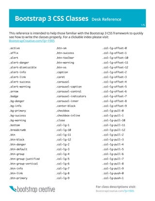
  • 6. Bootstrap 3 CSS Classes Desk Reference Free Bootstrap Video Tutorial Course BootstrapCreative.com/bootstrap-tutorial/ 6/8 .active .affix .alert .alert-danger .alert-dismissible .alert-info .alert-link .alert-success .alert-warning .arrow .badge .bg-danger .bg-info .bg-primary .bg-success .bg-warning .bottom .breadcrumb .btn .btn-block .btn-danger .btn-default .btn-group .btn-group-justified .btn-group-vertical .btn-info .btn-link .btn-primary .btn-sm .btn-success .btn-toolbar .btn-warning .btn-xs .caption .caret .carousel .carousel-caption .carousel-control .carousel-indicators .carousel-inner .center-block .checkbox .checkbox-inline .close .col-lg-* /*(1-12)*/ .col-lg-offset-* /*(0-12)*/ .col-lg-pull-* /*(0-12)*/ .col-lg-push-* /*(0-12)*/ .col-md-* /*(1-12)*/ .col-md-offset-* /*(0-12)*/ .col-md-pull-* /*(0-12)*/ .col-md-push-* /*(0-12)*/ .col-sm-* /*(1-12)*/ .col-sm-offset-* /*(0-12)*/ .col-sm-pull-* /*(0-12)*/ .col-sm-push-* /*(0-12)*/ .col-xs-* /*(1-12)*/ .col-xs-offset-* /*(0-12)*/ .col-xs-pull-* /*(0-12)*/ .col-xs-push-* /*(0-12)*/ Alphabetical Index of CSS Classes Tables <!-- Responsive table with all of the options applied --> <div class="table-responsive"> <table class="table table-condensed table-hover table-bordered table-striped"> <tr class="active">...</tr> <tr> <td class="info">...</td> </tr> </table> </div>
  • 7. Bootstrap 3 CSS Classes Desk Reference Free Bootstrap Video Tutorial Course BootstrapCreative.com/bootstrap-tutorial/ 7/8 .collapse .collapsing .container .container-fluid .control-label .divider .dropdown .dropdown-backdrop .dropdown-header .dropdown-menu .dropdown-menu-left .dropdown-menu-right .dropdown-toggle .embed-responsive .embed-responsive-16by9 .embed-responsive-4by3 .fade .form-control .form-control-feedback .form-control-static .form-group .glyphicon .glyphicon-chevron-left .glyphicon-chevron-right .h1 .h2 .h3 .h4 .h5 .h6 .has-feedback .help-block .hidden .hidden-lg .hidden-md .hidden-print .hidden-sm .hidden-xs .hide .icon-bar .icon-next .icon-prev .img-circle .img-rounded .img-thumbnail .in .initialism .input-group .input-group-addon .input-group-btn .input-lg .input-sm .invisible .item .jumbotron .label .label-danger .label-default .label-info .label-primary .label-success .label-warning .lead .left .list-group .list-group-item .list-group-item-danger .list-group-item-heading .list-group-item-info .list-group-item-success .list-group-item-text .list-group-item-warning .list-inline .list-unstyled .mark .media .media-body .media-heading .media-list .media-object .modal .modal-backdrop .modal-body .modal-content .modal-dialog .modal-footer .modal-header .modal-lg .modal-open .modal-scrollbar-measure .modal-sm .modal-title .nav .nav-divider .nav-justified .nav-tabs .nav-tabs-justified .navbar .navbar-brand
  • 8. Bootstrap 3 CSS Classes Desk Reference Free Bootstrap Video Tutorial Course BootstrapCreative.com/bootstrap-tutorial/ 8/8 .navbar-btn .navbar-collapse .navbar-default .navbar-fixed-bottom .navbar-fixed-top .navbar-form .navbar-header .navbar-inverse .navbar-left .navbar-link .navbar-nav .navbar-right .navbar-static-top .navbar-text .navbar-toggle .next .page-header .pager .pagination .panel .panel-body .panel-danger .panel-default .panel-footer .panel-group .panel-heading .panel-info .panel-primary .panel-success .panel-title .panel-warning .popover .popover-content .popover-title .pre-scrollable .prev .progress .progress-bar .progress-bar-danger .progress-bar-info .progress-bar-striped .progress-bar-success .progress-bar-warning .pull-left .pull-right .right .row .show .small .sr-only .tab-pane .table .table-bordered .table-responsive .text-capitalize .text-center .text-danger .text-hide .text-info .text-justify .text-left .text-lowercase .text-muted .text-nowrap .text-primary .text-right .text-success .text-uppercase .text-warning .thumbnail .tooltip .tooltip-arrow .tooltip-inner .top .visible-lg .visible-lg-block .visible-lg-inline .visible-lg-inline-block .visible-md .visible-md-block .visible-md-inline .visible-md-inline-block .visible-print .visible-print-block .visible-print-inline .visible-print-inline-block .visible-sm .visible-sm-block .visible-sm-inline .visible-sm-inline-block .visible-xs .visible-xs-block .visible-xs-inline .visible-xs-inline-block .well .well-lg .well-sm