BP Statistical Review of World Energy infographic
•
0 gostou•1,654 visualizações

BP Statistical Review of World Energy infographic

Recomendados
Mais conteúdo relacionado
Mais procurados
Mais procurados (19)
Destaque
Destaque (18)
Semelhante a BP Statistical Review of World Energy infographic
Semelhante a BP Statistical Review of World Energy infographic (20)
Mais de bp
Mais de bp (20)
Último
Último (20)
BP Statistical Review of World Energy infographic
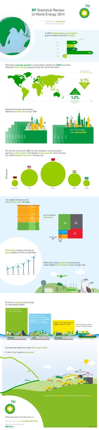
- 1. With above average growth in consumption overall from OECD countries offset by below average growth across the rest of the world As a global energy source, oil’s market share fell again 2009 2010 2011 2012 2013 Renewable energy continues to grow rapidly but from a small base hydro average above average 1.2% OECD non OECD 3.1% Meanwhile rising fossil fuel consumption meant global CO2 emissions from energy rose 2003 2005 2007 2009 2011 2013 Russia had the biggest growth of gas production in 2013 and remains the world’s LNG LNG So who is supplying the energy to meet global needs? the US had the biggest increase in energy production in 2013, driven by the biggest increase in production of oil in the country’s history While China produced the most energy overall China US Russia biggest energy exporter In the US oil imports decreased US China Oil 58% imported Gas 30% imported LNG LNG LNG So what else does this mean for energy trade? while China’s imports of oil and gas continued to rise © BP p.l.c. 2014 What else does the data tell us? Find out at bp.com/statisticalreview Join the conversation: #BPstats but it remains dominant oil 33% 30% 24% 7% 2% 4% renewables nuclear coal gas For the first time since 1999, the US increase in oil consumption was the world’s largest, and despite slower growth, China still saw the world’s biggest increase in energy use 2013 growth Germany US China India Brazil 0% below average 5% Overall EU energy consumption reached its lowest level since 1995 1995 1998 2001 2004 2007 2010 2013 2010 2011 2012 2013 but US energy use rebounded BP Statistical Review of World Energy 2014 Providing an unbiased viewpoint for 63 years In 2013 global energy consumption grew by slightly less than average 2013 2.3% 2012 1.8% 2011 2.3% 2010 5.6% 2009 -1.0%