HT19 - DA156A - Responsiv webb
•
0 gostou•366 visualizações

HT19 - DA156A - Responsiv webb

Recomendados
Mais conteúdo relacionado
Semelhante a HT19 - DA156A - Responsiv webb
Semelhante a HT19 - DA156A - Responsiv webb (20)
Mais de Anton Tibblin
Mais de Anton Tibblin (20)
HT19 - DA156A - Responsiv webb
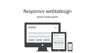
- 1. Responsiv webbdesign Genom media queries
- 2. Dagens föreläsning • Vad innebär responsiv webbdesign? • Media queries? • Att designa för olika enheter
- 3. Vilken enhet använder ni när ni surfar på webben? Vilken enhet använder ni när ni surfar på webben?
- 4. https://goo.gl/J8ouB6 • Bra? • Dåligt? • Förbättringar?
- 7. Tillbaka till 2009… • Webbplatser hade fasta bredder, så var det. • Vad hände sedan? • Våra skärmar blev större och större • Användare med mobiltelefoner började alltmer besöka våra webbplatser • Resan från 960px breda webbplatser, till responsiva
- 11. Responsive v.s adaptive design https://css-tricks.com/the-difference-between-responsive-and-adaptive-design/ Mer bra läsning: https://www.fastcodesign.com/3038367/9-gifs-that-explain-responsive-design-brilliantly
- 12. Varför är det så viktigt att fokusera på responsiv design?
- 13. 1. Allt fler surfar med mobiler/surfplattor
- 14. 2. Ger oss möjlighet anpassa innehållet efter det medium som användaren användare
- 15. 3. Många webbsidor hittas genom social media, vilket används mest på mobiler
- 16. 4. Responsiva webbplatser prioriteras av Google vid sökningar
- 17. 5. Snabbar upp webbsidorna
- 18. 6. Vi använder mer och mer olika enheter, för att utföra, eller fortsätta utföra en uppgift
- 19. Med andra ord – tänk responsivt!
- 20. Fler argument…
- 21. Once your page loads, users form an opinion in .05 seconds. — Kinesis Inc.
- 22. 40% of people will choose a different search result if the first is not mobile friendly. –Skillcrush
- 23. 40% of people will leave a website if it takes more than 3 seconds to load. — Econsultancy
- 24. You have 10 seconds to leave an impression and tell them what they’ll get out of your website and company. After this time (and oftentimes before), they’ll leave. — NN Group
- 25. Exempel på responsiva webbsidor
- 28. ia.webbintro.se
- 29. http://mediaqueri.es/ • Exempel på hur olika webbplatser använder sig utav responsiv design för att anpassa sig efter olika förutsättningar
- 32. http://alistapart.com/article/dao The web’s greatest strength, I believe, is often seen as a limitation, as a defect. It is the nature of the web to be flexible, and it should be our role as designers and developers to embrace this flexibility, and produce pages which, by being flexible, are accessible to all. —John Allsopp, 2000
- 33. Nyckelord för responsiv webbdesign • CSS 3 Media Queries • Flexible layout • Flexible media • Breakpoints • Mobile viewport sizes • Compatibility
- 36. Olika typer av stilmallar <link rel="stylesheet" type="text/css” media="screen" href=”style.css"> <link rel="stylesheet" type="text/css” media="print" href=”print.css">
- 37. Att styla för olika mål
- 38. Att styla för olika upplösningar
- 40. Att jobba med media queries DEMO - media print & media screen
- 41. Enheter i CSS
- 42. Enheter i CSS
- 43. Flexibel layout & media
- 46. Att jobba med dynamisk bredd % istället för pixlar Auto
- 47. Brytpunkter? Hur var när?
- 49. Exempel på brytpunkter http://lawrencestewart.ca/popular-media-queries-for-responsive-web-design/
- 51. "Start with the small screen first, then expand until it looks like *crap*. Time to insert a breakpoint!“ http://www.peachpit.com/articles/article.aspx?p=1945831
- 53. Att jobba med brytpunkter Vilka enheter ska vi anpassa oss till? Tankeverkstad!
- 55. Mobile Viewport Sizes Är en pixel alltid en pixel? https://developer.mozilla.org/en-US/docs/Mozilla/Mobile/Viewport_meta_tag
- 59. Anpassa storlek efter skärmstorlek Hmm, det blev ju ganska litet… hur löser vi detta?
- 60. Olika viewports <meta name="viewport" content="initial-scale=1.0, width=device-width"> initial-scale=1 maximum-scale=1 minimum-scale=1 width=500 user-scalable=no http://dev.w3.org/csswg/css-device-adapt/
- 61. Gör vår webbsida responsiv! =)
- 62. “that’s what responsive web design is: a possible solution, a way to more fully design for the web’s inherent flexibility”