Research poster design
•Transferir como PPTX, PDF•
1 gostou•480 visualizações

The document provides guidance on designing effective academic posters, including recommendations for layout, formatting, and inclusion of key elements such as the title, authors, sections, and visual elements. It discusses best practices for font size, style, and color usage, as well as tips for balancing text and graphics to engage audiences. The document also covers software, editing, printing, and presenting considerations to help researchers create high-quality posters that clearly communicate their work.

Recomendados
Mais conteúdo relacionado
Mais procurados
Mais procurados (20)
Semelhante a Research poster design
Semelhante a Research poster design (20)
Último
Último (20)
Research poster design
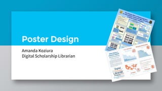
- 1. Poster Design Amanda Koziura Digital Scholarship Librarian
- 2. Why posters? Communicate main ideas of your work Easy to understand, visual format Stimulate interest & discussion
- 3. Qualities of a good poster Readable Legible Well Organized Succinct
- 4. Where to place items on your poster and how to make it look good Layout & Design
- 5. Capture your audience » 30% text, 40% graphics, 30% empty space » Clear title » Shift long explainations to a handout if they can’t be cut
- 6. Arranging poster elements » Vertically we read center → top → bottom » Horzontally we read left → right » Center top position is always your title and name
- 7. Arranging poster elements » Most people use 3-4 columns » Use sections to make the information easy to follow » Use blank space to highlight or offset information
- 8. Space » Without space your reader has no visual pauses to think » Leave space around sections and images » Leave at least ½” margin around the poster Poster content
- 9. Formatting » Do not single space! » Justify text » Use bullet points to highlight important points or lists
- 10. Be sure you include… » Title » PI & authors » Affiliations » Departments » School & institution names, logos, and addresses » Abstract » Introduction » Materials & methods » Results » Discussion » Conclusion » Future directions » References » Acknowledgements Depending on field and content, not all of these categories may apply
- 11. Guidelines for choosing the right ones Fonts and Color
- 12. Color » Be aware of color contrast » Use it to highlight important information » Too much color or patterning will drive people away » Dark backgrounds are fine but will cost more to print
- 13. Font style » Basic, sans-serif font such as Arial, Calibiri, Heveltica, and Tahoma » Avoid using multiple fonts » Be aware of color
- 14. Font size » Needs to be large; easily read from 4-6 ft. away » Test by viewing on your computer at 100% zoom and stepping back
- 15. Font size minimum recommendations » Title: 60 pt bold » Authors & affiliations: 48 pt » Section headings: Color of your choice, 30 pt bold » Text: Black, 24 pt » Figure, graph, & table captions: Black, 20 pt » References & acknowledgements: Black, 20 pt » Photo & image credits: Black, 14 pt
- 16. What makes your poster pop Images, Graphs, & Tables
- 17. Images » Place related items close together » Use color » Include captions » 300 dpi resolution » Use .jpg or .png files Figure 1. Health Centers
- 18. Graphs » Avoid complexity and excessive numbers » Use color to distinguish groups » Avoid fine patterns
- 19. Tables » Keep these compact » Only use tables when they tell the story better than a graph
- 20. Image Resources Logos The Noun Project Data Visualisation Catalogue Data Viz Project Additional resources at: https://researchguides.case.edu/posterdesign/home
- 21. How to make sure it comes out the way you want Pulling it all together
- 22. Time » Design takes time » Minimum of 2-3 days of concentrated effort » Leave space for items you don’t yet have
- 23. Software » Unless you have plenty of time, don’t learn something new. » Use what you’re comfortable with!
- 24. PowerPoint Tips 24 Slide Size Charts SmartArt Shapes
- 25. Edit, edit, edit! » 10 seconds to capture attention » People spend less than 10 minutes with your poster » Remove clutter!
- 26. Saving your poster file » Save files as PowerPoint and PDF » If working on a Mac or in another program, save as PDF to ensure quality prints
- 27. Proofread and test print » Have someone else read your poster » Do a test print on regular paper: Print → scale to fit → letter size paper → landscape
- 28. Printing » FedEx in Thwing » Student Activities in Tinkham Veale » Remember it takes time for things to be printed! Turn in your file for printing a few days ahead of time to avoid rush fees.
- 29. Presenting » Prep an elevator pitch to introduce people to your work in 1 minute or less » Enjoy your accomplishment » Be enthusiastic » Have fun!
- 30. Credits Adapted from a presentation by Ann Holstein Slide template Gremio by Slides Carnival
Notas do Editor
- So you may be wondering, why a poster? Posters allow you to communicate the main ideas of your work in a clear, easy to understand, visual format. A poster isn’t meant to cover a topic in detail – that’s what papers are for – but to give you a chance to start discussions about what you’re working on and what you discovered while working on it. Since a poster is a visual medium, there are a number of things to keep in mind when designing it.
- Readable Make sure there is a logical flow to your ideas and that you lay them out in order. It’s okay to label sections on your poster to make it easy to follow your thought process – in fact, it’s encouraged! You don’t want people to have to work at figuring out what you’re trying to say or how you made connections between one idea and the next. When writing the text of your poster, keep the language simple and proofread it for spelling and grammar errors. There is a place for long, grandiose, flowery sentences, but it’s not on a poster. You want your audience to be able to understand you without a looking things up in a dictionary, so keep your sentences simple. Bullet points are highly encouraged. Legible You could have the most well-written, easy to understand text on your poster, but no one is going to pay attention to it if they can’t read it. Watch your font sizes, font style choices, and coloring choices. Well Organized This goes back to what I mentioned about having a logical order to your thoughts. Be sure the order in which you place things on your poster makes sense – don’t make it so they have to solve a puzzle in order to understand what’s going on. Succinct You only have 10 seconds to grab someone’s attention, so use it well! Make sure your title gets to the heart of your topic and make it stand out on the page – make it nice and big and bold. Keep the amount of text to a minimum – people often grasp concepts faster through the use of graphics, so use as many charts, graphs, and pictures as you can. Finally, don’t attempt to include all the details! Again, that’s what papers are for. Posters are to give an overview of the concepts and spark conversation, not give an in-depth look at the topic. Now that we’ve gone over some of the design elements, there are a couple of things to keep in mind once you’re ready to sit down and start working on your poster.
- You should have a greater than or equal amount of images as compared to text. A good rule of thumb is 30% text, 40% graphics, 30% space Decide what the main message is. What’s the point you’re trying to make? Focus on that, and don’t include all the details! Stick to the main points. Keep it as short and easy to understand as possible. Remember you’re trying to capture an audience here. Large blocks of text are hard to read and will often turn people away from your poster. Make sure the main points are clear and if you absolutely must have a lot of detail, shift the details onto a handout to accompany the poster. You can talk about the details when people approach the poster and ask you questions. Also be sure that you are using language that the audience will understand – don’t use words from a specific discipline if your audience won’t understand them. Keep it simple, easy to read, and easy to understand or you’ll lose them. Remember, posters are visual. Clear, easy to understand graphics will take you a lot farther than text.
- Put the most important item at the top center position. This is the title slot – so make sure it’s descriptive of your topic. Then follow the progression outlined here. It’s important that your title and name be placed in the top center position as that will be seen in the first 10 seconds a person looks at your poster.
- Columns are the most common type of layout. Most often I see 3 or 4 columns. Organize your material into clearly marked sections. Don’t forget to leave white space (blank space) around the sections to make it easy to read and to highlight important information.
- Space is important! Leave a margin around your poster – it’s very difficult to read posters that go all the way to the edge of the paper. Be sure to do the same thing between bullet points, around graphics, and around sections of text. Without the white space people won’t be able to make sense of the information – they’ll find it too cluttered and walk away. Sketch out your poster on paper Check for sizing and spacing Limited space
- Do not single space your text! Remember what I’ve been saying about white space – you need it to make your poster readable Use indentations and bullets for lists and don’t be afraid to justify your test – it often makes it fill the space better. Don’t be afraid to use bullets!
- That said, there are certain elements that all posters need to have on them. These include: Title – nice and bold at the top Principal investigators name Other authors if applicable and affiliation of each Department and school name, addresses of school and other institutions These are often located right under the title The bulk of your poster area will usually be taken up by: Abstract, introduction, materials & methods, results, discussion, conclusion, future directions, references, acknowledgements, logos Now, this is a typical list for most scientific posters, so you may or may not be including all of these items. Think about which sections are most appropriate for your project and include them.
- Use color, but be careful when you do! Don’t use colors that are difficult for people to view for a long time, such as neon colors. Use it to highlight important information. Proper color contrast will reduce eye strain and make the poster more legible and interesting visually, but using it wrong will decrease the impact of your data and turn people away When you do use color, don’t go overboard! Not everything has to be color – use it mixed in with black and white. Avoid lots of patterns or motifs. Dark backgrounds are okay, but be careful using them because it’ll often make your poster more expensive to print.
- Choose your font wisely! You want a Sans-serif font that is easy to read and that most printers would be able to print. Using multiple fonts can be distracting, so stick to one (maybe two) and use things like sizing, italicizing, coloring, and bolding to make the text pop where needed. While using color to make your text pop is good, be careful about your color choices to make sure they are easy to read and don’t clash with your background.
- Posters are large and read at a distance, which means your font sizes need to be much larger than usual. If you’ve set your slide size to the size of the poster try zooming in at a 100% and stepping a few feet back from your screen. If you can read it easily, then you’re in good shape.
- Here are some minimum guidelines on font sizes. Title: 60 point bold Researchers and affiliations: 48 point Section headings: color of your choice, 30 point bold Text: black, 24 point Figure, graph and table captions: black, 20 point References and acknowledgements: black, 20 point Photo/image credit: black, 14 point Will have to go larger for larger posters
- Be sure to place related items next to each other so that people can easily see how your images relate to each other and the text around them. Don’t be afraid of color – greyscale images don’t pop. Be sure to include captions on your images that explain what they mean. High quality images – can always make something smaller without losing quality but not larger.
- While I encourage the use of graphs, charts, and tables, be sure they’re not overly complex and cluttered. Use color to help make your point and make them stand out. Fine patterns won’t be seen, so stick to colors and bold patterns.
- Graphs are generally better to use than tables, but if you do use a table keep it compact. Don’t be afraid to use color or shading in your charts to make them pop.
- Graphs are generally better to use than tables, but if you do use a table keep it compact. Don’t be afraid to use color or shading in your charts to make them pop.
- Be sure to give yourself plenty of time to design your poster. A poster is a visual medium, and so you’ll have to spend time not only writing but also creating graphics and laying them out in an easy to understand fashion. Give yourself a few days to work on it. If you’re waiting for data that’s going to come in at the last minute, leave a space in your design for it and add it once it’s ready – don’t wait for it.
- Choose your design software wisely. Use something you’re comfortable with – you’re going to have plenty of work creating the poster, you don’t want to be fighting with the software too. We recommend Microsoft PowerPoint due to its ease of use.
- The average person looking at your poster will spend less than 10 minutes on your work, and you only have 10 seconds to get their attention. Cluttered, crowded posters that try to convey too much will turn people away. If you’re thinking you have too much on your poster, you probably do. Edit things out and move on.
- Don’t forget to save your work periodically and in the proper format! At KSL we can only print pdf files, so if you’re using us to print bring one of those. Other printers may also accept .jpeg files, but saving your poster as such will often reduce the quality.
- Before your print, have someone proofread your work! If they’re confused, then you’ll have some more work to do to clarify your points. Pay attention to what isn’t necessary – for posters less is more! Test print your poster on a regular sheet of paper. You can do this easily in powerpoint by scaling your poster to fit on letter size paper. Don’t change any of the other settings or it might change your poster!
- When you’re ready to print there are several places on campus that can help. Remember it takes time for things to be printed! Turn in your file for printing a few days ahead of time to avoid rush fees.
- When getting ready to present your poster, you may want to want to prep a short presentation or elevator pitch to go with it so you’re ready when people approach to talk to you about your work. While all of this is a lot of work, don’t forget that it will pay off in the end. You’re showing off something you spent a lot of time on – have fun with it! Take time to enjoy talking to people and try to get a chance to interact with others. This is your work, be enthusiastic about showing it. ***Show them how to set slide size in powerpoint