SlideShare uma empresa Scribd logo
1 de 4
Masthead                                                         Comment on how the design of the magazine cover attracts the target audience:
The red and white that is College the masthead suits both
                 Salford City used in
the male and female Centre
                 Eccles audiences. It relates to the classic
                 AS Media Studies
album and song reviews that can be read within the
                 Foundation Portfolio
magazine. The bold attracts the older audience and the
‘Q’ stands out as it is unique and creative so it gives the                                                                                      Colour
magazine an edgy look to attract a younger audience as                                                                                           The red and white colours attract an older audience
well. It’s also placed in the top left corner which has been                                                                                     because they are quite plain but give a very professional
seen as the first thing an audience will look at when they                                                                                       and sophisticated look because of the contract on the
go to read a magazine.                                                                                                                           backlight. Red is known to symbolise passion and sex,
                                                                                                                                                 but also danger. This links to the main image and also
Main image                                                                                                                                       the model credit. White is a neutral colour which
Using a well known singer liker Cheryl Cole attracts both                                                                                        attracts both genders but also seen as an innocent
audiences of male and female because she is attractive                                                                                           colour and creates a contrast on its opposite colour red
and also a successful chart singer.                                                                                                              which brings danger. The contrast of white and red also
Her gesture code attracts younger males as it is a sexy and                                                                                      emphasises the importance of the stories.
seductive pose. Her direct eye contact lures audience in
because it gives them the impression that she is looking                                                                                         Typefaces
right at them. It also looks professional. The unusual water                                                                                     The bold, sophisticated typeface attracts the older
effect makes dramatic approach and catches the                                                                                                   audiences because it gives a very dramatic effect. It
audience’s attention because it stands out with the high                                                                                         looks very visual and stands out. It emphasises the
key lighting.                                                                                                                                    creativity and edgy look when using capitals and helps
                                                                                                                                                 the audience learn what the main attraction is.
Model credit
This is used in a bold effect and makes it intriguing for the                                                                                    Photography Lighting
audience to look at. It uses a shocking effect that attracts                                                                                     There is high key lighting used on the main image
audience because it looks important and outstanding from                                                                                         around the face to show that she is the dominant
other magazines. It helps to link to main image and                                                                                              contract. It also creates a distinctive image for the
informs the audience who it’s about and what it’s about.                                                                                         audience because it bring out the detail of the water
The large text stands out as it covers the whole of the                                                                                          effect and the beauty of her seductiveness.
bottom of page so the audience’s attention is dragged                                                                                            As the backlight is darker, this makes the main image
across the whole cover. It is also short and snappy which                                                                                        stand out even more to attract the audience.
 Immediately tells the audience what the article is about.                                                                                       The usual seductive look links to the edgy effect.
                                                                  House Style
Main cover line                                                   The design of the masthead is set out as the principle of design theory.       Coverlines
The contrast between the celebrity and the cover line             We are attracted to the top left because we read from left to right. This      These are a lot smaller than the main cover line so that
attracts the audience because fans and audiences that are         indicates that the audience will be attracted to the masthead first and        the audience isn’t distracted from the main image,
aware of Cheryl Cole know that she isn’t the rock star kind       also then drags their attention across the page as it goes straight into the   because that is what sells the magazine. The colours
of woman and doesn’t usually go for such a dramatic,              celebrity then to the main cover line. The typography used also keeps it       attract the audience because they look professional due
passionate look. Older fans recognise her from the                looking professional but edgy so that it attracts a wider audience. The        to the continuity of the red and white contrast on the
innocent girl band Girls Aloud and shows how independent          colour scheme would be eye catching because its stands out from the            darker backlight. The block effect used on the left hand
she is know and how she has changed to suit the needs of          low key lighting in the back ground and has been cleverly set out so that      side is used so that the audience can know what else is
her audience. It also tells the audience what the article will    the audience’s attention is attracted to the most important thing.             going to be available in the magazine without giving to
be about and lures them in because she is right above the                                                                                        much away. Also the names are major starts which will
cover line.                                                                 Design Principles Used?                                              attract more fans.
Masthead                                                         Comment on how the design of the magazine cover attracts the target audience:
The block letters used stand out from the main image
                Salford City College
colour. This attracts the audience because it looks exciting
                Eccles Centre
and shocking. This relates to its purpose of entertaining
                AS Media Studies
and informing Foundation Portfolio is abbreviations this gives
                its audience. As it
it a creative and unique selling point. The white colour
                                                                                                                                                 Colour
shows how important the magazine is because it
                                                                                                                                                 The white can connotes innocence which relates to her
emphasises what the magazine is called. Its targeted at a
                                                                                                                                                 gesture code and personality, but it also is a neutral
younger audience, but the white colour suggests its aimed
                                                                                                                                                 colour which means that it’s aimed at both genders. The
at male and female.
                                                                                                                                                 black colour can represent mystery which relates to her
                                                                                                                                                 gesture code of being secretive. Her red hair and lack of
Main image                                                                                                                                       makeup tells us she is not aiming to attractive a male
As it is a close up. We can see the gesture pose if quite                                                                                        audience. The emphasis of her red hair symbols passion
secretive and mysterious, which attracts male audiences. It                                                                                      and danger. But the contrast of the white on the red
attracts the audience because of the unusual pose. It is                                                                                         helps to emphasise the cover lines as well.
somewhat seductive, but the audience don’t think that
when they first see it. Her direct address also lures the
audience in because it quite relaxed but edgy. The mixture                                                                                       Typefaces
of emotions creates an eye catching look. As Florence is                                                                                         The bold font and capital letters attract the audience
well known and a chart topping singer, this would bring in                                                                                       because it eye catching and helps emphasise what the
indie/pop fans and audiences. As she is the only thing in                                                                                        magazine is based on. It gives the magazine an edgy
the cover, it drives the audience straight to her.                                                                                               look and also quite indie. The primary audience for this
                                                                                                                                                 magazine is indie/different people.
Model credit
This model credit is unusual because it is just the name of                                                                                      Photography Lighting
the singer. This would attract the audience because it gives                                                                                     The magazine uses high key lighting on the face of the
an enigmatic design and drives the audience the read on. It                                                                                      celebrity because she is the main attraction. It
is also very bold and dramatic and the only dark font which                                                                                      emphasises her beauty and how famous she is. It also
creates an eye catching effect to draw in the attention of                                                                                       attracts the audience because it brings out the vibrant
the audience. It also links to her privacy and for her being                                                                                     colours in her hair which she is very well known for. Her
known to not give in to the paparazzi. Also, she has a very                                                                                      white t-shirt also helps brighten the lighting to make it a
powerful voice, this credit emphasises by using big bold                                                                                         positive magazine and link to her happy success she has
letters.                                                                                                                                         had. The brightness itself attracts the audience.


Main cover line                                                   House Style                                                                    Coverlines
This stands out from the rest of cover because it helps to        The way in which this magazine cover is set up helps to make the               The cover lines are smaller than the main cover line
represent the qualities of the singer. The unusual use of         celebrity the main attraction on the screen. The use of white makes the        because they can’t let the audience get distracted. Also
just her name tells us that it shows her secrecy. Her             continuity of the magazine seem very innocent and girly which links in         they are arranged around her face so that the audience
powerful voice can be captivated in the cover line because        with her personality and high key lighting.                                    is still attracted to her face. They help to outline her
of the large text, but she has a very quiet voice. The                                                                                           face as well so the audience is attracted to the centre of
contrast of the two different sides to her can be seen in                                                                                        the page to her face. With them being white, its helps to
the contrast between the cover line and main image. The                                                                                          emphasises and create a distinctive image for the
text above it in white is emphasised and relates to stories                                                                                      audience because they have helped create a dominant
that are happening around the world for example, the x                                                                                           contrast.
factor was a popular TV show screening at the time.                         Design Principles Used?
Masthead
They have used boldCity College black and red which
                         text by using                                                                                                           Colour
              Salford
mainly attracts a male audience. It creates a contract on
              Eccles Centre                                                                                                                      The red colour symbolises sex, drugs, blood which all
the white background and helps it to stand out. The
              AS Media Studies                                                                                                                   link to the gangster theme. Black also symbolises
                                                                Comment on how the design of the magazine cover attracts the target audience:
black used links to main Portfolioclothing to create
              Foundation
                            image                                                                                                                gangster and death which links to the main cover
continuity. As it fills the top of page this attract audience                                                                                    line. All these colours are used on his last album
to read it because it’s dramatic. You can’t see all of it so                                                                                     which the target audience will be familiar with.
it must be easily recognisable and the audience are                                                                                              Altogether it creates a dark, intimidating atmosphere
already familiar with it. It looks quite gangster and                                                                                            for the reader.
manly links to rap music which will be a key feature that
attracts the primary audience as they like this kind of
music.

Main image                                                                                                                                       Typefaces
The main image has used a well-known celebrity. He is                                                                                            The bold dramatic effect is used to create a shocking
giving an intimidating look which helps link to gangster                                                                                         story and bring out the importance of main story and
look. They have used dark colours and tattoo helps build                                                                                         coverlines. The overlapping is used to make it seem
up and create a more intimidating. The medium shot is                                                                                            busy and to make the magazine seem like it has a lot
used to capture his muscles, tattoos and necklace that                                                                                           to tell the reader.
are key conventions of a gangster. They have defined his
features to help him stand out. He is wearing black to                                                                                           Photography Lighting
bring out a bad ass look and have also used a big                                                                                                The high key lighting used creates a shadow at the
necklace which keeps the link to gangster/rap.                                                                                                   back of the main image and sets a very nice stand out
                                                                                                                                                 of the main image which makes it a distinctive image.
Model credit                                                                                                                                     Also, the high key lighting brings out the features and
The red text is in bold and is recognisable because                                                                                              details on his tattoos which encourages the readers
audience link that to Eminem and his music. The quoting                                                                                          to have a look at what the actually are. It also brings
gives the audience an idea of what the interview is                                                                                              out the emotion of intimidation in his face.
about and has used shocking words like ‘died’ which
lures the audience in because they will have hear about
it in the news and will want to read about it properly.                                                                                         Coverlines
The list of drugs links to gangster and bad ass theme                                                                                           The cover lines are very close to the main image and
because they are dangerous and edgy. The quote ‘come                                                                                            draw an outline to help the main image stand out
clean’ can relate the cross around his neck and bring a                                                                                         more. It also uses the same colours in different parts
sense of innocence.                                                                                                                             of the colours to make it look quite edgy and different.
                                                                                                                                                They also name some big names in the music genre
Main cover line                                                                                                                                 which will help attract a wider audience.
The short and snappy cover line helps to makes the
audience only get half the story and makes them eager
to read on to find out how it relates to the main image.         House Style
The different colours create a contrast against white            In terms of house styles, this magazine cover has kept the continuity and
background and helps for the main cover line to stand            the colours red, black and grey to make it very masculine and gangster. It
out amongst the rest of the magazine. It also keeps a            has also kept to the bold typeface to make it stand out and be in the
constant and professional look for the audience.                 faces of the audience compared to rivalry magazines. The main image is          Design Principles Used?
                                                                 centred across the rule of three which helps to direct the audience’s
                                                                 attention to the most important thing selling the magazine.
Masthead                                                        Comment on how the design of the magazine cover attracts the target audience:
The mastheadSalford City College
                  is a bold pink heading that would attract a                                                                                   Colour
                 Eccles Centre
female audience. It is meant to entertain and look quite                                                                                        The pink connotes girls, hot and can be seen as a sexy
                 AS Media Studies                                                                                                               colour. For a deeper meaning it can be acceptance
quirky and eye catching. Portfolio out because it large
                 Foundation It stands
and spaced out. The masthead also fills top of page so                                                                                          which relates to being different link Avril being a
it’s the first thing the audience when they pick up the                                                                                         punk. Black is gothic colour and links to her style. The
magazine. The contrasts with the dark colours on girl                                                                                           white background helps brings out the contrasts from
help to create a fun and girly magazine with a twist of                                                                                         black being bad and white being innocent which is
adult because of the sophistication of the typeface.                                                                                            how most of the audience will act being young
                                                                                                                                                females. Change in colours makes magazine more
                                                                                                                                                high profile and professional to beat competition.
Main image
For the main image they have used a well-known
celebrity. The direct eye contact to audience lures them                                                                                        Typefaces
in because they are going to be interested about why                                                                                            As for the bold text, this makes magazine seem
they are on the magazine. The unusual gesture pose                                                                                              shocking and important towards the audience. It tries
focuses more on attracting girls not boys, although there                                                                                       to makes the magazine stand out from the rest of
is a hint of her seductively she is more in your face with                                                                                      them. Different sizes shapes used on the cover bring
an attitude rather than being sexy. Her smart, sarcastic                                                                                        creativity and a sense of edginess. This relates to main
smile looks like she has an attitude as she is known for                                                                                        image being in your face like text.
being bad ass and like a punk.
                                                                                                                                                Photography Lighting
Model credit                                                                                                                                    They have used high key lighting on face which
The model credit is bold like the masthead which shows                                                                                          creates a dominant contrast and helps to make the
continuity and as it is pink to attract the young female                                                                                        main image most important on the page. The white
audience. The white contrast on black dress is eye                                                                                              back ground helps to bring out features and dark
catching and luring. As it is at the bottom of page the                                                                                         colours on the celebrity. This creates a distinctive
audience are brought to it as a pattern from top to                                                                                             image for audience. The necklace is put in centre and
bottom. Because the colours are the brightest they stand                                                                                        brought out and helps create an unusual gesture pose
out. This all relates to the hard/punk look used on the                                                                                         to draw in audience.
main image. The short snappy lines to tell audience the
main storyline and leave an enigma so that the audience                                                                                         Coverlines
as drawn to the magazine.                                                                                                                       The cover lines have been places around the main
                                                                                                                                                image and smaller so the audience isn’t distracted
                                                                                                                                                when looking at the magazine. The changes from pink
Main cover line                                                  House Style                                                                    to black link to the celebrity and the masthead, this
They have used pink, white and black whichlinks to her           The use of bold text and 3 colours helps create continuity and creates a       helps keep continuity and professionalism. They are
perfume which uses these colours in mainstream stores            professional look on the magazine so that the audience are more likely to      surrounding main image so the audience is directed to
that the primary audience will go in and recognise her           be attracted to it. The masthead covers the whole of the top page so it        the centre of the page. It mentions important names
for as well as her music. The magazine has adapted to            attracts the audience because it stands out across the whole cover. The        to attract audience but not give too much away. They
this. The main cover line has used direct address using          main image covers the rule of three so audiences are attracted to the          are all aimed at one particular music group of the
‘You’ to attract the audience and bring them into the            most important features that are there to help sell the magazine. The          female audience.
story. The big text helps it stand out from the other            model credit also covers the bottom of page so that the audience follow
minor cover lines. The contrast on black helps to                the design principle theory and do not miss out on the key aspects of the
emphasise main story because the colours seem brighter                                                                                                 Design Principles Used?
                                                                 magazine.
and more obvious.

Mais conteúdo relacionado

Mais de AlixKelly

A2 media studies advanced portfolio evaluation
A2 media studies advanced portfolio evaluationA2 media studies advanced portfolio evaluation
A2 media studies advanced portfolio evaluationAlixKelly
 
Contact sheet for pictorials
Contact sheet for pictorialsContact sheet for pictorials
Contact sheet for pictorialsAlixKelly
 
A2 advanced portfolio production diary template 2013 to 2014
A2 advanced portfolio production diary template 2013 to 2014A2 advanced portfolio production diary template 2013 to 2014
A2 advanced portfolio production diary template 2013 to 2014AlixKelly
 
A2 advanced portfolio production diary template 2013 to 2014
A2 advanced portfolio production diary template 2013 to 2014A2 advanced portfolio production diary template 2013 to 2014
A2 advanced portfolio production diary template 2013 to 2014AlixKelly
 
Market research questionnaire
Market research questionnaireMarket research questionnaire
Market research questionnaireAlixKelly
 
Market research analysis
Market research analysisMarket research analysis
Market research analysisAlixKelly
 
Articles for my local newspaper
Articles for my local newspaperArticles for my local newspaper
Articles for my local newspaperAlixKelly
 
Radio advertisement report
Radio advertisement reportRadio advertisement report
Radio advertisement reportAlixKelly
 
Radio advertisement report
Radio advertisement reportRadio advertisement report
Radio advertisement reportAlixKelly
 
Media report
Media reportMedia report
Media reportAlixKelly
 
Question 5 fin
Question 5 finQuestion 5 fin
Question 5 finAlixKelly
 
Question 5 fin
Question 5 finQuestion 5 fin
Question 5 finAlixKelly
 
Question 5 fin
Question 5 finQuestion 5 fin
Question 5 finAlixKelly
 
Produce raw images
Produce raw imagesProduce raw images
Produce raw imagesAlixKelly
 

Mais de AlixKelly (20)

A2 media studies advanced portfolio evaluation
A2 media studies advanced portfolio evaluationA2 media studies advanced portfolio evaluation
A2 media studies advanced portfolio evaluation
 
Contact sheet for pictorials
Contact sheet for pictorialsContact sheet for pictorials
Contact sheet for pictorials
 
A2 advanced portfolio production diary template 2013 to 2014
A2 advanced portfolio production diary template 2013 to 2014A2 advanced portfolio production diary template 2013 to 2014
A2 advanced portfolio production diary template 2013 to 2014
 
A2 advanced portfolio production diary template 2013 to 2014
A2 advanced portfolio production diary template 2013 to 2014A2 advanced portfolio production diary template 2013 to 2014
A2 advanced portfolio production diary template 2013 to 2014
 
Market research questionnaire
Market research questionnaireMarket research questionnaire
Market research questionnaire
 
Market research analysis
Market research analysisMarket research analysis
Market research analysis
 
Articles for my local newspaper
Articles for my local newspaperArticles for my local newspaper
Articles for my local newspaper
 
Radio advertisement report
Radio advertisement reportRadio advertisement report
Radio advertisement report
 
Radio advertisement report
Radio advertisement reportRadio advertisement report
Radio advertisement report
 
Media report
Media reportMedia report
Media report
 
Doc1
Doc1Doc1
Doc1
 
Question 4
Question 4Question 4
Question 4
 
Question 2
Question 2Question 2
Question 2
 
Question 5 fin
Question 5 finQuestion 5 fin
Question 5 fin
 
Question 5 fin
Question 5 finQuestion 5 fin
Question 5 fin
 
Question 5 fin
Question 5 finQuestion 5 fin
Question 5 fin
 
Question 4
Question 4Question 4
Question 4
 
Question 1
Question 1Question 1
Question 1
 
Question 2
Question 2Question 2
Question 2
 
Produce raw images
Produce raw imagesProduce raw images
Produce raw images
 

Magazine front cover final analysis

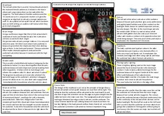
  • 1. Masthead Comment on how the design of the magazine cover attracts the target audience: The red and white that is College the masthead suits both Salford City used in the male and female Centre Eccles audiences. It relates to the classic AS Media Studies album and song reviews that can be read within the Foundation Portfolio magazine. The bold attracts the older audience and the ‘Q’ stands out as it is unique and creative so it gives the Colour magazine an edgy look to attract a younger audience as The red and white colours attract an older audience well. It’s also placed in the top left corner which has been because they are quite plain but give a very professional seen as the first thing an audience will look at when they and sophisticated look because of the contract on the go to read a magazine. backlight. Red is known to symbolise passion and sex, but also danger. This links to the main image and also Main image the model credit. White is a neutral colour which Using a well known singer liker Cheryl Cole attracts both attracts both genders but also seen as an innocent audiences of male and female because she is attractive colour and creates a contrast on its opposite colour red and also a successful chart singer. which brings danger. The contrast of white and red also Her gesture code attracts younger males as it is a sexy and emphasises the importance of the stories. seductive pose. Her direct eye contact lures audience in because it gives them the impression that she is looking Typefaces right at them. It also looks professional. The unusual water The bold, sophisticated typeface attracts the older effect makes dramatic approach and catches the audiences because it gives a very dramatic effect. It audience’s attention because it stands out with the high looks very visual and stands out. It emphasises the key lighting. creativity and edgy look when using capitals and helps the audience learn what the main attraction is. Model credit This is used in a bold effect and makes it intriguing for the Photography Lighting audience to look at. It uses a shocking effect that attracts There is high key lighting used on the main image audience because it looks important and outstanding from around the face to show that she is the dominant other magazines. It helps to link to main image and contract. It also creates a distinctive image for the informs the audience who it’s about and what it’s about. audience because it bring out the detail of the water The large text stands out as it covers the whole of the effect and the beauty of her seductiveness. bottom of page so the audience’s attention is dragged As the backlight is darker, this makes the main image across the whole cover. It is also short and snappy which stand out even more to attract the audience. Immediately tells the audience what the article is about. The usual seductive look links to the edgy effect. House Style Main cover line The design of the masthead is set out as the principle of design theory. Coverlines The contrast between the celebrity and the cover line We are attracted to the top left because we read from left to right. This These are a lot smaller than the main cover line so that attracts the audience because fans and audiences that are indicates that the audience will be attracted to the masthead first and the audience isn’t distracted from the main image, aware of Cheryl Cole know that she isn’t the rock star kind also then drags their attention across the page as it goes straight into the because that is what sells the magazine. The colours of woman and doesn’t usually go for such a dramatic, celebrity then to the main cover line. The typography used also keeps it attract the audience because they look professional due passionate look. Older fans recognise her from the looking professional but edgy so that it attracts a wider audience. The to the continuity of the red and white contrast on the innocent girl band Girls Aloud and shows how independent colour scheme would be eye catching because its stands out from the darker backlight. The block effect used on the left hand she is know and how she has changed to suit the needs of low key lighting in the back ground and has been cleverly set out so that side is used so that the audience can know what else is her audience. It also tells the audience what the article will the audience’s attention is attracted to the most important thing. going to be available in the magazine without giving to be about and lures them in because she is right above the much away. Also the names are major starts which will cover line. Design Principles Used? attract more fans.
  • 2. Masthead Comment on how the design of the magazine cover attracts the target audience: The block letters used stand out from the main image Salford City College colour. This attracts the audience because it looks exciting Eccles Centre and shocking. This relates to its purpose of entertaining AS Media Studies and informing Foundation Portfolio is abbreviations this gives its audience. As it it a creative and unique selling point. The white colour Colour shows how important the magazine is because it The white can connotes innocence which relates to her emphasises what the magazine is called. Its targeted at a gesture code and personality, but it also is a neutral younger audience, but the white colour suggests its aimed colour which means that it’s aimed at both genders. The at male and female. black colour can represent mystery which relates to her gesture code of being secretive. Her red hair and lack of Main image makeup tells us she is not aiming to attractive a male As it is a close up. We can see the gesture pose if quite audience. The emphasis of her red hair symbols passion secretive and mysterious, which attracts male audiences. It and danger. But the contrast of the white on the red attracts the audience because of the unusual pose. It is helps to emphasise the cover lines as well. somewhat seductive, but the audience don’t think that when they first see it. Her direct address also lures the audience in because it quite relaxed but edgy. The mixture Typefaces of emotions creates an eye catching look. As Florence is The bold font and capital letters attract the audience well known and a chart topping singer, this would bring in because it eye catching and helps emphasise what the indie/pop fans and audiences. As she is the only thing in magazine is based on. It gives the magazine an edgy the cover, it drives the audience straight to her. look and also quite indie. The primary audience for this magazine is indie/different people. Model credit This model credit is unusual because it is just the name of Photography Lighting the singer. This would attract the audience because it gives The magazine uses high key lighting on the face of the an enigmatic design and drives the audience the read on. It celebrity because she is the main attraction. It is also very bold and dramatic and the only dark font which emphasises her beauty and how famous she is. It also creates an eye catching effect to draw in the attention of attracts the audience because it brings out the vibrant the audience. It also links to her privacy and for her being colours in her hair which she is very well known for. Her known to not give in to the paparazzi. Also, she has a very white t-shirt also helps brighten the lighting to make it a powerful voice, this credit emphasises by using big bold positive magazine and link to her happy success she has letters. had. The brightness itself attracts the audience. Main cover line House Style Coverlines This stands out from the rest of cover because it helps to The way in which this magazine cover is set up helps to make the The cover lines are smaller than the main cover line represent the qualities of the singer. The unusual use of celebrity the main attraction on the screen. The use of white makes the because they can’t let the audience get distracted. Also just her name tells us that it shows her secrecy. Her continuity of the magazine seem very innocent and girly which links in they are arranged around her face so that the audience powerful voice can be captivated in the cover line because with her personality and high key lighting. is still attracted to her face. They help to outline her of the large text, but she has a very quiet voice. The face as well so the audience is attracted to the centre of contrast of the two different sides to her can be seen in the page to her face. With them being white, its helps to the contrast between the cover line and main image. The emphasises and create a distinctive image for the text above it in white is emphasised and relates to stories audience because they have helped create a dominant that are happening around the world for example, the x contrast. factor was a popular TV show screening at the time. Design Principles Used?
  • 3. Masthead They have used boldCity College black and red which text by using Colour Salford mainly attracts a male audience. It creates a contract on Eccles Centre The red colour symbolises sex, drugs, blood which all the white background and helps it to stand out. The AS Media Studies link to the gangster theme. Black also symbolises Comment on how the design of the magazine cover attracts the target audience: black used links to main Portfolioclothing to create Foundation image gangster and death which links to the main cover continuity. As it fills the top of page this attract audience line. All these colours are used on his last album to read it because it’s dramatic. You can’t see all of it so which the target audience will be familiar with. it must be easily recognisable and the audience are Altogether it creates a dark, intimidating atmosphere already familiar with it. It looks quite gangster and for the reader. manly links to rap music which will be a key feature that attracts the primary audience as they like this kind of music. Main image Typefaces The main image has used a well-known celebrity. He is The bold dramatic effect is used to create a shocking giving an intimidating look which helps link to gangster story and bring out the importance of main story and look. They have used dark colours and tattoo helps build coverlines. The overlapping is used to make it seem up and create a more intimidating. The medium shot is busy and to make the magazine seem like it has a lot used to capture his muscles, tattoos and necklace that to tell the reader. are key conventions of a gangster. They have defined his features to help him stand out. He is wearing black to Photography Lighting bring out a bad ass look and have also used a big The high key lighting used creates a shadow at the necklace which keeps the link to gangster/rap. back of the main image and sets a very nice stand out of the main image which makes it a distinctive image. Model credit Also, the high key lighting brings out the features and The red text is in bold and is recognisable because details on his tattoos which encourages the readers audience link that to Eminem and his music. The quoting to have a look at what the actually are. It also brings gives the audience an idea of what the interview is out the emotion of intimidation in his face. about and has used shocking words like ‘died’ which lures the audience in because they will have hear about it in the news and will want to read about it properly. Coverlines The list of drugs links to gangster and bad ass theme The cover lines are very close to the main image and because they are dangerous and edgy. The quote ‘come draw an outline to help the main image stand out clean’ can relate the cross around his neck and bring a more. It also uses the same colours in different parts sense of innocence. of the colours to make it look quite edgy and different. They also name some big names in the music genre Main cover line which will help attract a wider audience. The short and snappy cover line helps to makes the audience only get half the story and makes them eager to read on to find out how it relates to the main image. House Style The different colours create a contrast against white In terms of house styles, this magazine cover has kept the continuity and background and helps for the main cover line to stand the colours red, black and grey to make it very masculine and gangster. It out amongst the rest of the magazine. It also keeps a has also kept to the bold typeface to make it stand out and be in the constant and professional look for the audience. faces of the audience compared to rivalry magazines. The main image is Design Principles Used? centred across the rule of three which helps to direct the audience’s attention to the most important thing selling the magazine.
  • 4. Masthead Comment on how the design of the magazine cover attracts the target audience: The mastheadSalford City College is a bold pink heading that would attract a Colour Eccles Centre female audience. It is meant to entertain and look quite The pink connotes girls, hot and can be seen as a sexy AS Media Studies colour. For a deeper meaning it can be acceptance quirky and eye catching. Portfolio out because it large Foundation It stands and spaced out. The masthead also fills top of page so which relates to being different link Avril being a it’s the first thing the audience when they pick up the punk. Black is gothic colour and links to her style. The magazine. The contrasts with the dark colours on girl white background helps brings out the contrasts from help to create a fun and girly magazine with a twist of black being bad and white being innocent which is adult because of the sophistication of the typeface. how most of the audience will act being young females. Change in colours makes magazine more high profile and professional to beat competition. Main image For the main image they have used a well-known celebrity. The direct eye contact to audience lures them Typefaces in because they are going to be interested about why As for the bold text, this makes magazine seem they are on the magazine. The unusual gesture pose shocking and important towards the audience. It tries focuses more on attracting girls not boys, although there to makes the magazine stand out from the rest of is a hint of her seductively she is more in your face with them. Different sizes shapes used on the cover bring an attitude rather than being sexy. Her smart, sarcastic creativity and a sense of edginess. This relates to main smile looks like she has an attitude as she is known for image being in your face like text. being bad ass and like a punk. Photography Lighting Model credit They have used high key lighting on face which The model credit is bold like the masthead which shows creates a dominant contrast and helps to make the continuity and as it is pink to attract the young female main image most important on the page. The white audience. The white contrast on black dress is eye back ground helps to bring out features and dark catching and luring. As it is at the bottom of page the colours on the celebrity. This creates a distinctive audience are brought to it as a pattern from top to image for audience. The necklace is put in centre and bottom. Because the colours are the brightest they stand brought out and helps create an unusual gesture pose out. This all relates to the hard/punk look used on the to draw in audience. main image. The short snappy lines to tell audience the main storyline and leave an enigma so that the audience Coverlines as drawn to the magazine. The cover lines have been places around the main image and smaller so the audience isn’t distracted when looking at the magazine. The changes from pink Main cover line House Style to black link to the celebrity and the masthead, this They have used pink, white and black whichlinks to her The use of bold text and 3 colours helps create continuity and creates a helps keep continuity and professionalism. They are perfume which uses these colours in mainstream stores professional look on the magazine so that the audience are more likely to surrounding main image so the audience is directed to that the primary audience will go in and recognise her be attracted to it. The masthead covers the whole of the top page so it the centre of the page. It mentions important names for as well as her music. The magazine has adapted to attracts the audience because it stands out across the whole cover. The to attract audience but not give too much away. They this. The main cover line has used direct address using main image covers the rule of three so audiences are attracted to the are all aimed at one particular music group of the ‘You’ to attract the audience and bring them into the most important features that are there to help sell the magazine. The female audience. story. The big text helps it stand out from the other model credit also covers the bottom of page so that the audience follow minor cover lines. The contrast on black helps to the design principle theory and do not miss out on the key aspects of the emphasise main story because the colours seem brighter Design Principles Used? magazine. and more obvious.