At nasty
•Transferir como PPTX, PDF•
0 gostou•675 visualizações

Just an excerpt from a longer PPT. If this party company ever finds me, I bet they want to kick me.

Recomendados
Mais conteúdo relacionado
Destaque
Destaque (17)
Semelhante a At nasty
Semelhante a At nasty (20)
Mais de Miami University
Mais de Miami University (20)
Último
Último (20)
At nasty
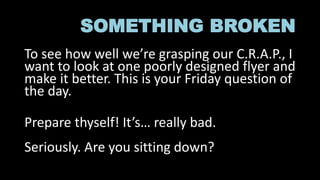
- 1. SOMETHING BROKEN To see how well we’re grasping our C.R.A.P., I want to look at one poorly designed flyer and make it better. This is your Friday question of the day. Prepare thyself! It’s… really bad. Seriously. Are you sitting down?
- 3. Design choices I’m not sure I precisely understand it, but there’s sort of a sub- genre of party flyers that look a bit like this one. Knowing that, I don’t want to act as if this is absolutely hideous, but I think you can safely say, based on our readings so far, that this is not a well designed flyer. When addressing a flyer like this, we want to collect some key information. So let’s break down what we actually have here.
- 4. Elements What is the event? What are the key brand info and what is critical to tell the audience? What is the key graphic thrust?
- 5. FIX IT! Using whatever software you want (other than Word– no Word), make a better flyer than the one we have. Post it when done.