SlideShare uma empresa Scribd logo
1 de 12
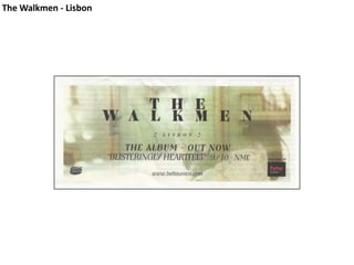
The Walkmen - Lisbon
Band name Release date Album review Album name On sale at HMV Website Record company
Fonts are different, but very similar – both use a serif font basis to represent their music – bold, guitar-based and an indie rock genre. The image used as the background for the advert is very cryptic – it isn’t definite what it actually is. This helps draw the eye to the writing. By keeping it very simple, the designer has been able to create something that uses a lack of visual content to it’s advantage.  The font stands out, and the star image motif of the image is prominent throughout. The use of a green wash across the background image adds another colour, but keeps it bright and noticeable. It also allows for the font to stand out prominently. The image is used across all three major platforms – album cover, website, and on their promotional material. However, it is different sections of the image, which then becomes apparent as a woman sitting down. The use of very soft colours with bold typography across the top of it shows that the music is very soft, with a heavy ‘kick’ – which comes in the shape of a horn section on each track.
Album Cover ↓ Magazine Advert ↑ Website Store ↓
White Lies – Tour Advert
Artist Tour Guests Tour Dates Ticket Website Single Details Artist Website Album Info Record Company & Management
The band only use one font throughout all their promotional material – it has been used to list all tour dates on their advert too. The advert uses quite dark colours, which, seeing as the band are listed as ‘alternative rock’, is very typical of the genre. The band rely very heavily on their guitars, but without knowing this, you wouldn’t assume they are a rock band straight from the ad. This defies the connotations of genre characteristics. The picture of the two girls is used as the band’s star image motif, as again, it is used across all their platforms – advert, website and album cover. By not laying any text over the image at the bottom, the reader’s eye is immediately drawn to the picture. This helps develop it as the band’s star image motif.
Magazine Advert ↑ Website ↓ Album ↑
Chase and Status – New Album & Tour Advert
Artist Album Name Tour Name Tour Dates Ticket Hotlines Ticket Website New Album Info Ticket Info Record Company & Management Artist Website Myspace Website
Two very similar fonts are used on the advert – one for the band name, which is used on all material with their name on it, and the other which lists all other information on the poster. The star image motif of the duo is a bulldog, and was used throughout their previous album’s promotional material as well.  This theme has been continued with this new album and features prominently across all  platforms. The use of an extreme close up of the dog has given the designer a lot of space to place the writing, whilst keeping the appearance of the dog intact. This is a very clever way of using the space as best as possible. The black and white picture of the dog, with the vibrant yellow of the typography, is very effective, and gives the connotation that the band are up-tempo and quite energetic – which is spot-on, as they are a dance duo. I think this is a very effective advert, however, it does not immediately inform the reader of exactly what genre the band are, but it does give you a good idea.
Magazine Advert ↑ Website ↓ Album ↑

Mais conteúdo relacionado

Mais procurados

Digital Draft Catherine W
Digital Draft Catherine WDigital Draft Catherine W
Digital Draft Catherine Wrhsmediastudies
 
Digipak analysis
Digipak analysisDigipak analysis
Digipak analysisTerry-W
 
Jaymes - Ancillary Research
Jaymes - Ancillary ResearchJaymes - Ancillary Research
Jaymes - Ancillary Researchrhsmediastudies
 
Magazine Advert Analysis
Magazine Advert AnalysisMagazine Advert Analysis
Magazine Advert Analysisshiplakecollege
 
Se7en Studios - Pitch
Se7en Studios - PitchSe7en Studios - Pitch
Se7en Studios - PitchFarzeen Somji
 
Digipak Analysis 4: This Corrosion.
Digipak Analysis 4: This Corrosion.Digipak Analysis 4: This Corrosion.
Digipak Analysis 4: This Corrosion.Sarah Byard
 
Ancilary task- Kathryn Naylor
Ancilary task- Kathryn NaylorAncilary task- Kathryn Naylor
Ancilary task- Kathryn NaylorAnya Szelewska
 
Blurryface – twenty one pilots digipak
Blurryface – twenty one pilots digipakBlurryface – twenty one pilots digipak
Blurryface – twenty one pilots digipakCantThinkOfAUserName
 
Analysis of digi packs
Analysis of digi packsAnalysis of digi packs
Analysis of digi packsEdward Towers
 
Analysis of music advert
Analysis of music advertAnalysis of music advert
Analysis of music advertMaisieLegg
 
Evanescence fallen digipak pwrpoint
Evanescence fallen digipak pwrpointEvanescence fallen digipak pwrpoint
Evanescence fallen digipak pwrpointjjawhite
 
Existing fonts within the pop genre
Existing fonts within the pop genre Existing fonts within the pop genre
Existing fonts within the pop genre bethwheal1
 
Evanescence fallen digipak pwrpoint
Evanescence fallen digipak pwrpointEvanescence fallen digipak pwrpoint
Evanescence fallen digipak pwrpointjjawhite
 
Magazine advert deconstruction
Magazine advert deconstructionMagazine advert deconstruction
Magazine advert deconstructiondaniellefamiyesin
 

Mais procurados (20)

Digital Draft Catherine W
Digital Draft Catherine WDigital Draft Catherine W
Digital Draft Catherine W
 
Digipak analysis
Digipak analysisDigipak analysis
Digipak analysis
 
Kings of leon
Kings of leonKings of leon
Kings of leon
 
Jaymes - Ancillary Research
Jaymes - Ancillary ResearchJaymes - Ancillary Research
Jaymes - Ancillary Research
 
Magazine Advert Analysis
Magazine Advert AnalysisMagazine Advert Analysis
Magazine Advert Analysis
 
Ancillary task
Ancillary taskAncillary task
Ancillary task
 
Se7en Studios - Pitch
Se7en Studios - PitchSe7en Studios - Pitch
Se7en Studios - Pitch
 
Digipak pres
Digipak presDigipak pres
Digipak pres
 
Digipak Analysis 4: This Corrosion.
Digipak Analysis 4: This Corrosion.Digipak Analysis 4: This Corrosion.
Digipak Analysis 4: This Corrosion.
 
Ancilary task- Kathryn Naylor
Ancilary task- Kathryn NaylorAncilary task- Kathryn Naylor
Ancilary task- Kathryn Naylor
 
Evaluation Question 2
Evaluation Question 2Evaluation Question 2
Evaluation Question 2
 
Blurryface – twenty one pilots digipak
Blurryface – twenty one pilots digipakBlurryface – twenty one pilots digipak
Blurryface – twenty one pilots digipak
 
Analysing digipaks 2
Analysing digipaks 2Analysing digipaks 2
Analysing digipaks 2
 
Cd planning
Cd planningCd planning
Cd planning
 
Analysis of digi packs
Analysis of digi packsAnalysis of digi packs
Analysis of digi packs
 
Analysis of music advert
Analysis of music advertAnalysis of music advert
Analysis of music advert
 
Evanescence fallen digipak pwrpoint
Evanescence fallen digipak pwrpointEvanescence fallen digipak pwrpoint
Evanescence fallen digipak pwrpoint
 
Existing fonts within the pop genre
Existing fonts within the pop genre Existing fonts within the pop genre
Existing fonts within the pop genre
 
Evanescence fallen digipak pwrpoint
Evanescence fallen digipak pwrpointEvanescence fallen digipak pwrpoint
Evanescence fallen digipak pwrpoint
 
Magazine advert deconstruction
Magazine advert deconstructionMagazine advert deconstruction
Magazine advert deconstruction
 

Semelhante a Ancillary Research - Adverts

Ancillary task
Ancillary taskAncillary task
Ancillary taskemily_hop
 
Cd Covers Analysis
Cd Covers AnalysisCd Covers Analysis
Cd Covers AnalysisWaleedbutt5
 
Kings Of Leon - Album Advert Analysis
Kings Of Leon - Album Advert AnalysisKings Of Leon - Album Advert Analysis
Kings Of Leon - Album Advert Analysis07saracree
 
Advert and album covers
Advert and album coversAdvert and album covers
Advert and album coversbradleyvgmedia
 
Summary of ancillary product 2
Summary of ancillary product 2Summary of ancillary product 2
Summary of ancillary product 2Lucaabraham
 
Textual analysis of magazine adverts
Textual analysis of magazine advertsTextual analysis of magazine adverts
Textual analysis of magazine advertslsuttie9
 
Magazine Advert Analysis
Magazine Advert AnalysisMagazine Advert Analysis
Magazine Advert Analysiselaboscabbo
 
Textual Analysis of Magazine Adverts
Textual Analysis of Magazine AdvertsTextual Analysis of Magazine Adverts
Textual Analysis of Magazine AdvertsRob Glover
 
Magazine Advert Analysis
Magazine Advert AnalysisMagazine Advert Analysis
Magazine Advert AnalysisTom Ibbott
 
Tanya's Digipak
Tanya's DigipakTanya's Digipak
Tanya's Digipakwhegg
 
The prodigy magazine advert analysis
The prodigy magazine advert analysisThe prodigy magazine advert analysis
The prodigy magazine advert analysisKFox_A2
 
Ancillary initial conventions research
Ancillary initial conventions researchAncillary initial conventions research
Ancillary initial conventions researchtaylaeva
 
Analysis of Magazine Adverts
Analysis of Magazine AdvertsAnalysis of Magazine Adverts
Analysis of Magazine Advertsitsjanakan
 
magazine poster analysis
magazine poster analysismagazine poster analysis
magazine poster analysisvanessa_wanner
 
Cd advert analysis
Cd advert analysisCd advert analysis
Cd advert analysispaige_rowell
 

Semelhante a Ancillary Research - Adverts (20)

Ancillary task
Ancillary taskAncillary task
Ancillary task
 
Album Poster Analysis
Album Poster AnalysisAlbum Poster Analysis
Album Poster Analysis
 
Cd Covers Analysis
Cd Covers AnalysisCd Covers Analysis
Cd Covers Analysis
 
Kings Of Leon - Album Advert Analysis
Kings Of Leon - Album Advert AnalysisKings Of Leon - Album Advert Analysis
Kings Of Leon - Album Advert Analysis
 
Advert and album covers
Advert and album coversAdvert and album covers
Advert and album covers
 
Summary of ancillary product 2
Summary of ancillary product 2Summary of ancillary product 2
Summary of ancillary product 2
 
Textual analysis of magazine adverts
Textual analysis of magazine advertsTextual analysis of magazine adverts
Textual analysis of magazine adverts
 
Magazine Advert Analysis
Magazine Advert AnalysisMagazine Advert Analysis
Magazine Advert Analysis
 
Textual Analysis of Magazine Adverts
Textual Analysis of Magazine AdvertsTextual Analysis of Magazine Adverts
Textual Analysis of Magazine Adverts
 
Magazine Advert Analysis
Magazine Advert AnalysisMagazine Advert Analysis
Magazine Advert Analysis
 
Magazine analysis
Magazine analysisMagazine analysis
Magazine analysis
 
Digipak
DigipakDigipak
Digipak
 
Tanya's Digipak
Tanya's DigipakTanya's Digipak
Tanya's Digipak
 
The prodigy magazine advert analysis
The prodigy magazine advert analysisThe prodigy magazine advert analysis
The prodigy magazine advert analysis
 
Ancillary initial conventions research
Ancillary initial conventions researchAncillary initial conventions research
Ancillary initial conventions research
 
Album release
Album releaseAlbum release
Album release
 
Analysis of Magazine Adverts
Analysis of Magazine AdvertsAnalysis of Magazine Adverts
Analysis of Magazine Adverts
 
magazine poster analysis
magazine poster analysismagazine poster analysis
magazine poster analysis
 
CD Cover Analysis
CD Cover AnalysisCD Cover Analysis
CD Cover Analysis
 
Cd advert analysis
Cd advert analysisCd advert analysis
Cd advert analysis
 

Ancillary Research - Adverts

  • 1. The Walkmen - Lisbon
  • 2. Band name Release date Album review Album name On sale at HMV Website Record company
  • 3. Fonts are different, but very similar – both use a serif font basis to represent their music – bold, guitar-based and an indie rock genre. The image used as the background for the advert is very cryptic – it isn’t definite what it actually is. This helps draw the eye to the writing. By keeping it very simple, the designer has been able to create something that uses a lack of visual content to it’s advantage. The font stands out, and the star image motif of the image is prominent throughout. The use of a green wash across the background image adds another colour, but keeps it bright and noticeable. It also allows for the font to stand out prominently. The image is used across all three major platforms – album cover, website, and on their promotional material. However, it is different sections of the image, which then becomes apparent as a woman sitting down. The use of very soft colours with bold typography across the top of it shows that the music is very soft, with a heavy ‘kick’ – which comes in the shape of a horn section on each track.
  • 4. Album Cover ↓ Magazine Advert ↑ Website Store ↓
  • 5. White Lies – Tour Advert
  • 6. Artist Tour Guests Tour Dates Ticket Website Single Details Artist Website Album Info Record Company & Management
  • 7. The band only use one font throughout all their promotional material – it has been used to list all tour dates on their advert too. The advert uses quite dark colours, which, seeing as the band are listed as ‘alternative rock’, is very typical of the genre. The band rely very heavily on their guitars, but without knowing this, you wouldn’t assume they are a rock band straight from the ad. This defies the connotations of genre characteristics. The picture of the two girls is used as the band’s star image motif, as again, it is used across all their platforms – advert, website and album cover. By not laying any text over the image at the bottom, the reader’s eye is immediately drawn to the picture. This helps develop it as the band’s star image motif.
  • 8. Magazine Advert ↑ Website ↓ Album ↑
  • 9. Chase and Status – New Album & Tour Advert
  • 10. Artist Album Name Tour Name Tour Dates Ticket Hotlines Ticket Website New Album Info Ticket Info Record Company & Management Artist Website Myspace Website
  • 11. Two very similar fonts are used on the advert – one for the band name, which is used on all material with their name on it, and the other which lists all other information on the poster. The star image motif of the duo is a bulldog, and was used throughout their previous album’s promotional material as well. This theme has been continued with this new album and features prominently across all platforms. The use of an extreme close up of the dog has given the designer a lot of space to place the writing, whilst keeping the appearance of the dog intact. This is a very clever way of using the space as best as possible. The black and white picture of the dog, with the vibrant yellow of the typography, is very effective, and gives the connotation that the band are up-tempo and quite energetic – which is spot-on, as they are a dance duo. I think this is a very effective advert, however, it does not immediately inform the reader of exactly what genre the band are, but it does give you a good idea.
  • 12. Magazine Advert ↑ Website ↓ Album ↑