Beginners Guide to TikTok for Search - Rachel Pearson - We are Tilt __ Bright...
Deconstruction of a magazine
1. NME magazine front cover deconstruction
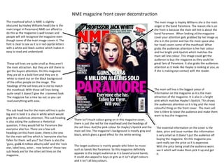
The masthead which is NME is slightly The main image is Hayley Williams she is the main
obscured by Hayley Williams head (she is the singer in the band Paramore. The reason she is on
main singer in Paramore) NME can afford to the front is because the main sell line is about the
do this as the magazine is well known and band Paramore. When looking at the magazine
people will still recognize the magazine even cover your attention gets grabbed by her image as
though some of the main image covers it. The she is in the center and has the most space also
font is clear to see as it is in red capital letters her head covers some of the masthead. What
with a white and black outline which makes it grabs the audiences attention is her hair colour
easy to read and understand. and her bright pink lipstick which matches the
main sell line colour. This image could get the
audience to buy the magazine as they could be
These sell lines are quite small as they aren't great fans of Paramore. It also grabs the audiences
the main attraction. But they are still there to attention as it looks like Hayley is looking at you, as
get the buyers attention. On this magazine if she is making eye contact with the reader.
they are all in a bold font and they are in
white to stand out on the black background
of the other people on the image. The
headings of the sell lines are in red to match
the masthead. With these sell lines being The main sell line is the biggest piece of
quite small it doesn’t give the crammed look. information on the magazine as it is the main
The magazine has a nice lay out so you can attraction of the magazine. It is also in a bright
read everything with ease. pink which matches Hayley’s lipstick. This draws
the audiences attention as it is big and the most
colourful thing on the front cover. The main sell
The sub head line for the main sell line is quite line is there to tease the audience and make them
big and in bold it is also in white which would want to buy the magazine.
grab the audiences attention. This sub heading
There isn't much colour going on in this magazine cover,
is also asking the audience a rhetorical
there is just the red for the masthead and the headings of
question, if they would fall for Paramore like
the sell lines. And the pink colour for Hayley’s lipstick and the The essential information on the cover is the
everyone else has. There are a few sub
main sell line. The magazine’s background is mostly gray and date, price and issue number this information
headings on this front cover, there is the one
black, which gives a good effect for the white writing. is very small so it doesn’t put the audience off
for the main sell line which is ‘everyone else has
fallen for them. will you?’ but there is also the buying the magazine. On this magazine you
‘guns, god& 4 million albums sold’ and the ‘rock cant really see the price as it is expensive.
The target audience is mainly people who listen to music With the price being small the audience wont
star, label boss, actor… now lecturer’ those two
such as bands like Paramore. So this magazine definitely see it which will make them pick it up and get
sub heads are for the other sell lines on the
appeals to the target audience as it is based around bands. it.
magazine.
It could also appeal to boys or girls as it isn't all girl colours
and it isn’t all boy colours.
2. Billboard magazine front cover deconstruction
The masthead is neat and the biggest The essential information which is the date,
piece of information on the front cover. It price and issue number of the magazine is very
takes the full top of the front cover up. small on this front cover this is so the audience
The masthead is partially obscured with isnt put off buying the mag.
Justin Bieber’s head, Billboard can afford
to cover some of its masthead as it’s a
popular magazine and people
automatically know what it is. The
masthead is big and it is in white which The main image is of Justin Bieber, this
stands out on the blue background, the tells me that the main story is about
letter ‘d’ is coloured in the center (yellow) Justin. This image would mainly appeal to
which gets your attention. teenage girls. The image of Justin looks as
though he is looking into the readers eye,
it is eye contact. This draws your attention
to him. It would make the audience want
The main sell line is ‘Justin Bieber’ which is to pick the mag up and read it. Justin is in
in white writing the font is basic but it still a gray top with low neck line– which
stands out as its on the blue background. shows some of his chest this would get
The sub head covers some of the main sell young girls attention.
line. This main sell line draws the audience
attention as they could be a Justin fan,
which would make them buy the magazine
just to read about Bieber.
The colours is mainly light which is the
The sub head is small but it stands out as blue background and the yellow for in-
its white writing on a red background. between the lettering and the sell line
The sub head covers some of the main headings. It has used colours that can
sell line, this has been done so it looks The other sell lines are a decent size and are be both for girls and boys. The colours
like the main image (Justin) is actually colourful. The other sell lines are talking about all go well together, there are no
saying the sub head- which is ‘everything famous music artists that are in. some of the sell clashes.
I do, I do to be the greatest’. lines are blocked by Justin's body so you cant read
some of the sell line about Lady Gaga.
3. Top of the pop’s magazine front cover deconstruction
This is a skyline and it gives a little information about another
story in the magazine.
The masthead is the biggest piece of The main image is of Jessie J, which indicates
information on the front cover and its quite that the main story is about Jessie. She stands
girly as its in dark pink– so this would appeal out as she is in the center of the magazine and
to the target audience which would be stands out on the white background. This image
teenage girls. The masthead looks good on is as though she is looking at you (making eye
this magazine as it stands out on the white contact). This would draw the audience
background. On this front cover the main attention as it is making eye contact and would
image isnt obscuring the masthead even make them want to buy it. With the main image
though the magazine is well known. being Jessie it appeals to the target audience as
young girls admire Jessie and want to be like her
so this would make them want to buy the mag
as it has her in it.
The main sell line is ‘the real Jessie J’ for this
being the main sell line its quite small but it is
in the middle of the magazine so it still stands
out. Also it is in a bubble which is coloured in The other images are off the other sell lines and they
bright pink which matches the colour of the also draw your attention as its mainly the young male
masthead. singers. In this music mag it also has a section about
clothes which would also appeal to the target
audience.
The sub head for the main sell line is ‘I’m not
going to hide anything’ which is also inside of Again on this magazine cover the essential
the bubble along with the main sell line. information is very small so it doesn't’t put the
readers off buying it.
The other sell lines also stand out as they are in
different colours and fonts. It draws your
The colours are all light and girly which also would appeal to the
attention as they are a decent size.
target audience. The main colours are pink, white and purple. The
colours are in big blocks and little blocks, making the text and
pictures stand out.